\n
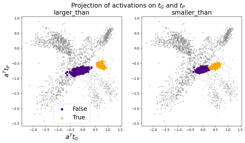
## Scatter Plot: Projection of Activations on τG and τP
### Overview
The image presents two scatter plots, arranged side-by-side. Both plots visualize the projection of activations onto τG (tau-G) and τP (tau-P) axes, likely representing some form of latent space or feature embedding.
### Plot 1: Projection of Activations - τG vs. τP
* **Axes:** The x-axis represents τG, and the y-axis represents τP.
* **Data Points:** Numerous data points are scattered across the plot, indicating the distribution of activations. The points appear to cluster in several regions, suggesting distinct patterns or groupings within the data.
* **Color Coding:** The points are color-coded, potentially representing different classes, categories, or conditions. A color bar on the right provides a mapping between colors and their corresponding labels.
* **Interpretation:** This plot shows how activations are distributed with respect to τG and τP. Clusters may indicate specific features or patterns that are strongly associated with certain values of τG and τP.
### Plot 2: Projection of Activations - τG vs. τP (Different View/Subset)
* **Axes:** Similar to Plot 1, the x-axis represents τG, and the y-axis represents τP.
* **Data Points:** This plot also contains scattered data points, but the distribution and clustering patterns may differ from Plot 1. This could be due to a different subset of data, a different view of the latent space, or a different set of conditions.
* **Color Coding:** The points are color-coded, with a color bar on the right providing the label mapping. The color scheme may be different from Plot 1, or it may represent a different set of labels.
* **Interpretation:** This plot provides a complementary view of the activation projections. Comparing it to Plot 1 can reveal how the distribution of activations changes under different conditions or for different subsets of data.
### Overall Interpretation
The two scatter plots together offer insights into the structure of the activation space defined by τG and τP. The clustering patterns and color coding can help identify meaningful features, relationships, and distinctions within the data. These plots are useful for visualizing and understanding the behavior of a neural network or other machine learning model.