## Scatter Plots: Projection of activations on t_G and t_P
### Overview
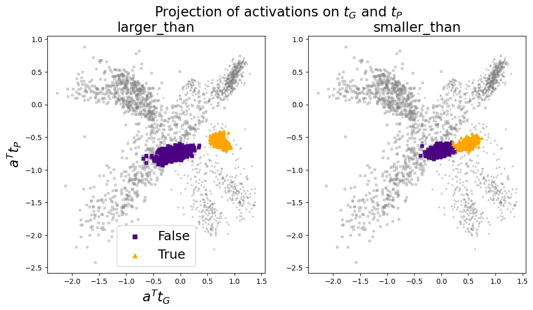
Two side-by-side scatter plots compare activation projections on two variables, t_G (green) and t_P (purple), under two conditions: "larger_than" (left) and "smaller_than" (right). Points are color-coded as "False" (purple squares) and "True" (yellow triangles), with gray squares representing background data.
### Components/Axes
- **X-axis**: Labeled "a^T t_G" (projection of activations on t_G), scaled from -2.5 to 1.5.
- **Y-axis**: Labeled "a^T t_P" (projection of activations on t_P), scaled from -2.5 to 1.0.
- **Legend**: Located at the bottom-left of both plots, mapping:
- Purple squares → "False"
- Yellow triangles → "True"
- **Subtitles**:
- Left plot: "larger_than"
- Right plot: "smaller_than"
### Detailed Analysis
#### Left Plot ("larger_than")
- **Clusters**:
- **Purple ("False")**: Concentrated around (-0.5, -1.0), with a density peak at (-0.3, -1.2).
- **Yellow ("True")**: Clustered near (0.5, -0.5), with a peak at (0.4, -0.6).
- **Distribution**: Gray points form a diffuse "X" shape across the plot, with higher density near the origin.
#### Right Plot ("smaller_than")
- **Clusters**:
- **Purple ("False")**: Similar to the left plot, centered at (-0.5, -1.0).
- **Yellow ("True")**: Clustered near (0.5, -0.5), mirroring the left plot.
- **Distribution**: Gray points follow the same "X" pattern as the left plot.
### Key Observations
1. **Symmetry**: Both plots show nearly identical cluster positions for "False" and "True" categories, suggesting the condition ("larger_than"/"smaller_than") affects the interpretation rather than the raw data.
2. **Cluster Overlap**: Purple and yellow clusters overlap slightly but remain distinct, indicating separable categories.
3. **Gray Background**: The majority of points (gray) form a broad, diagonal "X" pattern, suggesting a general relationship between t_G and t_P projections.
### Interpretation
- **Condition Impact**: The subtitles ("larger_than"/"smaller_than") likely indicate whether t_G > t_P or t_G < t_P, but the identical cluster positions imply the condition modifies the analysis framework rather than the data itself.
- **Activation Relationships**: The diagonal "X" of gray points suggests a linear relationship between a^T t_G and a^T t_P, with deviations concentrated in the colored clusters.
- **Classification**: The purple ("False") and yellow ("True") clusters may represent binary outcomes (e.g., classification errors vs. correct predictions) tied to the activation projections.
### Notable Patterns
- **Cluster Stability**: Identical cluster positions across both plots suggest the condition modifies the analysis context, not the underlying data distribution.
- **Density Peaks**: Sharp peaks in purple and yellow clusters indicate localized activation patterns critical to the "False"/"True" distinction.