TECHNICAL ASSET FINGERPRINT
867ad973d8979f16403fff7b
Click to view fullscreen
Press ESC or click to close
FOUND IN PAPERS
EXPERT: gemma-3-27b-it-free VERSION 1
RUNTIME: google-free/gemma-3-27b-it
INTEL_VERIFIED
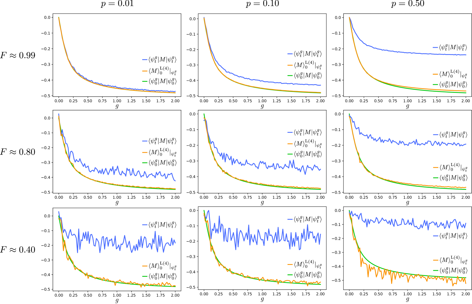
## Chart: Dependence of Observables on g for Different p Values
### Overview
The image presents a 3x3 grid of line plots. Each plot visualizes the relationship between a quantity (represented on the y-axis) and a parameter 'g' (on the x-axis). The plots are grouped by a parameter 'F' (indicated on the left y-axis) with values approximately 0.99, 0.80, and 0.40. Within each group, the plots are further differentiated by the value of 'p' (indicated at the top of each plot), which takes values 0.01, 0.10, and 0.50. Each plot contains three lines, each representing a different mathematical expression.
### Components/Axes
* **X-axis:** Labeled 'g', ranging from 0.00 to 2.00 with increments of 0.25.
* **Y-axis:** Labeled 'F̃' (tilde F), ranging from -0.5 to 0.1 with increments of 0.1.
* **Parameter F:** Values are approximately 0.99, 0.80, and 0.40, displayed vertically on the left side of the grid.
* **Parameter p:** Values are 0.01, 0.10, and 0.50, displayed horizontally at the top of each plot.
* **Legend:** Located in the top-right corner of each plot, identifying the three lines:
* `-⟨ψ₀|M|ψ₀⟩` (Blue line)
* `-⟨M|M|M⟩` (Green line)
* `-⟨ψ₀|M|ψ₀⟩` (Yellow line)
### Detailed Analysis
Each plot shows the behavior of the three expressions as 'g' varies from 0.00 to 2.00.
**F̃ ≈ 0.99:**
* **p = 0.01:** The blue line starts at approximately -0.05 and decreases rapidly to approximately -0.45 at g = 0.5, then plateaus around -0.45 to -0.5. The green line starts at approximately -0.15 and decreases to approximately -0.45 at g = 0.5, then plateaus around -0.45 to -0.5. The yellow line starts at approximately -0.25 and decreases to approximately -0.45 at g = 0.5, then plateaus around -0.45 to -0.5.
* **p = 0.10:** The blue line starts at approximately -0.05 and decreases rapidly to approximately -0.45 at g = 0.5, then plateaus around -0.45 to -0.5. The green line starts at approximately -0.15 and decreases to approximately -0.45 at g = 0.5, then plateaus around -0.45 to -0.5. The yellow line starts at approximately -0.25 and decreases to approximately -0.45 at g = 0.5, then plateaus around -0.45 to -0.5.
* **p = 0.50:** The blue line starts at approximately -0.05 and decreases slowly to approximately -0.35 at g = 2.0. The green line starts at approximately -0.15 and decreases slowly to approximately -0.35 at g = 2.0. The yellow line starts at approximately -0.25 and decreases slowly to approximately -0.35 at g = 2.0.
**F̃ ≈ 0.80:**
* **p = 0.01:** The blue line starts at approximately -0.1 and decreases rapidly to approximately -0.45 at g = 0.5, then plateaus around -0.45 to -0.5. The green line starts at approximately -0.2 and decreases to approximately -0.45 at g = 0.5, then plateaus around -0.45 to -0.5. The yellow line starts at approximately -0.3 and decreases to approximately -0.45 at g = 0.5, then plateaus around -0.45 to -0.5.
* **p = 0.10:** The blue line starts at approximately -0.1 and decreases slowly to approximately -0.35 at g = 2.0. The green line starts at approximately -0.2 and decreases slowly to approximately -0.35 at g = 2.0. The yellow line starts at approximately -0.3 and decreases slowly to approximately -0.35 at g = 2.0.
* **p = 0.50:** The blue line starts at approximately -0.1 and decreases slowly to approximately -0.35 at g = 2.0. The green line starts at approximately -0.2 and decreases slowly to approximately -0.35 at g = 2.0. The yellow line starts at approximately -0.3 and decreases slowly to approximately -0.35 at g = 2.0.
**F̃ ≈ 0.40:**
* **p = 0.01:** The blue line starts at approximately -0.15 and decreases rapidly to approximately -0.45 at g = 0.5, then plateaus around -0.45 to -0.5. The green line starts at approximately -0.25 and decreases to approximately -0.45 at g = 0.5, then plateaus around -0.45 to -0.5. The yellow line starts at approximately -0.35 and decreases to approximately -0.45 at g = 0.5, then plateaus around -0.45 to -0.5.
* **p = 0.10:** The blue line starts at approximately -0.15 and decreases slowly to approximately -0.35 at g = 2.0. The green line starts at approximately -0.25 and decreases slowly to approximately -0.35 at g = 2.0. The yellow line starts at approximately -0.35 and decreases slowly to approximately -0.35 at g = 2.0.
* **p = 0.50:** The blue line starts at approximately -0.15 and decreases slowly to approximately -0.35 at g = 2.0. The green line starts at approximately -0.25 and decreases slowly to approximately -0.35 at g = 2.0. The yellow line starts at approximately -0.35 and decreases slowly to approximately -0.35 at g = 2.0.
### Key Observations
* For F̃ ≈ 0.99, at p = 0.01 and p = 0.10, all three lines exhibit a steep initial decrease followed by a plateau. As p increases to 0.50, the decrease becomes much more gradual.
* For F̃ ≈ 0.80 and F̃ ≈ 0.40, the behavior is similar to F̃ ≈ 0.99 at p = 0.50, with a gradual decrease as 'g' increases.
* The lines representing `-⟨ψ₀|M|ψ₀⟩` (blue) consistently have the highest values (least negative) across all plots.
* The lines representing `-⟨M|M|M⟩` (green) and `-⟨ψ₀|M|ψ₀⟩` (yellow) are very close to each other in value.
### Interpretation
The plots demonstrate the dependence of three observables on the parameter 'g' for different values of 'F' and 'p'. The parameter 'F' likely represents some physical quantity, and its value influences the overall behavior of the observables. The parameter 'p' appears to control the rate of change of the observables with respect to 'g'.
When 'F' is high (0.99), a small 'p' (0.01 or 0.10) leads to a rapid initial change in the observables, suggesting a strong sensitivity to 'g' at the beginning. As 'p' increases (0.50), the sensitivity decreases, and the observables change more gradually.
When 'F' is low (0.80 or 0.40), the observables exhibit a gradual change with 'g' regardless of the value of 'p', indicating a weaker dependence on 'g' in these regimes.
The consistent ordering of the lines (blue > green ≈ yellow) suggests a hierarchical relationship between the corresponding mathematical expressions. The blue line, representing `-⟨ψ₀|M|ψ₀⟩`, is consistently the least negative, implying it has the highest value among the three observables. The green and yellow lines are very similar, suggesting they represent closely related quantities.
The plots could be representing the behavior of a quantum system, where 'F' is a measure of some system property, 'p' is a control parameter, 'g' is an external field, and the observables represent different measurable quantities. The observed trends could provide insights into the system's dynamics and response to external perturbations.
DECODING INTELLIGENCE...