TECHNICAL ASSET FINGERPRINT
867ad973d8979f16403fff7b
Click to view fullscreen
Press ESC or click to close
FOUND IN PAPERS
EXPERT: healer-alpha-free VERSION 1
RUNTIME: free/openrouter/healer-alpha
INTEL_VERIFIED
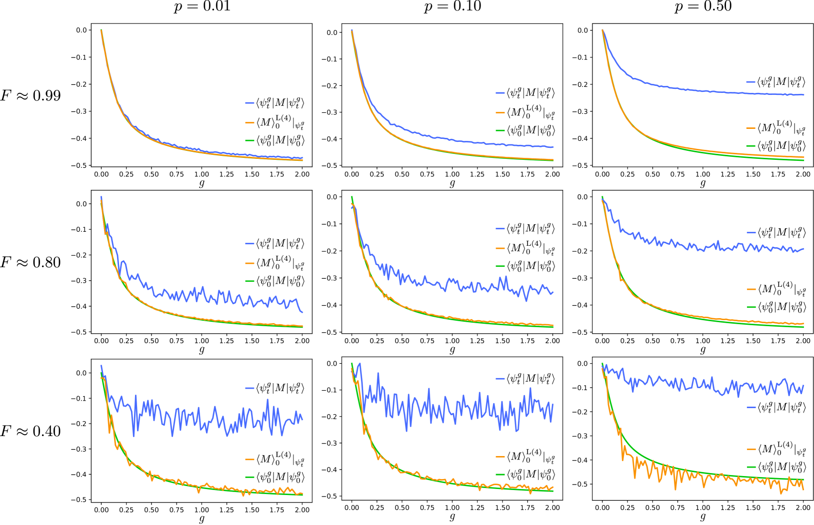
## [Multi-Panel Line Chart]: Expectation Values of Operator M vs. Coupling Parameter g
### Overview
The image displays a 3x3 grid of line charts, totaling nine individual plots. Each plot shows the relationship between a coupling parameter `g` (x-axis) and the expectation value of an operator `M` (y-axis) for three different quantum states or calculation methods. The grid is organized by two parameters: `p` (columns) and `F` (rows). The plots demonstrate how the behavior of these expectation values changes as `p` and `F` vary.
### Components/Axes
* **Grid Structure:**
* **Columns (Parameter `p`):** Labeled at the top of each column as `p = 0.01` (left), `p = 0.10` (center), `p = 0.50` (right).
* **Rows (Parameter `F`):** Labeled to the left of each row as `F ≈ 0.99` (top), `F ≈ 0.80` (middle), `F ≈ 0.40` (bottom).
* **Individual Plot Axes:**
* **X-axis:** Labeled `g` in all plots. The scale runs from `0.00` to `2.00` with major ticks at intervals of `0.25`.
* **Y-axis:** Represents the expectation value of operator `M`. The scale runs from `-0.5` to `0.0` with major ticks at intervals of `0.1`.
* **Legend (Present in each plot):**
* **Blue Line:** `⟨ψ_t^g|M|ψ_t^g⟩` (Expectation value in the time-evolved state `ψ_t^g`).
* **Orange Line:** `⟨M⟩_0^{L(4)}|ψ_t^g⟩` (Likely a theoretical or approximate expectation value, possibly from a 4th-order linked-cluster expansion, evaluated for the state `ψ_t^g`).
* **Green Line:** `⟨ψ_0^g|M|ψ_0^g⟩` (Expectation value in the initial state `ψ_0^g`).
* **Legend Position:** Typically located in the top-right or center-right quadrant of each subplot.
### Detailed Analysis
**General Trend Across All Plots:** All three lines (blue, orange, green) start near `0.0` at `g=0.00` and decrease (become more negative) as `g` increases towards `2.00`. The rate of decrease is steepest for small `g` and flattens out for larger `g`.
**Analysis by Row (Parameter `F`):**
* **Top Row (`F ≈ 0.99`):** The lines are very smooth. The blue line (`⟨ψ_t^g|M|ψ_t^g⟩`) and the orange line (`⟨M⟩_0^{L(4)}|ψ_t^g⟩`) are nearly indistinguishable across all `p` values. The green line (`⟨ψ_0^g|M|ψ_0^g⟩`) is also very close, showing only a slight deviation at higher `g` for `p=0.50`.
* **Middle Row (`F ≈ 0.80`):** The blue line begins to show noticeable high-frequency noise or fluctuations, especially for `g > 0.5`. The orange and green lines remain smooth and closely aligned with each other. The separation between the blue line and the orange/green pair becomes more apparent as `p` increases.
* **Bottom Row (`F ≈ 0.40`):** The blue line exhibits significant noise and large fluctuations across the entire range of `g`. The orange and green lines remain smooth but start to show a clear separation from each other, particularly at higher `p` values (`p=0.10` and `p=0.50`). For `p=0.50`, the orange line (`⟨M⟩_0^{L(4)}|ψ_t^g⟩`) is consistently above (less negative than) the green line (`⟨ψ_0^g|M|ψ_0^g⟩`).
**Analysis by Column (Parameter `p`):**
* **Left Column (`p = 0.01`):** The three lines are most tightly clustered. Even at `F ≈ 0.40`, the separation between the orange and green lines is minimal.
* **Center Column (`p = 0.10`):** The separation between the blue line and the orange/green pair becomes more pronounced with decreasing `F`. The orange and green lines begin to separate slightly at `F ≈ 0.40`.
* **Right Column (`p = 0.50`):** This column shows the most dramatic effects. The blue line is highest (least negative) and most noisy at low `F`. The separation between the orange and green lines is most significant here, especially at `F ≈ 0.40`, where the orange line is clearly above the green line for `g > ~0.25`.
### Key Observations
1. **Noise Correlation with `F`:** The noise in the blue line (`⟨ψ_t^g|M|ψ_t^g⟩`) is inversely correlated with the parameter `F`. High `F` (~0.99) yields smooth curves, while low `F` (~0.40) yields highly fluctuating curves.
2. **Divergence with `p`:** The parameter `p` controls the divergence between the different calculation methods. At low `p` (0.01), all methods agree closely. At high `p` (0.50), significant differences emerge, particularly between the time-evolved state expectation (blue) and the other two, and between the theoretical approximation (orange) and the initial state expectation (green) at low `F`.
3. **Agreement of Orange and Green Lines:** The orange line (`⟨M⟩_0^{L(4)}|ψ_t^g⟩`) and the green line (`⟨ψ_0^g|M|ψ_0^g⟩`) track each other very closely for high `F` values across all `p`. Their separation is a key indicator of the breakdown of an approximation or the influence of the parameter `p` at lower `F`.
4. **Systematic Offset:** For `p=0.50` and `F ≈ 0.40`, the orange line is systematically less negative than the green line for `g > 0.25`, suggesting the theoretical approximation (`L(4)`) overestimates the expectation value compared to the initial state calculation under these conditions.
### Interpretation
This chart likely comes from a study in quantum many-body physics or quantum simulation, comparing different methods for calculating the expectation value of an observable `M` as a function of a coupling strength `g`.
* **Parameter `F`:** This likely represents a **fidelity** or a measure of state quality/purity. A high `F` (~0.99) indicates a high-quality, low-noise state or simulation, leading to smooth, reliable results. A low `F` (~0.40) indicates a noisy, low-fidelity state, causing the direct measurement (blue line) to become unreliable and fluctuate wildly.
* **Parameter `p`:** This could represent a **noise rate**, **error probability**, or a **perturbation strength**. Increasing `p` introduces more disturbance into the system, causing the different theoretical and computational approaches to diverge.
* **The Three Lines:**
* The **blue line** is the "direct" result from the (possibly noisy) time-evolved state. Its noise at low `F` reflects the instability of this direct calculation.
* The **green line** is a baseline calculation from the initial state `ψ_0^g`.
* The **orange line** appears to be a **theoretical approximation** (e.g., from perturbation theory or a linked-cluster expansion) intended to predict the expectation value for the state `ψ_t^g`.
* **Core Finding:** The data suggests that the theoretical approximation (orange) is excellent when the system fidelity `F` is high, as it matches both the direct calculation (blue) and the initial state baseline (green). However, as fidelity `F` decreases and noise `p` increases, the approximation breaks down. It no longer matches the noisy direct calculation and, more importantly, deviates from the initial state baseline, indicating a fundamental change in the system's behavior or the failure of the approximation under noisy, low-fidelity conditions. The chart effectively maps the "phase space" of validity for the theoretical model.
DECODING INTELLIGENCE...