## Line Chart: Newly Connected Pairs (sampled) vs. Iteration
### Overview
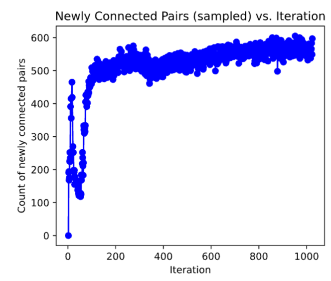
The image displays a line chart illustrating the relationship between the "Count of newly connected pairs" (Y-axis) and the "Iteration" (X-axis). The chart depicts a single data series represented by a blue line with circular markers, showing a highly volatile initial phase followed by a period of stabilization and gradual growth.
### Components/Axes
* **Title:** "Newly Connected Pairs (sampled) vs. Iteration" (Centered at the top).
* **X-Axis:** Labeled "Iteration". The scale is linear, marked at intervals of 200, ranging from 0 to 1000.
* **Y-Axis:** Labeled "Count of newly connected pairs". The scale is linear, marked at intervals of 100, ranging from 0 to 600.
* **Data Series:** A single blue line connecting circular data points.
### Detailed Analysis
The data can be segmented into three distinct phases based on the visual trend:
1. **Initial Volatility (Iterations 0–50):**
* The series begins at (0, 0).
* It exhibits a sharp, rapid ascent to a peak of approximately 470 connected pairs at roughly iteration 10.
* This is immediately followed by a sharp, steep decline, bottoming out at approximately 120 connected pairs around iteration 50.
2. **Recovery Phase (Iterations 50–150):**
* Following the dip at iteration 50, the trend reverses sharply upward.
* The count climbs rapidly from ~120 to ~500 by iteration 150, indicating a stabilization of the connection logic or algorithm.
3. **Stabilization and Slow Growth (Iterations 150–1000+):**
* From iteration 150 onwards, the volatility decreases significantly.
* The data points fluctuate within a range of approximately 450 to 600.
* There is a visible, gradual upward trend throughout this phase. By iteration 1000, the count reaches approximately 600.
### Key Observations
* **Anomalous Dip:** The most significant feature is the sharp "V" shape between iterations 0 and 100, suggesting a system reset, a change in sampling strategy, or a constraint violation early in the process.
* **Sampling Noise:** Throughout the entire duration, the data points exhibit consistent "jitter" or vertical variance, which is characteristic of sampled data or stochastic processes.
* **Convergence:** The system appears to reach a quasi-stable state after iteration 150, where the rate of new connections becomes more predictable, though it continues to grow slowly.
### Interpretation
This chart is characteristic of a training process for a machine learning model, a graph-building algorithm, or a network growth simulation.
* **System Behavior:** The initial spike and subsequent crash (0–50 iterations) likely represent an "exploration" phase where the algorithm initially over-connected or made invalid connections, followed by a correction.
* **Learning/Growth:** The steady, slow growth after iteration 150 suggests that the system is successfully learning or building the graph, but the rate of "newly connected pairs" is slowing down as the graph becomes denser or the model converges.
* **Implications:** The fact that the line does not plateau completely at 600 suggests the process is still active and finding new connections, rather than having reached a hard saturation point. The persistent noise suggests that the sampling method is stochastic rather than deterministic.