\n
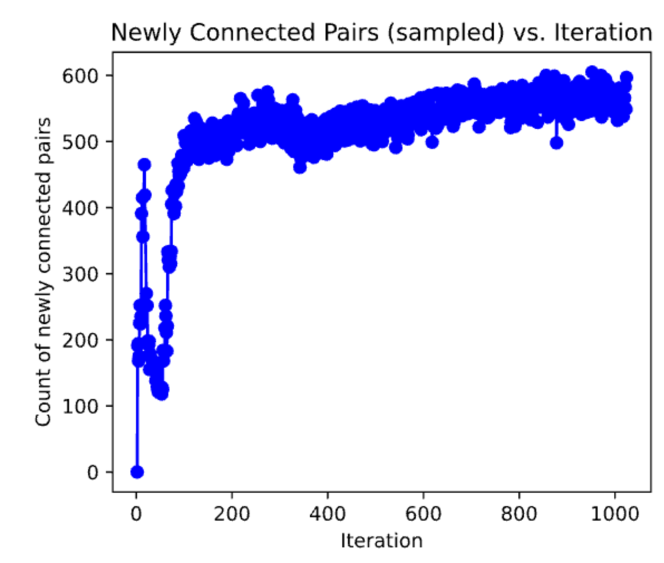
## Scatter Plot: Newly Connected Pairs (sampled) vs. Iteration
### Overview
The image presents a scatter plot visualizing the relationship between the iteration number and the count of newly connected pairs (sampled). The plot shows a clear trend of increasing connected pairs with iteration, followed by a plateau.
### Components/Axes
* **Title:** "Newly Connected Pairs (sampled) vs. Iteration" - positioned at the top-center of the image.
* **X-axis:** "Iteration" - ranging from approximately 0 to 1000, with tick marks at intervals of 100.
* **Y-axis:** "Count of newly connected pairs" - ranging from 0 to 600, with tick marks at intervals of 100.
* **Data Series:** A single series of blue data points.
### Detailed Analysis
The data series exhibits a rapid increase in the count of newly connected pairs during the initial iterations (0-100). The slope is steep, indicating a high rate of new connections. Between iterations 100 and 400, the rate of increase slows down, and the curve begins to flatten. From approximately iteration 400 to 1000, the count of newly connected pairs plateaus, fluctuating around a value of approximately 550-580.
Here's a breakdown of approximate data points:
* Iteration 0: Approximately 0 newly connected pairs.
* Iteration 50: Approximately 200 newly connected pairs.
* Iteration 100: Approximately 350 newly connected pairs.
* Iteration 200: Approximately 480 newly connected pairs.
* Iteration 300: Approximately 520 newly connected pairs.
* Iteration 400: Approximately 530 newly connected pairs.
* Iteration 500: Approximately 550 newly connected pairs.
* Iteration 600: Approximately 560 newly connected pairs.
* Iteration 700: Approximately 570 newly connected pairs.
* Iteration 800: Approximately 570 newly connected pairs.
* Iteration 900: Approximately 580 newly connected pairs.
* Iteration 1000: Approximately 570 newly connected pairs.
### Key Observations
* The initial growth is exponential, suggesting a rapid initial phase of network formation or connection establishment.
* The plateau indicates that the system is approaching a saturation point, where adding more iterations yields diminishing returns in terms of new connections.
* There are minor fluctuations around the plateau, which could be due to sampling variability or inherent randomness in the connection process.
### Interpretation
The plot likely represents the progress of a network formation process, such as the growth of a social network, the establishment of connections in a communication network, or the learning process of a machine learning model. The initial rapid growth suggests that early connections are easy to establish, perhaps due to a large pool of unconnected nodes. As the network matures, finding new connections becomes more difficult, leading to the observed plateau. The fluctuations around the plateau could be due to the limited sample size or the inherent stochasticity of the connection process. The data suggests that the system is converging towards a stable state where the rate of new connections is minimal. Further investigation might involve analyzing the characteristics of the nodes that remain unconnected after the plateau is reached, or exploring the impact of different parameters on the connection rate.