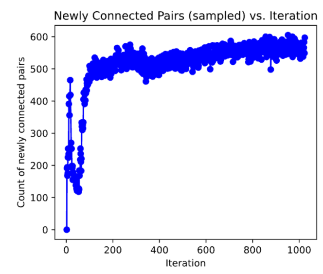
## Scatter Plot: Newly Connected Pairs (sampled) vs. Iteration
### Overview
The image is a scatter plot with connected lines, displaying the relationship between the number of iterations (x-axis) and the count of newly connected pairs (y-axis). The data shows a rapid initial increase followed by a plateau with fluctuations.
### Components/Axes
* **Chart Title:** "Newly Connected Pairs (sampled) vs. Iteration"
* **X-Axis:**
* **Label:** "Iteration"
* **Scale:** Linear, ranging from 0 to 1000.
* **Major Tick Marks:** 0, 200, 400, 600, 800, 1000.
* **Y-Axis:**
* **Label:** "Count of newly connected pairs"
* **Scale:** Linear, ranging from 0 to 600.
* **Major Tick Marks:** 0, 100, 200, 300, 400, 500, 600.
* **Data Series:** A single series represented by blue circular markers connected by a thin blue line. There is no legend, as only one data series is present.
### Detailed Analysis
The data exhibits two distinct phases:
1. **Initial Rapid Growth (Iterations 0-100):**
* The series begins at approximately (0, 0).
* It experiences a very sharp, near-vertical increase, reaching a local peak of approximately 450-470 pairs within the first 50 iterations.
* This is followed by a sharp decline, dropping to a local minimum of approximately 120-150 pairs around iteration 75-100.
2. **Plateau with Fluctuations (Iterations 100-1000):**
* After iteration 100, the count rises steeply again, crossing 500 pairs by approximately iteration 150.
* From iteration 200 onward, the data enters a plateau phase. The count fluctuates primarily within the band of 500 to 600 newly connected pairs.
* The trend within this plateau shows a very slight, gradual upward slope from ~500 at iteration 200 to ~550-600 by iteration 1000.
* **Notable Fluctuations:**
* A significant dip occurs between iterations 300 and 400, where the count falls to approximately 460-480.
* Another noticeable dip occurs around iteration 850, dropping to approximately 500.
* The highest density of points and the apparent maximum values (approaching 600) are clustered in the later iterations (800-1000).
### Key Observations
* **High Volatility Early On:** The process is highly unstable in the first 100 iterations, with dramatic swings in the count of new connections.
* **Stabilization:** The system reaches a quasi-stable state after iteration 200, where the rate of new connections remains high but relatively consistent.
* **Persistent Noise:** Even in the stable phase, the data is noisy, indicating continuous small-scale variation in the process being measured.
* **Slight Positive Drift:** There is a subtle but discernible upward trend across the entire plateau phase, suggesting a very slow increase in the baseline rate of new connections over time.
### Interpretation
This plot likely visualizes the output of a dynamic network simulation, a machine learning training process, or an optimization algorithm where "newly connected pairs" is a key metric.
* **The initial spike and crash** suggest a "discovery" or "exploration" phase where many new connections are made rapidly, followed by a consolidation or pruning phase where some are lost.
* **The sustained high plateau** indicates the process has entered a "steady state" of growth or learning, continuously generating new connections at a high rate. The slight upward drift could imply the system is becoming more efficient or expansive over time.
* **The persistent fluctuations and specific dips** (e.g., at iteration ~350) are anomalies that would warrant investigation in a technical context. They could correspond to specific events in the process, such as a change in parameters, the introduction of new data, or a periodic reset mechanism.
* **Overall Trend:** The data demonstrates a classic pattern of rapid initial adaptation followed by sustained, noisy, but stable operation with a hint of long-term improvement. The process does not appear to converge to a fixed value but rather maintains a dynamic equilibrium.