TECHNICAL ASSET FINGERPRINT
87153c346728fff4461ed305
Click to view fullscreen
Press ESC or click to close
FOUND IN PAPERS
EXPERT: gemini-2.0-flash VERSION 1
RUNTIME: nugit/gemini/gemini-2.0-flash
INTEL_VERIFIED
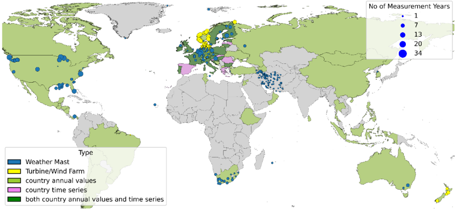
## World Map: Measurement Locations and Types
### Overview
The image is a world map displaying the locations of different types of measurements related to weather and wind energy. The map uses color-coding to indicate the type of measurement and the size of the blue circles to represent the number of measurement years.
### Components/Axes
* **Map:** A world map with countries colored in either light green or light gray.
* **Legend (Type):** Located in the bottom-left corner, it defines the color codes for different measurement types:
* Blue: Weather Mast
* Yellow: Turbine/Wind Farm
* Light Green: Country annual values
* Pink: Country time series
* Dark Green: Both country annual values and time series
* **Legend (No of Measurement Years):** Located in the top-right corner, it defines the size of the blue circles representing the number of measurement years:
* Smallest circle: 1 year
* Small circle: 7 years
* Medium circle: 13 years
* Large circle: 20 years
* Largest circle: 34 years
### Detailed Analysis or ### Content Details
* **North America:**
* Concentration of blue circles (Weather Masts) in the United States and Canada. The size of the circles varies, indicating different measurement durations.
* **Europe:**
* A mix of blue, yellow, pink, and dark green areas.
* Yellow (Turbine/Wind Farm) is concentrated in Scandinavia.
* Pink (Country time series) is present in Spain, Italy, and Greece.
* Dark Green (Both country annual values and time series) is present in the UK, France, and Germany.
* **Asia:**
* Blue circles (Weather Masts) are scattered across Russia, India, and China.
* **Africa:**
* Blue circles (Weather Masts) are present in South Africa.
* **Australia:**
* Blue circles (Weather Masts) are present in the southeast.
* **South America:**
* Few data points.
### Key Observations
* Weather mast measurements (blue) are the most widespread, appearing across all continents.
* Turbine/Wind Farm measurements (yellow) are concentrated in Europe, specifically Scandinavia.
* Country annual values and time series data (green and pink) are primarily found in Europe.
* The size variation of the blue circles indicates a range of measurement durations, with some locations having significantly longer measurement periods.
### Interpretation
The map provides a visual representation of the global distribution of weather and wind energy measurements. The concentration of weather masts across various regions suggests a broad interest in weather monitoring. The focus on turbine/wind farm measurements in Europe, particularly Scandinavia, reflects the region's investment in wind energy. The presence of country-level annual values and time series data in Europe indicates a more comprehensive approach to data collection and analysis in that region. The varying sizes of the circles highlight the differing lengths of measurement campaigns, which could be related to project timelines, funding availability, or the specific research questions being addressed.
DECODING INTELLIGENCE...
EXPERT: gemma-3-27b-it-free VERSION 1
RUNTIME: google-free/gemma-3-27b-it
INTEL_VERIFIED
## Map: Global Distribution of Measurement Sites
### Overview
The image is a world map displaying the distribution of various types of measurement sites. The sites are represented by colored circles, with the size of the circle indicating the number of measurement years. A legend in the bottom-left corner identifies the site types, and a legend in the top-right corner corresponds to the circle sizes and measurement years. The map is predominantly light green, representing landmasses, with blue indicating oceans.
### Components/Axes
* **Map Projection:** Mercator projection (appears to be).
* **Legends:**
* **Site Type (Bottom-Left):**
* Blue: Weather Mast
* Dark Blue: Offshore/Wind Farm
* Yellow: Country annual values
* Pink: Country time series
* Green: Both country annual values and time series
* **Measurement Years (Top-Right):**
* White: 1 year
* Light Grey: 7 years
* Blue: 13 years
* Dark Blue: 20 years
* Darkest Blue: 34 years
* **Geographic Coverage:** Global, with a focus on Europe, North America, and parts of South America, Africa, and Asia.
* **Color Scheme:** Primarily uses shades of blue, green, yellow, and pink to differentiate site types.
### Detailed Analysis
The map shows a dense concentration of measurement sites in Europe, particularly in Northern and Western Europe. North America also has a significant number of sites, concentrated in the United States and Canada. The distribution in other regions is more sparse.
Here's a breakdown of site types and approximate counts (due to the density of some areas, these are estimates):
* **Weather Mast (Blue):** Numerous sites scattered globally, with concentrations along coastlines and in Europe. Circle sizes vary from 1 year (white) to 20 years (dark blue).
* **Offshore/Wind Farm (Dark Blue):** Predominantly located in Europe (North Sea, Baltic Sea, Atlantic coast) and along the eastern coast of the United States. Sizes range from 7 years (light grey) to 34 years (darkest blue).
* **Country Annual Values (Yellow):** Primarily found in Europe, with a few scattered locations in other parts of the world. Sizes range from 1 year (white) to 13 years (blue).
* **Country Time Series (Pink):** Concentrated in Europe, with a few sites in South America and Asia. Sizes range from 1 year (white) to 7 years (light grey).
* **Both Country Annual Values and Time Series (Green):** Widely distributed, with a significant presence in Europe, North America, and parts of South America and Africa. Sizes range from 1 year (white) to 20 years (dark blue).
**Specific Observations (Approximate):**
* **Europe:** High density of all site types, with many sites having 20+ years of measurement data.
* **North America:** Primarily green (both annual and time series data), with a mix of measurement durations.
* **South America:** Sparse distribution, mostly green sites with shorter measurement durations (1-7 years).
* **Africa:** Very sparse distribution, mostly green sites with shorter measurement durations (1-7 years).
* **Asia:** Scattered sites, with a mix of types and durations.
* **Australia/Oceania:** Few sites, mostly green with shorter measurement durations.
### Key Observations
* **European Dominance:** Europe clearly has the most extensive network of measurement sites, and the longest measurement durations.
* **Data Type Diversity:** The presence of multiple site types (Weather Mast, Wind Farm, Annual Values, Time Series) suggests a comprehensive approach to data collection.
* **Measurement Duration:** The variation in circle sizes indicates a range of measurement durations, with some sites having decades of data.
* **Geographic Gaps:** Significant regions, such as much of Africa, South America, and Asia, have limited measurement coverage.
### Interpretation
This map demonstrates a global effort to collect data related to weather and wind resources, likely for renewable energy applications (specifically wind energy, given the presence of offshore/wind farm sites). The concentration of sites in Europe suggests a historical focus on wind energy development in that region. The varying measurement durations indicate that some sites have been continuously monitoring conditions for decades, providing valuable long-term datasets. The geographic gaps highlight areas where further investment in measurement infrastructure is needed to improve data coverage and support future renewable energy projects. The combination of different site types suggests a multi-faceted approach to data collection, encompassing both localized measurements (Weather Masts) and broader regional assessments (Country Annual Values and Time Series). The presence of both annual and time series data indicates an interest in both short-term variability and long-term trends. The map is a visual representation of a global monitoring network, and the data collected from these sites is likely used for resource assessment, forecasting, and validation of climate models.
DECODING INTELLIGENCE...
EXPERT: healer-alpha-free VERSION 1
RUNTIME: free/openrouter/healer-alpha
INTEL_VERIFIED
## Thematic World Map: Global Wind Measurement Infrastructure
### Overview
This image is a world map visualizing the global distribution and type of wind measurement data sources. It uses proportional symbols (dots) to indicate specific measurement locations and their duration, combined with choropleth shading (country coloring) to indicate the availability of aggregated national data. The map reveals a strong concentration of measurement activity in Europe and North America, with varying levels of data availability across other continents.
### Components/Axes
The map contains two primary legends and a base world map.
1. **Top-Right Legend: "No of Measurement Years"**
* This legend explains the size of the blue dots on the map.
* It uses five discrete size categories, represented by blue circles of increasing diameter.
* **Categories (from smallest to largest):** 1, 7, 13, 20, 34 years.
* **Spatial Placement:** Located in the top-right corner of the image, over the North Atlantic Ocean.
2. **Bottom-Left Legend: "Type"**
* This legend explains the color coding for both the dots and the country shading.
* **Categories and Colors:**
* **Weather Mast:** Blue (used for point locations).
* **Turbine/Wind Farm:** Yellow (used for point locations).
* **country annual values:** Light green (used for country shading).
* **country time series:** Pink (used for country shading).
* **both country annual values and time series:** Dark green (used for country shading).
* **Spatial Placement:** Located in the bottom-left corner of the image, over the South Pacific Ocean.
3. **Base Map:**
* A standard world map with country borders.
* Countries are shaded according to the "Type" legend or left in a neutral grey if no data category applies.
### Detailed Analysis
**Spatial Distribution of Measurement Points (Dots):**
* **Europe:** Shows the highest density and diversity of points. A dense cluster of large blue dots (indicating 20-34 years of data) is visible in the North Sea region (e.g., offshore UK, Netherlands, Denmark). Western and Central Europe (e.g., Germany, France, Spain) have a mix of blue (Weather Mast) and yellow (Turbine/Wind Farm) dots of various sizes. Southern Europe (e.g., Italy, Greece) and Eastern Europe have fewer, generally smaller dots.
* **North America:** The United States has a high density of blue dots, primarily of medium size (approx. 7-20 years), concentrated in the central plains, west coast, and northeast. Canada has several dots, mostly in its southern regions. Mexico has a few scattered dots.
* **Asia:** Measurement points are sparse. A notable cluster of small-to-medium blue dots exists in western China. India has a few dots. Japan and South Korea have a small number of dots. The Middle East (e.g., Iran, Arabian Peninsula) shows scattered small blue dots.
* **South America:** Very few points. A handful of small blue dots are visible in southern Brazil, Argentina, and Chile.
* **Africa:** Extremely sparse. A few small blue dots are located in South Africa and along the northwest coast (Morocco/Western Sahara). One dot is visible in Ethiopia.
* **Oceania:** Australia has a cluster of dots in its southeast and southwest corners, and a few in the interior. New Zealand has several dots, including a prominent yellow one (Turbine/Wind Farm) on the North Island.
**Country Shading (Choropleth):**
* **Light Green ("country annual values"):** This is the most common shading. It covers large areas including the United States, Canada, Brazil, Australia, Russia, China, India, and many countries in Africa and South America.
* **Dark Green ("both country annual values and time series"):** This shading is concentrated in Western and Northern Europe, including the United Kingdom, Ireland, France, Germany, Benelux countries, Scandinavia (Norway, Sweden, Finland), and parts of the Iberian Peninsula (Spain, Portugal).
* **Pink ("country time series"):** This shading is less common. It is visible in Italy, Poland, Romania, Bulgaria, and Turkey.
* **Grey (No specified data type):** Includes most of Africa (except South Africa and a few others), parts of the Middle East, Central Asia, and Southeast Asia.
### Key Observations
1. **Data Density Disparity:** There is a stark contrast between the data-rich Northern Hemisphere (especially Europe and North America) and the data-sparse Southern Hemisphere and tropics.
2. **Long-Term Measurements:** The largest dots (20-34 years) are almost exclusively found in Europe, particularly around the North Sea, indicating the longest historical records for wind measurement are concentrated there.
3. **Infrastructure Correlation:** Countries shaded dark green (having both annual and time-series data) generally also have a high density of measurement points, suggesting a robust national wind energy assessment infrastructure.
4. **Technology Mix:** Yellow dots (Turbine/Wind Farm) are primarily co-located with blue dots (Weather Mast) in established wind energy regions like Europe and the US, but also appear independently in places like New Zealand and parts of Europe.
5. **Potential Outlier:** The single yellow dot in New Zealand stands out as a significant wind farm location in an otherwise sparsely measured region.
### Interpretation
This map is a visual inventory of the global wind energy data landscape, likely used for resource assessment, academic research, or industry planning. It demonstrates that the foundational data for understanding wind resources is heavily concentrated in regions with mature wind energy markets (Europe, North America). The correlation between long measurement records (large dots), comprehensive national data (dark green shading), and dense point measurements in Europe underscores its position as the historical and technical leader in wind energy development.
The widespread "country annual values" (light green) shading across many continents suggests that basic wind resource estimates exist globally, but the lack of corresponding point measurements or time-series data in those regions indicates lower data granularity and confidence. This map highlights significant data gaps in the Global South, which could be a barrier to wind energy development in those regions. The presence of turbine locations (yellow dots) in areas with sparse supporting measurement data (e.g., New Zealand) may indicate either localized high-quality resources or a reliance on data from other sources or shorter measurement campaigns.
DECODING INTELLIGENCE...
EXPERT: nemotron-free VERSION 1
RUNTIME: free/nvidia/nemotron-nano-12b-v2-vl:free
INTEL_VERIFIED
## World Map: Distribution of Measurement Data Types and Temporal Coverage
### Overview
The image is a world map with colored dots representing different types of environmental measurement data and their temporal coverage. The map uses a color-coded legend to distinguish between data types (Weather Mast, Turbine/Wind Farm, country annual values, country time series, and both) and a scale to indicate the number of measurement years (1, 7, 13, 34). The spatial distribution of these data points highlights regional patterns in data collection.
### Components/Axes
- **Legend (Left Side)**:
- **Blue**: Weather Mast
- **Yellow**: Turbine/Wind Farm
- **Green**: Country annual values
- **Pink**: Country time series
- **Dark Green**: Both country annual values and time series
- **Scale (Right Side)**:
- **Dot Size**: Number of measurement years (1, 7, 13, 34)
- **Color**: Data type (as per legend)
- **Map**:
- **Countries**: Colored based on data type (green for "country annual values," pink for "country time series," etc.)
- **Dots**: Placed over countries to indicate specific measurement locations (e.g., Weather Masts, Turbine/Wind Farms).
### Detailed Analysis
- **Weather Mast (Blue)**:
- Concentrated in North America (e.g., United States, Canada), Europe (e.g., Germany, France), and parts of Asia (e.g., China, India).
- Dot sizes vary: 1–34 measurement years, with larger dots (34 years) in Europe and North America.
- **Turbine/Wind Farm (Yellow)**:
- Dominant in Europe (e.g., Germany, Denmark, Spain) and Australia.
- Dot sizes: 1–34 years, with larger dots in Europe.
- **Country Annual Values (Green)**:
- Widespread across all continents, with higher density in Europe, North America, and Asia.
- Dot sizes: 1–34 years, with larger dots in Europe and North America.
- **Country Time Series (Pink)**:
- Limited to Europe (e.g., Germany, France) and parts of Asia (e.g., China).
- Dot sizes: 1–34 years, with larger dots in Europe.
- **Both Country Annual Values and Time Series (Dark Green)**:
- Rare, with only a few dots in Europe (e.g., Germany, France) and North America (e.g., United States).
### Key Observations
1. **Europe Dominates Wind Energy Data**:
- Yellow (Turbine/Wind Farm) and pink (country time series) dots are most concentrated in Europe, suggesting a focus on renewable energy infrastructure and long-term data collection.
2. **North America Has Mixed Data Types**:
- Blue (Weather Mast) and green (country annual values) dots are prevalent, indicating a balance between weather monitoring and annual environmental data.
3. **Temporal Coverage**:
- Larger dots (34 years) are primarily in Europe and North America, reflecting longer-term data collection efforts.
4. **Sparse Data in Africa and South America**:
- Fewer dots overall, with smaller sizes (1–7 years), suggesting limited measurement infrastructure or shorter data collection periods.
### Interpretation
The map reveals a clear regional disparity in environmental data collection. Europe’s dominance in wind energy (yellow dots) and time series data (pink) aligns with its leadership in renewable energy policies. North America’s mix of Weather Masts (blue) and annual values (green) highlights a focus on both real-time weather monitoring and aggregated environmental metrics. The scarcity of data in Africa and South America (smaller dots, fewer years) may indicate underdeveloped infrastructure or prioritization of other data types. The presence of "both" data types (dark green) in Europe and North America suggests integrated approaches to environmental monitoring, combining historical trends with real-time measurements. This spatial and temporal distribution underscores the importance of regional policies and resource allocation in shaping environmental data ecosystems.
DECODING INTELLIGENCE...