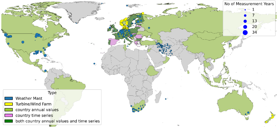
## World Map: Measurement Locations and Types
### Overview
The image is a world map displaying the locations of different types of measurements related to weather and wind energy. The map uses color-coding to indicate the type of measurement and the size of the blue circles to represent the number of measurement years.
### Components/Axes
* **Map:** A world map with countries colored in either light green or light gray.
* **Legend (Type):** Located in the bottom-left corner, it defines the color codes for different measurement types:
* Blue: Weather Mast
* Yellow: Turbine/Wind Farm
* Light Green: Country annual values
* Pink: Country time series
* Dark Green: Both country annual values and time series
* **Legend (No of Measurement Years):** Located in the top-right corner, it defines the size of the blue circles representing the number of measurement years:
* Smallest circle: 1 year
* Small circle: 7 years
* Medium circle: 13 years
* Large circle: 20 years
* Largest circle: 34 years
### Detailed Analysis or ### Content Details
* **North America:**
* Concentration of blue circles (Weather Masts) in the United States and Canada. The size of the circles varies, indicating different measurement durations.
* **Europe:**
* A mix of blue, yellow, pink, and dark green areas.
* Yellow (Turbine/Wind Farm) is concentrated in Scandinavia.
* Pink (Country time series) is present in Spain, Italy, and Greece.
* Dark Green (Both country annual values and time series) is present in the UK, France, and Germany.
* **Asia:**
* Blue circles (Weather Masts) are scattered across Russia, India, and China.
* **Africa:**
* Blue circles (Weather Masts) are present in South Africa.
* **Australia:**
* Blue circles (Weather Masts) are present in the southeast.
* **South America:**
* Few data points.
### Key Observations
* Weather mast measurements (blue) are the most widespread, appearing across all continents.
* Turbine/Wind Farm measurements (yellow) are concentrated in Europe, specifically Scandinavia.
* Country annual values and time series data (green and pink) are primarily found in Europe.
* The size variation of the blue circles indicates a range of measurement durations, with some locations having significantly longer measurement periods.
### Interpretation
The map provides a visual representation of the global distribution of weather and wind energy measurements. The concentration of weather masts across various regions suggests a broad interest in weather monitoring. The focus on turbine/wind farm measurements in Europe, particularly Scandinavia, reflects the region's investment in wind energy. The presence of country-level annual values and time series data in Europe indicates a more comprehensive approach to data collection and analysis in that region. The varying sizes of the circles highlight the differing lengths of measurement campaigns, which could be related to project timelines, funding availability, or the specific research questions being addressed.