## Heatmap Series: Target vs. Output Sequence Comparison
### Overview
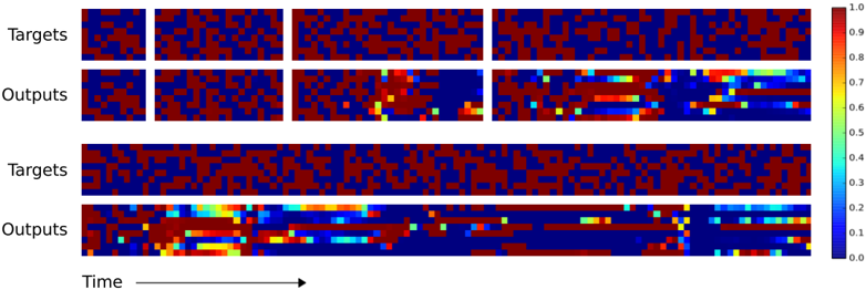
The image displays a series of horizontal heatmaps arranged in four rows, comparing "Targets" (ground truth sequences) with "Outputs" (model predictions) over time. The visualization is split into two main sections, each containing a pair of rows (Targets and Outputs). A vertical color scale bar on the right provides the key for interpreting the heatmap values.
### Components/Axes
* **Row Labels (Left Side):**
* Row 1: "Targets"
* Row 2: "Outputs"
* Row 3: "Targets"
* Row 4: "Outputs"
* **Horizontal Axis (Bottom):** Labeled "Time" with a right-pointing arrow, indicating the sequence progresses from left to right.
* **Color Scale/Legend (Right Side):** A vertical bar with a gradient from dark blue at the bottom to dark red at the top. Numerical markers are placed at intervals:
* 0.0 (bottom, dark blue)
* 0.1
* 0.2
* 0.3
* 0.4
* 0.5 (middle, greenish-yellow)
* 0.6
* 0.7
* 0.8
* 0.9
* 1.0 (top, dark red)
* **Heatmap Grids:** Each row is a long, narrow grid of colored cells. The grid is divided into four distinct segments or blocks by thin vertical white lines, suggesting discrete time windows or samples.
### Detailed Analysis
**1. Targets Rows (Rows 1 & 3):**
* **Visual Trend:** Both "Targets" rows exhibit a highly consistent, binary-like pattern. They are composed almost exclusively of two colors: dark blue (value ~0.0) and dark red (value ~1.0). The pattern appears as a complex, non-repeating sequence of these two states across all four time segments.
* **Data Points:** No intermediate colors (greens, yellows, cyans) are visible. The data suggests a ground truth signal that is categorical or at a very high/low activation state.
**2. Outputs Rows (Rows 2 & 4):**
* **Visual Trend:** The "Outputs" rows show a much more varied and continuous color palette compared to their corresponding Targets. While they often attempt to mirror the red/blue pattern of the Targets, they frequently display intermediate values.
* **Data Points & Patterns:**
* **Early Segments (Left):** The outputs in the first two segments of each Outputs row more closely resemble the Targets, with a higher prevalence of distinct red and blue cells.
* **Later Segments (Right):** As time progresses (moving right), the outputs become increasingly "noisy" or "diffuse." There is a significant increase in cells colored cyan (~0.3-0.4), green (~0.5), and yellow (~0.6-0.7).
* **Specific Anomalies:** In the later segments, there are horizontal streaks of yellow and cyan, indicating sustained periods where the model's output confidence is moderate, rather than committing to a high (red) or low (blue) value. Some red cells in the output align with red in the target, but many are replaced by these intermediate hues.
### Key Observations
1. **Fidelity Degradation:** The model's output fidelity to the target sequence degrades over time. The leftmost segments show the best alignment, while the rightmost segments show the most deviation and uncertainty.
2. **Introduction of Uncertainty:** The "Outputs" introduce a spectrum of values not present in the binary "Targets." This is visualized as the emergence of the full color scale (blue -> cyan -> green -> yellow -> red) in the prediction rows.
3. **Spatial Consistency of Error:** The errors (deviations from red/blue) are not random noise; they form coherent horizontal structures, suggesting the model's uncertainty is systematic and persists over short time windows.
### Interpretation
This visualization likely represents the performance of a sequence prediction model (e.g., a recurrent neural network, transformer, or time-series model) over extended sequences.
* **What the data suggests:** The model is trained to predict a binary or high-contrast sequence (Targets). While it learns the pattern, its confidence diminishes as the sequence length increases. The intermediate colors in the Outputs represent the model's predicted probability or activation level, where values around 0.5 (green) indicate maximum uncertainty.
* **How elements relate:** The direct vertical alignment between a "Targets" row and an "Outputs" row allows for point-by-point comparison. The color scale is the critical key for translating the visual patterns into quantitative assessments of model confidence and error.
* **Notable trends/anomalies:** The most significant trend is the **temporal decay in prediction sharpness**. The model starts strong but becomes increasingly hesitant, "smearing" its predictions across the value spectrum. This could indicate issues with long-term dependency modeling, error accumulation in autoregressive generation, or a mismatch between the training sequence length and the evaluation sequence length shown here. The absence of pure red in later output segments is a key anomaly, showing the model rarely achieves high confidence in its positive predictions as time goes on.