## Heatmaps: Time-Series Data Comparison - Targets vs. Outputs
### Overview
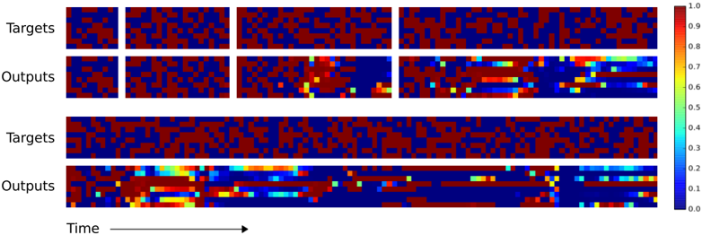
The image presents four heatmaps arranged in two rows and two columns, visualizing time-series data. Each heatmap represents a different set of data: "Targets" and "Outputs" across two distinct time periods or conditions. The heatmaps use a color gradient to represent the magnitude of values, with red indicating higher values and blue indicating lower values. A horizontal axis labeled "Time" is indicated at the bottom of the image.
### Components/Axes
* **Labels:** "Targets" (appears twice), "Outputs" (appears twice). These labels are positioned vertically to the left of each pair of heatmaps.
* **Axis:** A horizontal axis labeled "Time" is indicated with an arrow pointing to the right. The axis is not explicitly scaled with numerical values.
* **Color Scale:** A color bar is positioned vertically on the right side of the image. It ranges from blue (approximately 0.0) to red (approximately 1.0), with intermediate colors representing values between 0.2, 0.4, 0.6, 0.8.
* **Heatmap Grid:** The image is divided into four rectangular heatmaps. Each heatmap appears to represent a snapshot of the "Targets" and "Outputs" at a specific point in time or under a specific condition.
### Detailed Analysis or Content Details
**Top Row:**
* **Targets (Top-Left):** This heatmap is predominantly red, indicating high values across most of the data points. There is some variation in intensity, but overall, the values are clustered around 0.8-1.0. The heatmap is approximately 20x20 cells.
* **Outputs (Top-Right):** This heatmap shows a more complex pattern. It starts with a predominantly blue/dark blue color (values around 0.0-0.2) in the left portion, transitioning to orange/yellow (values around 0.6-0.8) in the right portion. There are several distinct areas of higher intensity (red) scattered throughout. The heatmap is approximately 20x20 cells.
**Bottom Row:**
* **Targets (Bottom-Left):** This heatmap is predominantly red, similar to the top-left heatmap, indicating high values (approximately 0.8-1.0) across most of the data points. There is some variation in intensity. The heatmap is approximately 40x20 cells.
* **Outputs (Bottom-Right):** This heatmap exhibits a more structured pattern. There are several horizontal bands of higher intensity (yellow/orange, values around 0.6-0.8) interspersed with bands of lower intensity (blue/dark blue, values around 0.0-0.2). The bands appear to be aligned with the "Time" axis. The heatmap is approximately 40x20 cells.
**General Observations:**
* The "Targets" heatmaps consistently show high values, suggesting a relatively stable or consistent signal.
* The "Outputs" heatmaps show more variability and complexity, indicating a dynamic response or process.
* The bottom row heatmaps have a higher resolution (more cells) than the top row heatmaps.
### Key Observations
* The "Outputs" in the top row transition from low to high values over time.
* The "Outputs" in the bottom row exhibit a periodic or banded pattern.
* The "Targets" remain consistently high across both time periods/conditions.
* The "Outputs" in the bottom row appear to be more structured and potentially more informative than those in the top row.
### Interpretation
The data suggests a comparison between desired "Targets" and actual "Outputs" of a system or process over time. The consistent high values in the "Targets" heatmaps indicate a stable desired state. The varying patterns in the "Outputs" heatmaps suggest that the system's response is dynamic and potentially influenced by external factors or internal processes.
The transition in the top row "Outputs" could represent a system learning or adapting to reach the target level. The banded pattern in the bottom row "Outputs" might indicate a cyclical process or a response to periodic inputs. The higher resolution of the bottom row heatmaps could allow for a more detailed analysis of the system's behavior.
The difference in the "Outputs" between the top and bottom rows suggests that the system's behavior changes over time or under different conditions. This could be due to changes in the input data, adjustments to the system's parameters, or the emergence of new patterns. The data could be used to evaluate the performance of a control system, identify potential bottlenecks, or optimize the system's parameters.