## Horizontal Bar Chart: Research Paper Filtering Funnel
### Overview
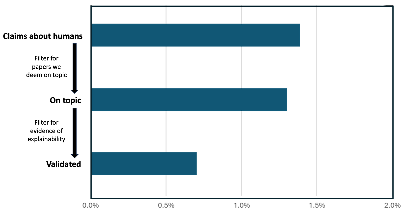
The image displays a horizontal bar chart illustrating a three-stage filtering process for research papers, likely within the field of AI or machine learning explainability. The chart quantifies the percentage of papers retained at each stage, showing a significant reduction from initial claims to validated evidence.
### Components/Axes
* **Chart Type:** Horizontal bar chart.
* **Y-Axis (Categories):** Three categorical stages are listed vertically on the left side of the chart. From top to bottom:
1. **Claims about humans**
2. **On topic**
3. **Validated**
* **X-Axis (Scale):** A percentage scale running horizontally along the bottom. The axis is labeled with markers at:
* `0.0%`
* `0.5%`
* `1.0%`
* `1.5%`
* `2.0%`
* **Data Series:** A single data series represented by dark teal-colored bars. There is no separate legend, as all bars belong to the same series.
* **Annotations:** Text and arrows are positioned to the left of the bars, explaining the filtering criteria between stages.
* Between "Claims about humans" and "On topic": An arrow points downward with the text: **"Filter for papers we deem on topic"**.
* Between "On topic" and "Validated": An arrow points downward with the text: **"Filter for evidence of explainability"**.
### Detailed Analysis
* **Stage 1: Claims about humans**
* **Bar Length:** The bar extends to approximately **1.4%** on the x-axis.
* **Trend:** This is the longest bar, representing the initial pool of papers containing claims about humans.
* **Stage 2: On topic**
* **Bar Length:** The bar extends to approximately **1.3%** on the x-axis.
* **Trend:** This bar is slightly shorter than the first, indicating a small reduction after applying the "on topic" filter.
* **Stage 3: Validated**
* **Bar Length:** The bar extends to approximately **0.7%** on the x-axis.
* **Trend:** This bar is significantly shorter, showing a substantial drop after applying the "evidence of explainability" filter.
### Key Observations
1. **Funnel Effect:** The chart clearly depicts a funnel or filtering process where each subsequent stage retains a smaller percentage of the original set.
2. **Major Reduction Point:** The most significant reduction in percentage occurs between the "On topic" and "Validated" stages (from ~1.3% to ~0.7%), suggesting that finding papers with concrete evidence of explainability is a much stricter filter than simply determining topical relevance.
3. **Low Initial Percentage:** Even the starting point, "Claims about humans," represents only about 1.4% of some larger, unstated corpus (e.g., all surveyed papers). This implies the initial topic itself is niche within the broader field.
4. **Visual Design:** The use of a single color for all bars emphasizes the sequential nature of the process. The annotations are spatially aligned with the gaps between bars, clearly indicating the action taken to move from one stage to the next.
### Interpretation
This chart visualizes the attrition rate of research papers through a validation pipeline focused on human-centric claims and explainability. The data suggests that while a small fraction of papers (~1.4%) make claims about humans, an even smaller subset (~0.7%, or half of the initial claims) can be validated with evidence of explainability.
The process highlights a potential gap in the research landscape: the challenge of moving from making claims to providing validated, explainable evidence for those claims. The steep drop at the final filter indicates that "evidence of explainability" is a high bar that many papers claiming to be on-topic do not meet. This could point to issues with reproducibility, methodological rigor, or the inherent difficulty of establishing explainability in this domain. The chart serves as a quantitative argument for the scarcity of validated, explainable research on human-related claims within the analyzed corpus.