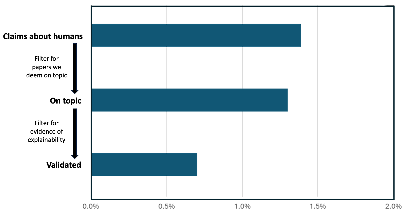
## Horizontal Bar Chart: Claims Validation Process
### Overview
The image is a horizontal bar chart illustrating a filtering process applied to claims about humans. The chart shows the proportion of claims remaining after each filtering step. The filtering steps are: initial claims, claims deemed "on topic," and finally, claims validated for evidence of explainability.
### Components/Axes
* **Y-axis Labels (Top to Bottom):**
* Claims about humans
* On topic
* Validated
* **Filtering Steps (Top to Bottom):**
* Filter for papers we deem on topic
* Filter for evidence of explainability
* **X-axis Title:** (Implied) Proportion of Claims
* **X-axis Scale:** 0.0% to 2.0%, with increments of 0.5%
### Detailed Analysis
The chart presents three horizontal bars, each representing a stage in the filtering process. All bars are the same color: a dark teal.
* **Claims about humans:** The bar extends to approximately 1.4% on the x-axis.
* **On topic:** The bar extends to approximately 1.3% on the x-axis.
* **Validated:** The bar extends to approximately 0.6% on the x-axis.
### Key Observations
* The proportion of claims decreases with each filtering step.
* The largest drop occurs between "On topic" and "Validated," indicating that a significant portion of claims deemed on-topic lack sufficient evidence of explainability.
### Interpretation
The chart demonstrates a funnel effect, where the initial pool of claims about humans is significantly reduced after applying filters for relevance and evidence of explainability. The data suggests that while a substantial number of claims are initially made, only a small fraction are both relevant and supported by explainable evidence. This highlights the importance of rigorous validation processes in research and analysis. The drop between "On topic" and "Validated" suggests that explainability is a significant bottleneck in the validation process.