\n
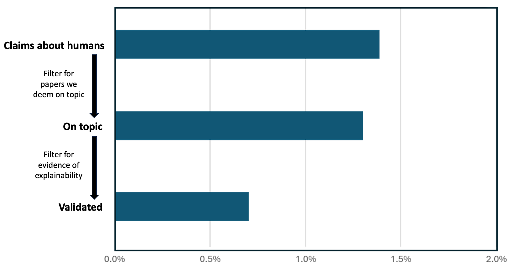
## Horizontal Bar Chart: Claims About Humans - Filtering Process
### Overview
This is a horizontal bar chart illustrating the filtering process applied to claims about humans, showing the reduction in the number of claims as they pass through different filtering stages. The chart displays the proportion of claims remaining after each filter is applied.
### Components/Axes
* **Y-axis (Vertical):** Represents the filtering stages: "Claims about humans", "On topic", and "Validated". The stages are listed from top to bottom, indicating the flow of the filtering process.
* **X-axis (Horizontal):** Represents the proportion of claims, ranging from 0.00% to 2.00%, with gridlines at 0.5%, 1.0%, 1.5%, and 2.0%.
* **Bars:** Each horizontal bar represents the proportion of claims remaining at each filtering stage.
* **Arrows:** Two arrows indicate the filtering process. The first arrow points from "Claims about humans" to "On topic" with the label "Filter for papers we deem on topic". The second arrow points from "On topic" to "Validated" with the label "Filter for evidence of explainability".
### Detailed Analysis
* **Claims about humans:** The bar extends from approximately 0.00% to 1.65%. This represents approximately 1.65% of the initial claims.
* **On topic:** The bar extends from approximately 0.00% to 1.15%. This represents approximately 1.15% of the initial claims.
* **Validated:** The bar extends from approximately 0.00% to 0.50%. This represents approximately 0.50% of the initial claims.
The trend shows a decreasing proportion of claims as they move through the filtering stages. The largest reduction occurs between "On topic" and "Validated".
### Key Observations
* The initial number of "Claims about humans" is significantly higher than the number of "Validated" claims.
* The filtering process substantially reduces the number of claims, indicating a rigorous selection process.
* The reduction from "Claims about humans" to "On topic" is less drastic than the reduction from "On topic" to "Validated".
### Interpretation
The chart demonstrates a funnel-like filtering process. Initially, a large number of claims about humans are considered. The first filter, focusing on relevance ("On topic"), reduces the number of claims, but the second filter, requiring evidence of explainability ("Validated"), causes a more significant reduction. This suggests that while many claims may be relevant, fewer have sufficient supporting evidence to be considered validated. The chart highlights the importance of both relevance and explainability in the validation process. The substantial drop-off at the "Validated" stage indicates a high standard for evidence and a potentially challenging process for claims to meet that standard.