# Technical Document Analysis of Chart
## Chart Type
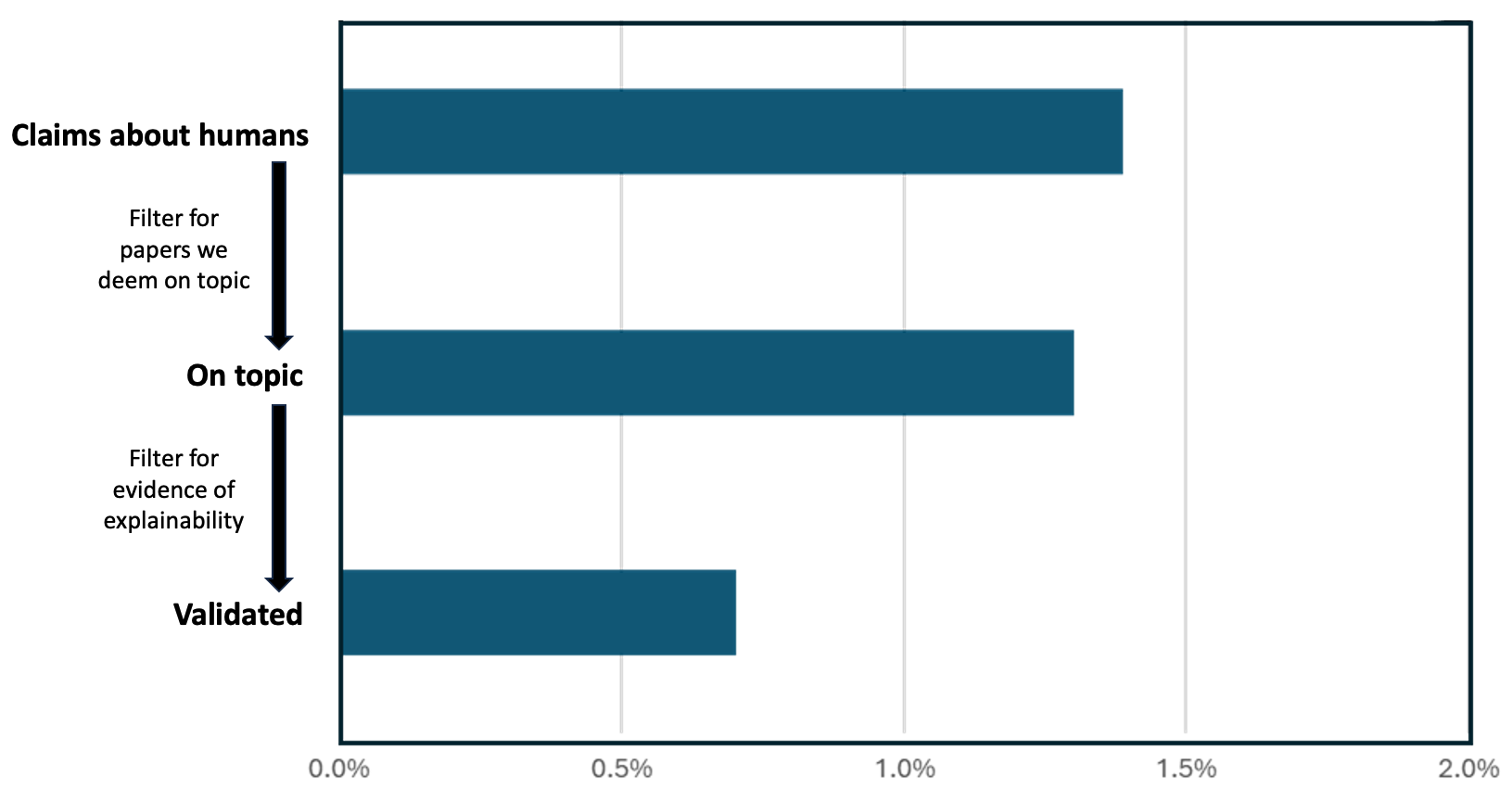
Horizontal bar chart with three data series and explanatory arrows.
## Labels and Axis Titles
- **X-axis**: Labeled with percentage values from **0.0%** to **2.0%** in increments of 0.5%.
- **Y-axis**: Categories listed as:
1. **Claims about humans**
2. **On topic**
3. **Validated**
## Data Points and Trends
1. **Claims about humans**
- **Value**: 1.4%
- **Position**: Topmost bar, spanning from 0.0% to 1.4% on the x-axis.
- **Trend**: Highest value in the dataset.
2. **On topic**
- **Value**: 1.3%
- **Position**: Middle bar, spanning from 0.0% to 1.3% on the x-axis.
- **Trend**: Slight decrease from the previous category (1.4% → 1.3%).
3. **Validated**
- **Value**: 0.7%
- **Position**: Bottom bar, spanning from 0.0% to 0.7% on the x-axis.
- **Trend**: Significant drop from the previous category (1.3% → 0.7%).
## Explanatory Arrows and Text
- **Arrow 1**:
- **From**: "Claims about humans" (1.4%)
- **To**: "On topic" (1.3%)
- **Text**: *"Filter for papers we deem on topic"*
- **Arrow 2**:
- **From**: "On topic" (1.3%)
- **To**: "Validated" (0.7%)
- **Text**: *"Filter for evidence of explainability"*
## Color and Legend
- **Bar Color**: All bars are **dark blue**.
- **Legend**: No explicit legend is present in the chart.
## Spatial Grounding
- **X-axis**: Positioned at the bottom of the chart, with percentage labels.
- **Y-axis**: Categories are vertically aligned on the left side.
- **Arrows**: Connect the end of each bar to the next category, positioned to the right of the bars.
## Component Isolation
1. **Header**: No explicit header title is visible.
2. **Main Chart**:
- Three horizontal bars with percentage values.
- Two explanatory arrows with descriptive text.
3. **Footer**: No footer elements are present.
## Transcribed Text
- **Y-axis Labels**:
- "Claims about humans"
- "On topic"
- "Validated"
- **Arrow Text**:
- "Filter for papers we deem on topic"
- "Filter for evidence of explainability"
- **X-axis Labels**:
- 0.0%, 0.5%, 1.0%, 1.5%, 2.0%
## Additional Notes
- The chart illustrates a **filtering process** where the initial set of claims ("Claims about humans") is reduced through two sequential filters:
1. **Topic relevance** (1.4% → 1.3%).
2. **Explainability evidence** (1.3% → 0.7%).
- No other languages or non-English text are present in the image.
## Conclusion
The chart visually represents a stepwise reduction in the number of papers through two filtering criteria, with the final validated set being 50% smaller than the initial claims. All data points and explanatory text are explicitly labeled.