\n
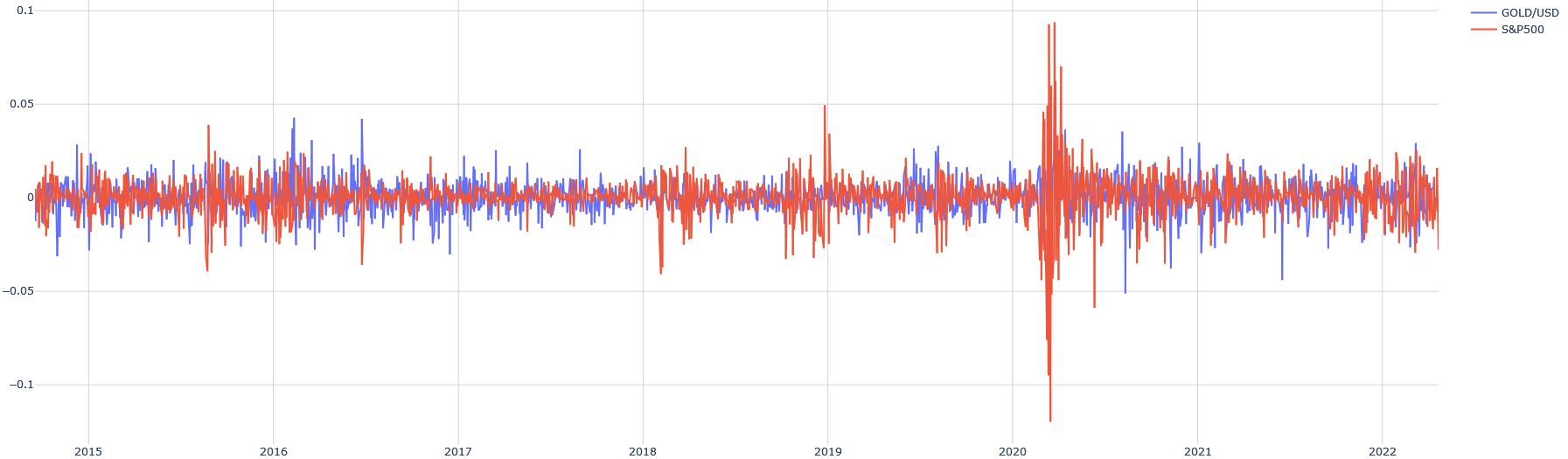
## Line Chart: GOLD/USD vs. S&P500 Daily Returns (Approx. 2015-2022)
### Overview
This image is a time-series line chart comparing the daily percentage returns (or a similar volatility metric) of two financial instruments: GOLD/USD (gold priced in US dollars) and the S&P500 stock market index. The chart spans a period from early 2015 to early 2022. The data is presented as two overlapping, highly volatile line series oscillating around a zero baseline.
### Components/Axes
* **Chart Type:** Dual-line time-series chart.
* **X-Axis (Horizontal):** Represents time. Major tick marks and labels denote the start of each year: `2015`, `2016`, `2017`, `2018`, `2019`, `2020`, `2021`, `2022`. The axis spans approximately 7 years.
* **Y-Axis (Vertical):** Represents a numerical value, likely daily returns or a volatility measure. The scale is linear.
* **Axis Labels (from top to bottom):** `0.1`, `0.05`, `0`, `-0.05`, `-0.1`.
* **Interpretation:** Values are decimals, where `0.05` likely corresponds to a 5% daily move, and `-0.1` to a -10% daily move.
* **Legend:** Located in the **top-right corner** of the chart area.
* **Blue Line:** Labeled `GOLD/USD`.
* **Red/Orange Line:** Labeled `S&P500`.
* **Grid:** A light gray grid is present, with horizontal lines at each major Y-axis tick and vertical lines at each year marker.
### Detailed Analysis
**1. GOLD/USD (Blue Line):**
* **Trend Description:** The blue line exhibits continuous, high-frequency volatility throughout the entire period. It oscillates sharply above and below the zero line. The amplitude of these oscillations appears relatively consistent from 2015 through 2019, with most daily moves contained within the `-0.05` to `+0.05` range.
* **Key Data Points & Periods:**
* **2015-2019:** Volatility is persistent but range-bound. Notable spikes above `+0.05` occur occasionally (e.g., around mid-2016, early 2017).
* **Early 2020:** A period of extreme volatility coincides with the major S&P500 spike. The blue line shows several large downward spikes, approaching or briefly exceeding `-0.05`.
* **2021-2022:** Volatility remains elevated compared to the pre-2020 period but appears slightly less extreme than the 2020 peak.
**2. S&P500 (Red/Orange Line):**
* **Trend Description:** The red line also shows constant volatility but with a distinctly different pattern. From 2015 to late 2019, its volatility is generally lower in amplitude than GOLD/USD, with most moves within a tighter band around zero.
* **Key Data Points & Periods:**
* **2015-2019:** Relatively subdued volatility. A notable downward spike occurs in late 2018 (approaching `-0.05`).
* **Early 2020 (CRITICAL ANOMALY):** This is the most prominent feature of the entire chart. The S&P500 series experiences a massive, unprecedented spike in volatility.
* **Upward Spike:** A sharp peak reaches near the `0.1` (10%) level.
* **Downward Spike:** Immediately following, an even sharper trough plunges below the `-0.1` (-10%) level, representing the single largest move on the chart.
* **Post-2020:** Following the extreme event, volatility remains significantly higher than in the 2015-2019 period, with frequent moves exceeding the `±0.025` range, but it does not revisit the 2020 extremes.
**3. Comparative Relationship:**
* The two series do not move in lockstep. There are periods where they appear negatively correlated (e.g., during the 2020 crash, large down moves in S&P500 sometimes coincide with up moves in GOLD/USD, and vice-versa).
* GOLD/USD generally exhibits higher baseline volatility than the S&P500 outside of crisis periods.
### Key Observations
1. **The 2020 Volatility Event:** The S&P500's price action in early 2020 is a clear outlier, dwarfing all other market movements on the chart. This visually corresponds to the COVID-19 market crash and subsequent rebound.
2. **Volatility Regime Shift:** Both assets show a clear increase in average daily volatility after the 2020 event compared to the 2015-2019 period.
3. **Asymmetric Spikes:** Downward spikes (negative returns) for the S&P500, especially in 2020, appear sharper and deeper than its upward spikes. GOLD/USD spikes appear more symmetric.
4. **Legend Accuracy:** The blue line (`GOLD/USD`) is consistently more "jagged" and wider in its oscillations during calm periods. The red line (`S&P500`) is the one responsible for the extreme 2020 spikes, confirming the legend mapping.
### Interpretation
This chart visually demonstrates the concept of **market volatility** and **asset class behavior during crises**.
* **What the data suggests:** It shows that while both gold (a traditional safe-haven asset) and the broad stock market (S&P500) are volatile on a daily basis, their volatility profiles differ. The S&P500 can experience periods of relative calm followed by explosive, panic-driven moves (as in 2020). Gold tends to have more consistent, "noisy" volatility.
* **Relationship between elements:** The 2020 anomaly highlights a moment of extreme market stress where traditional correlations may break down. The simultaneous large moves in both assets suggest a systemic shock affecting all markets, but with gold potentially acting as a hedge, as seen by some inverse movements during the crash.
* **Notable Insight:** The chart is a powerful testament to the "fat tail" risk in financial markets—the 2020 event is a visual representation of a multi-standard deviation move that models based on normal distributions might severely underestimate. The persistence of higher volatility post-2020 suggests a lasting change in market regime or investor sentiment.