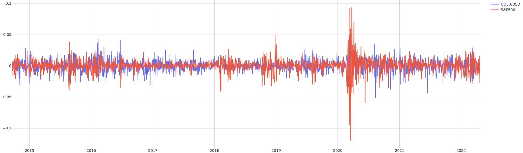
## Line Chart: Correlation of GOLD/USD and S&P500
### Overview
The image presents a line chart comparing the fluctuations of GOLD/USD and S&P500 over time, from approximately 2015 to 2022. The chart displays the data as a time series, with the y-axis representing a value ranging from approximately -0.1 to 0.1, and the x-axis representing the years from 2015 to 2022.
### Components/Axes
* **X-axis:** Represents time, labeled with years from 2015 to 2022. The scale is linear and evenly spaced.
* **Y-axis:** Represents a numerical value, ranging from approximately -0.1 to 0.1. The axis is not explicitly labeled, but appears to represent a rate of change or normalized value. The scale is linear.
* **Legend:** Located in the top-right corner, identifies the two data series:
* **GOLD/USD:** Represented by a blue line.
* **S&P500:** Represented by a red line.
* **Gridlines:** Horizontal and vertical gridlines are present to aid in reading values.
### Detailed Analysis
The chart shows two fluctuating lines over the specified time period.
* **GOLD/USD (Blue Line):** The line exhibits high-frequency fluctuations throughout the period. The trend is generally around the zero line, with periods of positive and negative values. There is a significant spike upwards around 2020, reaching a peak value of approximately 0.08. After 2020, the line returns to its previous fluctuating pattern.
* **S&P500 (Red Line):** Similar to GOLD/USD, the S&P500 line also shows high-frequency fluctuations. It generally oscillates around the zero line. However, there is a dramatic negative spike in early 2020, dropping to approximately -0.1. This is a much larger drop than any observed in the GOLD/USD line. After the drop, the S&P500 line recovers and continues to fluctuate around the zero line.
Approximate Data Points (extracted visually):
| Year | GOLD/USD (approx.) | S&P500 (approx.) |
|---|---|---|
| 2015 | 0.01 | 0.005 |
| 2016 | -0.02 | 0.01 |
| 2017 | 0.005 | 0.02 |
| 2018 | -0.01 | 0.005 |
| 2019 | 0.01 | 0.015 |
| 2020 (Jan-Feb) | 0.02 | 0.02 |
| 2020 (March) | 0.08 | -0.1 |
| 2021 | 0.01 | 0.01 |
| 2022 | -0.01 | 0.005 |
### Key Observations
* **Inverse Correlation in 2020:** The most striking observation is the inverse correlation between the two assets in early 2020. While the S&P500 experienced a significant drop, GOLD/USD spiked upwards. This suggests a flight to safety during that period, with investors moving funds from stocks to gold.
* **Similar Fluctuations:** Outside of the 2020 event, both assets exhibit similar fluctuating patterns, suggesting a degree of correlation or shared underlying factors influencing their movements.
* **Magnitude of Change:** The S&P500 experienced a much larger single-point drop in 2020 than any fluctuation observed in GOLD/USD.
### Interpretation
The chart demonstrates the relationship between GOLD/USD and the S&P500 over a period of economic uncertainty. The inverse correlation observed in early 2020 is a classic example of a "safe haven" asset (gold) performing well during a stock market downturn (S&P500). This suggests that investors perceived increased risk in the stock market and sought the relative safety of gold. The subsequent recovery of the S&P500 and the return of GOLD/USD to its previous fluctuations indicate a stabilization of market conditions. The chart highlights the potential for gold to act as a hedge against market volatility, but also shows that its performance is not always directly opposite to that of stocks. The data suggests that while there is some correlation, the two assets are influenced by a complex interplay of factors.