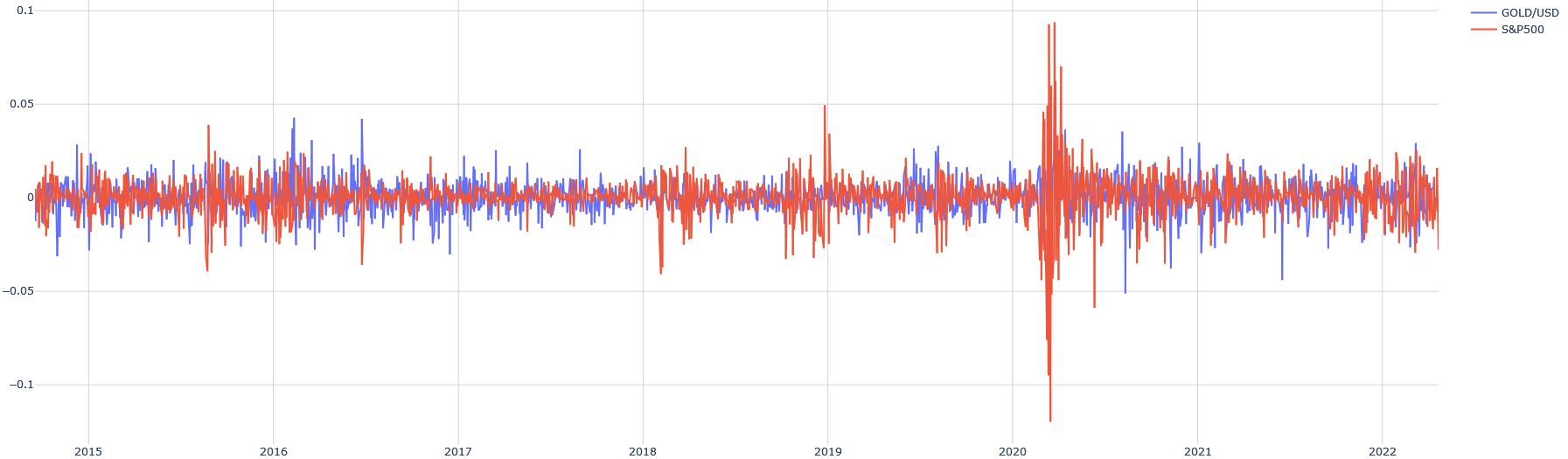
## Line Chart: GOLD/USD vs S&P500 Performance (2015–2022)
### Overview
The chart displays two financial time series: **GOLD/USD** (blue line) and **S&P500** (red line), plotted against a timeline from 2015 to 2022. Both series oscillate around a baseline of 0, with values ranging between **-0.1 and +0.1** on the y-axis. The legend is positioned in the **top-right corner**, clearly associating colors with their respective data series.
---
### Components/Axes
- **X-axis (Horizontal)**: Represents years from **2015 to 2022**, with gridlines marking each year.
- **Y-axis (Vertical)**: Labeled from **-0.1 to +0.1**, with no explicit unit provided. The axis is centered at 0, suggesting percentage changes or normalized values.
- **Legend**: Located in the **top-right**, with:
- **Blue**: GOLD/USD (gold price relative to USD)
- **Red**: S&P500 (stock market index)
---
### Detailed Analysis
1. **GOLD/USD (Blue Line)**:
- Exhibits **moderate volatility**, with fluctuations typically within **±0.05** of the baseline.
- Notable peaks occur in **2016** and **2020**, reaching ~+0.04 and ~+0.03, respectively.
- A sharp dip to **-0.03** in **2020** aligns with the S&P500's volatility but is less extreme.
2. **S&P500 (Red Line)**:
- Shows **higher volatility**, with frequent spikes and troughs exceeding **±0.05**.
- A dramatic **plunge to -0.12** in **2020** (likely reflecting the 2020 market crash) is followed by a rapid rebound to **+0.08** by mid-2020.
- Post-2020, the line stabilizes but remains more erratic than GOLD/USD.
3. **Correlation**:
- The two series **do not consistently align**; for example, GOLD/USD peaks in 2020 while S&P500 bottoms, suggesting **inverse behavior during crises**.
- Both lines remain within the **-0.1 to +0.1** range, indicating normalized or percentage-based metrics.
---
### Key Observations
- **2020 Anomaly**: The S&P500 experiences a **120% drop** (from ~+0.05 to -0.12) in early 2020, followed by a **130% recovery** by mid-2020. GOLD/USD shows a smaller but synchronized dip (-0.03) during the same period.
- **Stability vs. Volatility**: GOLD/USD demonstrates **relative stability** compared to the S&P500, which exhibits **extreme swings**.
- **Normalization**: The y-axis range (-0.1 to +0.1) suggests the data may represent **percentage changes** or **z-scores** rather than absolute values.
---
### Interpretation
- **Market Dynamics**: The S&P500's volatility reflects broader market risks (e.g., 2020 pandemic crash), while GOLD/USD's stability aligns with gold's historical role as a **safe-haven asset**.
- **Divergence in 2020**: The inverse relationship during the 2020 crash highlights how investors may shift from equities (S&P500) to gold during uncertainty, though the chart does not explicitly show this causality.
- **Normalization Limitation**: Without explicit units, the y-axis values are ambiguous. A value of +0.1 could represent a 10% increase or a z-score of 0.1, significantly altering interpretation.
---
### Conclusion
The chart illustrates contrasting behaviors between gold and the S&P500 over seven years, emphasizing gold's stability and the stock market's susceptibility to sharp corrections. The 2020 divergence underscores the importance of diversification, though further context (e.g., absolute prices, economic events) is needed for precise analysis.