## Line Graphs: Effective Bandwidth and TPOT Relative to DAK
### Overview
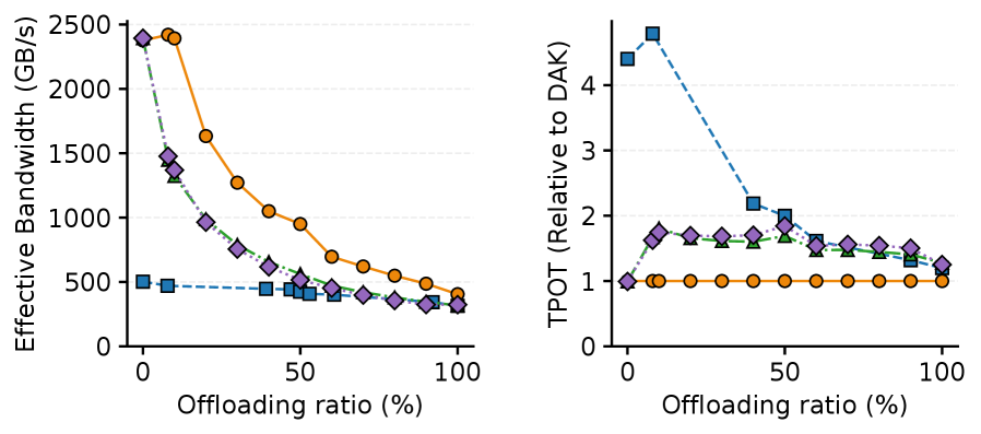
The image contains two side-by-side line graphs. The left graph plots **Effective Bandwidth (GB/s)** against **Offloading ratio (%)**, while the right graph plots **TPOT (Relative to DAK)** against the same x-axis. Both graphs include three data series represented by distinct markers and colors: orange circles, blue squares, and purple diamonds. The legend is positioned on the right side of each graph, but the labels for the series are not explicitly stated in the image.
---
### Components/Axes
- **Left Graph (Effective Bandwidth):**
- **X-axis**: Offloading ratio (%) ranging from 0 to 100.
- **Y-axis**: Effective Bandwidth (GB/s) ranging from 0 to 2500.
- **Data Series**:
- Orange circles (solid line).
- Blue squares (solid line).
- Purple diamonds (solid line).
- **Legend**: Located on the right side of the graph, with colors matching the data series.
- **Right Graph (TPOT Relative to DAK):**
- **X-axis**: Offloading ratio (%) ranging from 0 to 100.
- **Y-axis**: TPOT (Relative to DAK) ranging from 0 to 4.
- **Data Series**:
- Orange circles (dashed line).
- Blue squares (dashed line).
- Purple diamonds (dashed line).
- **Legend**: Located on the right side of the graph, with colors matching the data series.
---
### Detailed Analysis
#### Left Graph (Effective Bandwidth)
1. **Orange Circles (Solid Line)**:
- Starts at ~2400 GB/s at 0% offloading.
- Drops sharply to ~500 GB/s at 50% offloading.
- Levels off to ~400 GB/s at 100% offloading.
2. **Blue Squares (Solid Line)**:
- Remains relatively flat at ~500 GB/s across all offloading ratios.
3. **Purple Diamonds (Solid Line)**:
- Starts at ~1400 GB/s at 0% offloading.
- Drops to ~300 GB/s at 50% offloading.
- Levels off to ~250 GB/s at 100% offloading.
#### Right Graph (TPOT Relative to DAK)
1. **Orange Circles (Dashed Line)**:
- Remains flat at ~1 across all offloading ratios.
2. **Blue Squares (Dashed Line)**:
- Starts at ~4 at 0% offloading.
- Drops to ~2 at 50% offloading.
- Levels off to ~1.5 at 100% offloading.
3. **Purple Diamonds (Dashed Line)**:
- Starts at ~1.5 at 0% offloading.
- Peaks at ~2.5 at 50% offloading.
- Drops to ~1.2 at 100% offloading.
---
### Key Observations
1. **Left Graph Trends**:
- The orange line (Series A) exhibits the steepest decline in effective bandwidth with increasing offloading.
- The blue line (Series B) shows minimal change, suggesting stability.
- The purple line (Series C) has a moderate decline, followed by stabilization.
2. **Right Graph Trends**:
- The blue line (Series B) shows the most significant drop in TPOT relative to DAK.
- The orange line (Series A) remains constant, indicating no change in TPOT.
- The purple line (Series C) exhibits a non-linear trend, peaking at 50% offloading before declining.
---
### Interpretation
- **Effective Bandwidth**: The left graph suggests that higher offloading ratios reduce bandwidth efficiency, with Series A (orange) being the most affected. Series B (blue) remains unaffected, possibly due to inherent stability or design constraints.
- **TPOT Relative to DAK**: The right graph indicates that Series B (blue) experiences the greatest reduction in TPOT, while Series C (purple) shows a paradoxical increase at 50% offloading. This could imply that offloading strategies vary in effectiveness across series, with Series C potentially optimizing performance at intermediate offloading ratios.
- **Anomalies**: The purple line in the right graph (Series C) deviates from the general trend, suggesting a unique relationship between offloading and TPOT for this series.
---
### Notes on Data Extraction
- All values are approximate, with uncertainty due to the absence of explicit numerical labels on the graph.
- The legend colors (orange, blue, purple) are cross-referenced with the data series to ensure accuracy.
- The spatial positioning of the legend (right side of each graph) and the use of solid/dashed lines for differentiation are consistent across both graphs.