## Histogram: Distribution Plot
### Overview
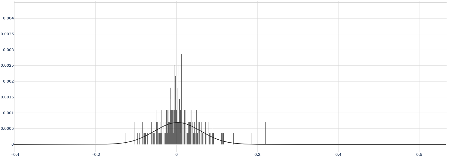
The image is a histogram displaying the distribution of a dataset. The histogram consists of vertical bars representing the frequency of data points within specific ranges, overlaid with a black curve that approximates the distribution. The data appears to be centered around zero, with a concentration of values near the center and tapering off towards the extremes.
### Components/Axes
* **X-axis:** Ranges from -0.4 to 0.6, with tick marks at -0.4, -0.2, 0, 0.2, 0.4, and 0.6. The x-axis represents the values of the data being distributed.
* **Y-axis:** Ranges from 0 to 0.004, with tick marks at 0, 0.0005, 0.001, 0.0015, 0.002, 0.0025, 0.003, 0.0035, and 0.004. The y-axis represents the frequency or density of the data.
* **Bars:** Gray vertical bars represent the frequency of data points within specific ranges along the x-axis. The height of each bar corresponds to the frequency of data within that range.
* **Curve:** A black curve is overlaid on the histogram, approximating the distribution of the data. It appears to be a normal distribution curve, centered around zero.
### Detailed Analysis
* The highest frequency of data points occurs around x = 0. The bars are densest and tallest in this region.
* The frequency of data points decreases as you move away from x = 0 in either direction. The bars become shorter and sparser.
* The black curve closely follows the shape of the histogram, indicating a good fit for the distribution.
* The distribution appears to be roughly symmetrical around x = 0.
* The maximum value of the distribution is approximately 0.003.
### Key Observations
* The data is heavily concentrated around zero.
* The distribution is approximately normal.
* There are few data points beyond x = -0.2 and x = 0.2.
### Interpretation
The histogram suggests that the underlying data is centered around zero and follows a roughly normal distribution. This could represent a variety of phenomena, such as measurement errors, random fluctuations, or the distribution of a variable around its mean. The concentration of data around zero indicates that values close to zero are more common than values further away. The shape of the distribution can provide insights into the nature of the data and the processes that generate it.