\n
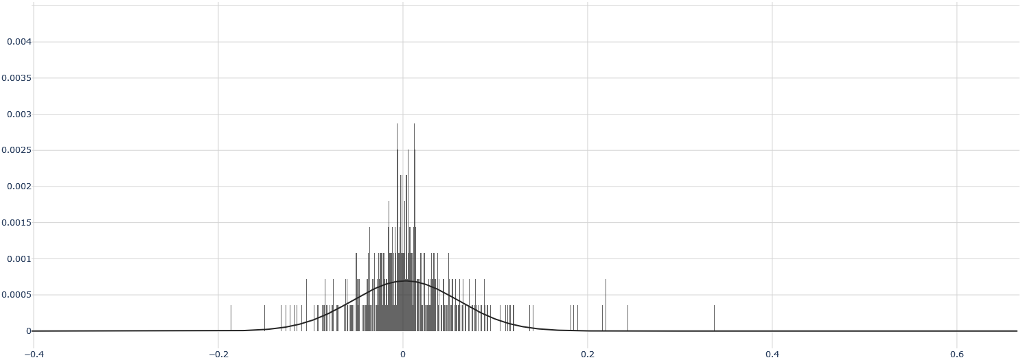
## Histogram: Distribution of Values
### Overview
The image presents a histogram displaying the distribution of a single variable. The x-axis represents the range of values, and the y-axis represents the frequency or density of those values. A smooth curve is overlaid on the histogram, likely representing a density estimate of the underlying distribution.
### Components/Axes
* **X-axis:** Ranges from approximately -0.4 to 0.6. The axis is labeled with numerical values, incrementing by 0.1.
* **Y-axis:** Ranges from 0 to approximately 0.004. The axis represents the frequency or density.
* **Histogram Bars:** Vertical bars representing the frequency of values within specific bins.
* **Density Curve:** A smooth, black curve overlaid on the histogram, approximating the probability density function of the data.
### Detailed Analysis
The histogram shows a highly skewed distribution. The majority of the data points are clustered around 0. The distribution exhibits a sharp peak near 0, with a rapid decline in frequency as values move away from 0 in either direction.
* **Peak:** The highest frequency occurs at approximately x = 0, with a y-value of around 0.0028.
* **Left Tail:** The distribution extends to the left (negative values) with a relatively slow decay. The frequency decreases gradually from x = 0 to x = -0.4.
* **Right Tail:** The distribution extends to the right (positive values) with a much faster decay. The frequency drops off rapidly from x = 0 to x = 0.2, and then continues to decrease more slowly to x = 0.6.
* **Density Curve:** The curve closely follows the shape of the histogram, indicating a good fit. The curve is highest at x = 0, mirroring the peak in the histogram.
### Key Observations
* The distribution is strongly concentrated around 0.
* The distribution is not symmetrical; it is skewed to the right (positive values).
* There are very few data points with values greater than 0.3.
* The density curve suggests a unimodal distribution.
### Interpretation
The data suggests a variable where values are predominantly close to zero, with a decreasing probability of observing larger positive or negative values. This could represent a variety of phenomena, such as:
* **Residuals from a regression model:** If this is a histogram of residuals, it suggests the model fits the data reasonably well, but there might be some slight skewness.
* **Changes or differences:** The variable could represent changes in a quantity over time, where most changes are small and infrequent.
* **Errors:** The variable could represent measurement errors, where most errors are small and close to zero.
The sharp peak at zero and the rapid decay in frequency indicate that extreme values are rare. The skewness suggests that positive values are more common than negative values, although both are relatively infrequent compared to values near zero. The density curve provides a smoothed representation of the distribution, allowing for a better understanding of the underlying probability density.