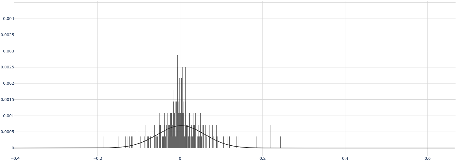
## Histogram with Overlaid Probability Density Curve: Distribution of Values Centered Near Zero
### Overview
The image displays a statistical chart combining a histogram and a smooth probability density function (PDF) curve. The chart illustrates the distribution of a dataset where the majority of values are concentrated around zero, with a symmetric, bell-shaped pattern indicative of a normal (Gaussian) distribution. The histogram bars represent the frequency of observed data points within specific bins, while the overlaid curve represents a theoretical continuous distribution model.
### Components/Axes
* **Chart Type:** Histogram with overlaid probability density curve.
* **X-Axis (Horizontal):**
* **Scale:** Linear.
* **Range:** Approximately -0.4 to 0.6.
* **Major Tick Marks & Labels:** -0.4, -0.2, 0, 0.2, 0.4, 0.6.
* **Axis Title:** Not explicitly labeled. Represents the value of the measured variable.
* **Y-Axis (Vertical):**
* **Scale:** Linear.
* **Range:** 0 to 0.004.
* **Major Tick Marks & Labels:** 0, 0.0005, 0.001, 0.0015, 0.002, 0.0025, 0.003, 0.0035, 0.004.
* **Axis Title:** Not explicitly labeled. Represents probability density or relative frequency.
* **Legend:** No legend is present in the image.
* **Grid:** A light gray grid is present, with vertical lines at each major x-axis tick and horizontal lines at each major y-axis tick.
### Detailed Analysis
* **Histogram Bars:**
* **Distribution Shape:** The bars form a unimodal, roughly symmetric distribution centered at x=0.
* **Peak Density:** The highest concentration of bars (and thus the mode of the binned data) occurs in the immediate vicinity of x=0.
* **Spread:** The vast majority of the data falls between approximately -0.2 and +0.2. The bars become sparse and short beyond ±0.2, with a few isolated, very short bars extending to about -0.3 on the left and +0.35 on the right.
* **Bar Height (Approximate):** The tallest bars near x=0 reach a y-value of approximately 0.0028 to 0.003. The height decreases rapidly as the distance from zero increases.
* **Probability Density Curve:**
* **Shape:** A smooth, continuous, bell-shaped curve.
* **Peak (Mean/Mode/Median):** The apex of the curve is located at x=0, with a corresponding y-value (density) of approximately 0.0007.
* **Inflection Points:** The curve changes from concave down to concave up at points roughly symmetric around the mean, visually estimated near x = ±0.1.
* **Tails:** The curve approaches but does not touch the x-axis (y=0) asymptotically as x moves away from zero in both directions. It visually flattens out near y=0 around x = ±0.25.
* **Relationship Between Elements:** The smooth curve appears to be a fitted normal distribution model for the empirical data shown by the histogram. The curve's peak aligns with the histogram's central cluster, and its width encompasses the main body of the histogram data.
### Key Observations
1. **Central Tendency:** The data is strongly centered around zero. Both the histogram and the fitted curve have their maximum at x=0.
2. **Symmetry:** The distribution is highly symmetric about the mean (x=0). The pattern of bars to the left of zero mirrors the pattern to the right.
3. **Kurtosis (Tail Weight):** The histogram shows "fat tails" relative to the smooth curve. While the curve predicts very low probability density beyond ±0.2, the histogram shows actual data points (short bars) existing in this region, particularly between 0.2 and 0.35 on the right side. This suggests the real data may have slightly heavier tails than a perfect normal distribution.
4. **Data Sparsity:** The data becomes very sparse beyond ±0.15, indicated by the gaps between histogram bars and their minimal height.
### Interpretation
This chart demonstrates a dataset whose values are normally distributed around a mean of zero. This is a common pattern for:
* **Residuals in regression analysis:** The errors (differences between predicted and observed values) often follow such a distribution.
* **Measurement errors:** Random errors in scientific instruments tend to be normally distributed around the true value.
* **Standardized scores:** Data that has been transformed to have a mean of 0 and a standard deviation of 1 (z-scores).
The close fit of the smooth curve to the histogram suggests the normal distribution is a good model for this data. However, the presence of histogram bars in the regions where the curve's density is near zero (the "tails") indicates potential outliers or a slight deviation from perfect normality, which could be important for sensitive statistical analyses. The chart effectively communicates that while most observations are very close to zero, there is a measurable, albeit small, probability of observing values further away, especially in the positive direction up to ~0.35.