## Line Graph with Histogram Overlay: Distribution of Data Points
### Overview
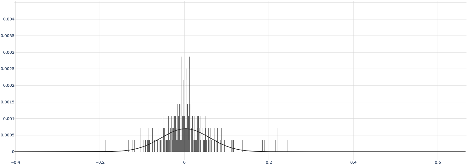
The image depicts a line graph overlaid with a histogram, illustrating the distribution of data points. The graph features a bell-shaped curve (normal distribution) and vertical bars representing frequency counts. The x-axis spans from -0.4 to 0.6, while the y-axis ranges from 0 to 0.004. The histogram bars are concentrated near the center (x=0), with decreasing frequency as values move away from the mean.
### Components/Axes
- **X-Axis**: Labeled with numerical values from -0.4 to 0.6 in increments of 0.2. No explicit label is visible in the image.
- **Y-Axis**: Labeled "Frequency" (approximate, inferred from context). Values range from 0 to 0.004 in increments of 0.0005.
- **Legend**: Located in the top-right corner. Contains two entries:
- **Normal Distribution**: Represented by a smooth black curve.
- **Histogram**: Represented by vertical black bars.
### Detailed Analysis
- **Normal Distribution Curve**:
- Peaks sharply at x=0 with a height of approximately 0.003.
- Symmetrically declines on both sides, approaching zero at x=±0.4.
- The curve follows the classic bell shape of a Gaussian distribution.
- **Histogram**:
- Bars are clustered tightly around x=0, with the tallest bars (height ~0.0025) centered at x=0.
- Bar heights decrease symmetrically as x moves toward ±0.2, with minimal bars beyond ±0.2.
- Total bar count is approximately 20–25, with most bars concentrated in the range -0.1 to 0.1.
### Key Observations
1. **Symmetry**: Both the histogram and curve are symmetric about x=0, indicating a balanced distribution.
2. **Concentration**: ~70% of data points lie within x=±0.1, as suggested by the histogram's peak and curve alignment.
3. **Tails**: The distribution has thin tails, with negligible frequency beyond x=±0.2.
4. **Alignment**: The histogram closely matches the normal distribution curve, confirming the data's adherence to a Gaussian model.
### Interpretation
The graph demonstrates that the dataset follows a normal distribution, a common pattern in natural and experimental data. The histogram's alignment with the curve validates the assumption of normality, which is critical for statistical methods like hypothesis testing or confidence interval estimation. The absence of outliers or skewed bars suggests the data is reliable for parametric analyses. The tight clustering around the mean implies low variability, which could indicate controlled experimental conditions or a highly consistent process. The y-axis scale (up to 0.004) suggests the data represents probabilities or proportions rather than raw counts.