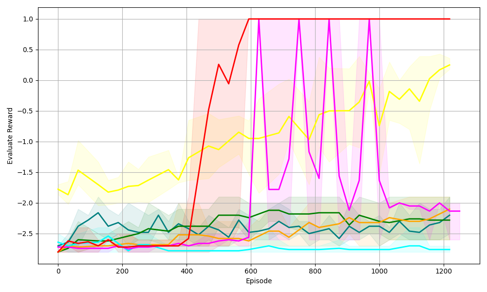
## Line Chart: Evaluate Reward vs. Episode (Multiple Data Series)
### Overview
The image is a line chart displaying the **Evaluate Reward** (y-axis) over **Episode** (x-axis) for multiple experimental conditions (data series). Each series is represented by a colored line with a shaded confidence interval (likely standard deviation or error band) to show variability. The chart spans episodes from 0 to ~1250 and rewards from -2.5 to 1.0.
### Components/Axes
- **X-axis (Horizontal)**:
Label: *Episode*
Ticks: 0, 200, 400, 600, 800, 1000, 1200 (spanning 0 to ~1250 episodes).
- **Y-axis (Vertical)**:
Label: *Evaluate Reward*
Ticks: -2.5, -2.0, -1.5, -1.0, -0.5, 0.0, 0.5, 1.0 (spanning -2.5 to 1.0).
- **Data Series (Lines + Shaded Regions)**:
Multiple colored lines (red, yellow, magenta, green, teal, orange, cyan) with corresponding light-colored shaded regions (confidence intervals). Each line represents a distinct experimental condition/algorithm.
### Detailed Analysis (By Series, Approximate Values)
#### 1. Red Line
- **Trend**: Starts at ~-2.5 (episode 0), rises sharply around episode 400, peaks at 1.0 (episode 600), then stabilizes at 1.0 until episode 1200.
- **Shaded Region**: Light red, wide initially (high variability) but narrows as the line stabilizes.
- **Key Points**:
- Episode 0: ~-2.5
- Episode 400: ~-2.5
- Episode 500: ~0.25
- Episode 600: 1.0
- Episodes 600–1200: 1.0
#### 2. Yellow Line
- **Trend**: Starts at ~-1.75 (episode 0), fluctuates but generally increases over time, reaching ~0.25 (episode 1200).
- **Shaded Region**: Light yellow, wide (high variability).
- **Key Points**:
- Episode 0: ~-1.75
- Episode 200: ~-1.75
- Episode 400: ~-1.25
- Episode 600: ~-1.0
- Episode 800: ~-0.75
- Episode 1000: ~-0.5
- Episode 1200: ~0.25
#### 3. Magenta Line
- **Trend**: Highly volatile, with sharp peaks (1.0) at episodes 600, 800, 1000 and deep troughs (~-2.0).
- **Shaded Region**: Light magenta, wide (high variability).
- **Key Points**:
- Episode 0: ~-2.5
- Episode 600: 1.0
- Episode 700: ~-1.75
- Episode 800: 1.0
- Episode 900: ~-2.0
- Episode 1000: 1.0
- Episode 1100: ~-2.0
- Episode 1200: ~-2.0
#### 4. Green Line
- **Trend**: Relatively stable, fluctuating around -2.0 to -2.5, with a slight upward trend toward the end.
- **Shaded Region**: Light green, narrow (low variability).
- **Key Points**:
- Episode 0: ~-2.5
- Episode 200: ~-2.25
- Episode 400: ~-2.25
- Episode 600: ~-2.25
- Episode 800: ~-2.25
- Episode 1000: ~-2.25
- Episode 1200: ~-2.25
#### 5. Teal Line
- **Trend**: Fluctuates around -2.5 to -2.0, similar to green but with more variation.
- **Shaded Region**: Light teal, moderate width.
- **Key Points**:
- Episode 0: ~-2.5
- Episode 200: ~-2.25
- Episode 400: ~-2.25
- Episode 600: ~-2.25
- Episode 800: ~-2.25
- Episode 1000: ~-2.25
- Episode 1200: ~-2.25
#### 6. Orange Line
- **Trend**: Starts low, rises slightly, then stabilizes around -2.5 to -2.0.
- **Shaded Region**: Light orange, narrow.
- **Key Points**:
- Episode 0: ~-2.5
- Episode 200: ~-2.5
- Episode 400: ~-2.5
- Episode 600: ~-2.5
- Episode 800: ~-2.5
- Episode 1000: ~-2.5
- Episode 1200: ~-2.5
#### 7. Cyan Line
- **Trend**: Very stable, flat around -2.5 throughout all episodes.
- **Shaded Region**: Light cyan, very narrow (minimal variability).
- **Key Points**:
- Episode 0: ~-2.5
- Episode 200: ~-2.5
- Episode 400: ~-2.5
- Episode 600: ~-2.5
- Episode 800: ~-2.5
- Episode 1000: ~-2.5
- Episode 1200: ~-2.5
### Key Observations
- **Red Line**: Achieves the highest reward (1.0) and stabilizes, indicating a successful learning curve (e.g., a well-performing algorithm).
- **Magenta Line**: Highly volatile (peaks at 1.0, troughs at ~-2.0), suggesting instability or exploration-exploitation tradeoffs.
- **Yellow Line**: Gradual improvement over time (learning trend) but with high variability (wide shaded area).
- **Green, Teal, Orange, Cyan Lines**: Remain low (≈-2.5 to -2.0) with little improvement, indicating poor performance or stagnation.
- **Shaded Regions**: Wider for red, yellow, magenta (high variability) and narrower for green, teal, orange, cyan (low variability), correlating with performance stability.
### Interpretation
This chart likely compares **reinforcement learning algorithms** (or experimental conditions) over training episodes, measured by “Evaluate Reward.”
- The **red line**’s rapid rise to 1.0 and stability suggest it converges to an optimal policy (most effective).
- The **magenta line**’s volatility implies unstable updates or ongoing exploration (high risk/reward).
- The **yellow line**’s gradual improvement shows learning but with high variance (e.g., a less stable algorithm).
- The **green, teal, orange, cyan lines** show little improvement, indicating poor tuning, ineffective algorithms, or local optima.
Shaded regions (confidence intervals) highlight reliability: narrower bands = consistent results; wider bands = high variability (e.g., stochasticity in the environment/algorithm).
(Note: No explicit legend labels are visible, so series are identified by color. All values are approximate, based on visual inspection.)