## Line Chart: Evaluate Reward vs. Episode
### Overview
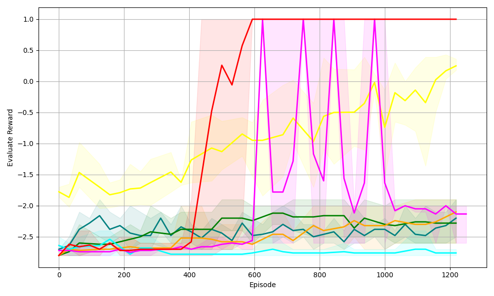
The image is a line chart displaying the "Evaluate Reward" on the y-axis versus "Episode" on the x-axis. There are multiple colored lines, each representing a different data series, along with shaded regions around each line indicating variability or confidence intervals. The chart spans from episode 0 to 1200, and the reward ranges from approximately -2.7 to 1.0.
### Components/Axes
* **X-axis:** Episode, ranging from 0 to 1200 in increments of 200.
* **Y-axis:** Evaluate Reward, ranging from -2.5 to 1.0 in increments of 0.5.
* **Gridlines:** Present on both axes, aiding in value estimation.
* **Data Series:** Multiple colored lines, each with a corresponding shaded region. The colors are red, magenta, yellow, green, teal, dark teal, and orange. There is no legend, so the meaning of each color is unknown.
### Detailed Analysis
* **Red Line:** Initially at approximately -2.7, the red line increases sharply around episode 400, reaching a reward of 0.0 around episode 500. It then rises to 1.0 around episode 600 and remains at 1.0 until the end of the chart at episode 1200.
* **Magenta Line:** Starts at approximately -2.7. It remains relatively flat until around episode 600, after which it exhibits significant oscillations, reaching values as high as 1.0 and as low as -2.7 multiple times between episodes 600 and 1000. After episode 1000, it stabilizes around -2.0.
* **Yellow Line:** Begins around -1.8 and fluctuates between -2.0 and -1.5 until around episode 400. It then gradually increases, reaching approximately -0.1 by episode 1200.
* **Green Line:** Starts around -2.6 and fluctuates slightly, generally staying between -2.6 and -2.2 throughout the entire range of episodes.
* **Teal Line:** Starts around -2.6 and remains relatively flat around -2.7 throughout the entire range of episodes.
* **Dark Teal Line:** Starts around -2.6 and gradually increases to approximately -2.2 by episode 200. It then fluctuates between -2.5 and -2.0 until the end of the chart.
* **Orange Line:** Starts around -2.6 and fluctuates slightly, generally staying between -2.6 and -2.4 until around episode 600. It then increases to approximately -2.4 and remains relatively flat until the end of the chart.
### Key Observations
* The red line shows the most significant improvement in reward, quickly reaching and maintaining the maximum reward value.
* The magenta line exhibits high volatility in reward between episodes 600 and 1000.
* The teal line shows the least change in reward, remaining consistently low.
* The shaded regions around each line indicate the variance or uncertainty associated with each data series.
### Interpretation
The chart likely represents the performance of different algorithms or configurations (represented by the different colored lines) during a learning process, where the "Evaluate Reward" measures the success of each algorithm at each "Episode." The red line represents the most successful algorithm, as it quickly learns and maintains a high reward. The magenta line shows an algorithm that initially struggles but then exhibits volatile behavior, possibly indicating instability or overshooting. The teal line represents an algorithm that fails to learn effectively, consistently achieving low rewards. The other lines represent algorithms with varying degrees of success and stability. The shaded regions provide insight into the consistency of each algorithm's performance.