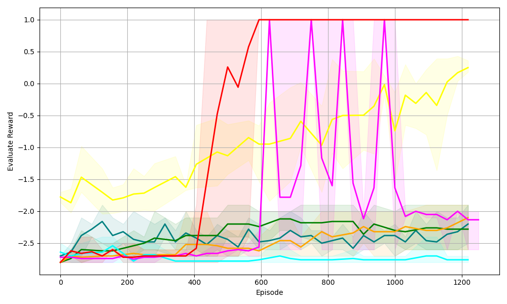
## Line Graph: Evaluation Reward Over Episodes
### Overview
The image depicts a multi-line graph tracking the "Evaluate Reward" metric across 1200 episodes. Five distinct data series (colored lines) are plotted, each with shaded confidence intervals. The graph shows significant divergence in performance trends between the series, with one line achieving near-perfect stability while others exhibit volatility or gradual improvement.
### Components/Axes
- **X-axis (Episode)**:
- Range: 0 to 1200
- Increment: 200
- Label: "Episode"
- **Y-axis (Evaluate Reward)**:
- Range: -2.5 to 1.0
- Increment: 0.5
- Label: "Evaluate Reward"
- **Legend**:
- Position: Right side of the graph
- Colors/Labels:
- Red: "Algorithm A"
- Yellow: "Algorithm B"
- Green: "Algorithm C"
- Blue: "Algorithm D"
- Purple: "Algorithm E"
### Detailed Analysis
1. **Red Line (Algorithm A)**:
- **Trend**: Sharp upward spike at ~400 episodes, plateauing at 1.0 reward from ~600 episodes onward.
- **Confidence Interval**: Narrow shaded area post-600 episodes, indicating low variance.
- **Key Data Points**:
- Episode 400: ~0.25 reward
- Episode 600: 1.0 reward (peak)
- Episode 1200: 1.0 reward (sustained)
2. **Yellow Line (Algorithm B)**:
- **Trend**: Gradual upward trajectory from -2.0 to ~0.2 reward.
- **Confidence Interval**: Moderate variability (wider shaded area).
- **Key Data Points**:
- Episode 0: -2.0 reward
- Episode 600: -0.8 reward
- Episode 1200: 0.2 reward
3. **Green Line (Algorithm C)**:
- **Trend**: Stable performance between -2.0 and -2.5 reward.
- **Confidence Interval**: Narrow shaded area, indicating consistency.
- **Key Data Points**:
- Episode 0: -2.5 reward
- Episode 600: -2.0 reward
- Episode 1200: -2.0 reward
4. **Blue Line (Algorithm D)**:
- **Trend**: Erratic fluctuations, dipping below -2.5 reward.
- **Confidence Interval**: Wide shaded area, reflecting high variance.
- **Key Data Points**:
- Episode 0: -2.5 reward
- Episode 400: -2.7 reward (minimum)
- Episode 1200: -2.3 reward
5. **Purple Line (Algorithm E)**:
- **Trend**: High-risk, high-reward pattern with sharp spikes to 1.0 reward.
- **Confidence Interval**: Very wide shaded area, indicating extreme volatility.
- **Key Data Points**:
- Episode 600: 1.0 reward (peak)
- Episode 800: -1.5 reward (trough)
- Episode 1200: 0.1 reward
### Key Observations
- **Algorithm A** achieves perfect stability after episode 600, suggesting a robust solution.
- **Algorithm B** shows steady improvement but remains suboptimal compared to Algorithm A.
- **Algorithm C** maintains consistent underperformance, possibly indicating a flawed baseline.
- **Algorithm D** exhibits catastrophic failure at episode 400, with recovery attempts failing.
- **Algorithm E** demonstrates the highest variance, with rewards swinging between -1.5 and 1.0.
### Interpretation
The graph illustrates a competitive landscape of algorithms evaluated over 1200 episodes. Algorithm A's plateau at 1.0 reward suggests it solved the problem optimally, while Algorithm E's volatility implies an unstable or exploratory approach. The shaded areas reveal critical insights: narrow intervals (A, C) indicate reliable performance, whereas wide intervals (B, D, E) highlight uncertainty. The divergence between lines underscores the importance of stability in achieving long-term success, even if initial performance lags behind riskier strategies.