\n
## Diagram: Causal Structures
### Overview
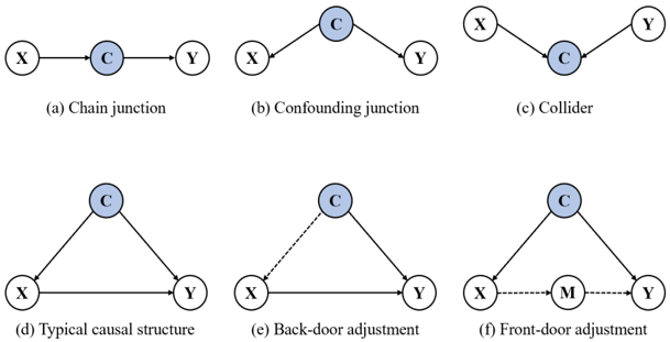
The image presents six diagrams illustrating different causal structures in graphical models. Each diagram depicts relationships between variables X, Y, and C (and M in one case) using directed arrows to represent causal influence. Each diagram is labeled with a letter (a-f) and a descriptive title.
### Components/Axes
The diagrams consist of nodes (circles) representing variables and directed edges (arrows) representing causal relationships. The variables are labeled X, Y, C, and M. Each diagram has a label below it describing the type of causal structure it represents:
* (a) Chain junction
* (b) Confounding junction
* (c) Collider
* (d) Typical causal structure
* (e) Back-door adjustment
* (f) Front-door adjustment
The dashed lines in diagrams (e) and (f) indicate adjustments or interventions.
### Detailed Analysis or Content Details
**Diagram (a): Chain Junction**
* X -> C -> Y: X causes C, and C causes Y. A linear causal pathway.
**Diagram (b): Confounding Junction**
* X <- C -> Y: C causes both X and Y. C is a common cause (confounder) of X and Y.
**Diagram (c): Collider**
* X -> C <- Y: Both X and Y cause C. C is a collider variable.
**Diagram (d): Typical Causal Structure**
* X -> C -> Y and X <- C: X causes C, C causes Y, and C causes X. A more complex structure with feedback.
**Diagram (e): Back-door Adjustment**
* X -> C -> Y and X <- C: Similar to (d), but with a dashed line from X to Y, representing a back-door path that is being adjusted for.
**Diagram (f): Front-door Adjustment**
* X -> M -> Y and X -> C -> Y: X causes both M and C, M causes Y, and C causes Y. A dashed line from X to Y represents a front-door path.
### Key Observations
The diagrams illustrate fundamental causal structures commonly encountered in causal inference. The use of arrows clearly indicates the direction of causal influence. The dashed lines in (e) and (f) highlight the concept of adjustment paths used to estimate causal effects.
### Interpretation
These diagrams are foundational to understanding causal relationships and the challenges of inferring causality from observational data.
* **Chain Junction (a)** represents a simple direct effect.
* **Confounding Junction (b)** illustrates how a common cause can create a spurious correlation between X and Y.
* **Collider (c)** demonstrates how conditioning on a collider can induce a correlation between X and Y, even if they are initially independent.
* **Typical Causal Structure (d)** shows a more complex relationship with feedback loops.
* **Back-door Adjustment (e)** and **Front-door Adjustment (f)** represent techniques for estimating causal effects by blocking confounding paths or utilizing mediating variables.
The diagrams are not presenting numerical data, but rather conceptual models of causal relationships. They are essential for understanding the assumptions underlying causal inference methods and for designing studies that can reliably estimate causal effects. The diagrams are a visual aid for understanding the complexities of causal reasoning. They are not about specific values, but about the *relationships* between variables.