\n
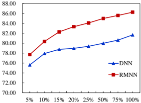
## Line Chart: Performance Comparison of DNN vs. RMNN Across Data Percentages
### Overview
The image displays a line chart comparing the performance of two models, labeled "DNN" and "RMNN," across a range of data percentages. The chart plots a performance metric (y-axis) against an increasing percentage of something (x-axis), likely data split or training ratio. Both models show improved performance as the percentage increases, but RMNN consistently outperforms DNN.
### Components/Axes
* **Chart Type:** Line chart with markers.
* **X-Axis:** Labeled with percentage values: `5%`, `10%`, `15%`, `20%`, `25%`, `50%`, `75%`, `100%`. The axis title is not explicitly visible.
* **Y-Axis:** Numerical scale ranging from `70.00` to `88.00`, with major tick marks every 2.00 units (70.00, 72.00, 74.00, ..., 88.00). The axis title is not explicitly visible.
* **Legend:** Located in the bottom-right corner of the plot area.
* **DNN:** Represented by a blue line with upward-pointing triangle markers (▲).
* **RMNN:** Represented by a red line with square markers (■).
### Detailed Analysis
**Data Series 1: RMNN (Red line, square markers)**
* **Trend:** The line shows a steady, monotonic upward slope from left to right, indicating consistent improvement in the measured metric as the x-axis percentage increases.
* **Approximate Data Points:**
* 5%: ~78.00
* 10%: ~80.50
* 15%: ~82.00
* 20%: ~83.00
* 25%: ~84.00
* 50%: ~85.00
* 75%: ~86.00
* 100%: ~86.50
**Data Series 2: DNN (Blue line, triangle markers)**
* **Trend:** The line also shows a steady upward slope, but it is less steep than the RMNN line. The performance improves with increasing percentage, but at a slower rate.
* **Approximate Data Points:**
* 5%: ~76.00
* 10%: ~78.00
* 15%: ~78.50
* 20%: ~79.00
* 25%: ~79.50
* 50%: ~80.50
* 75%: ~81.00
* 100%: ~81.50
### Key Observations
1. **Consistent Performance Gap:** The RMNN line is positioned entirely above the DNN line for all plotted percentages, indicating RMNN achieves a higher value of the measured metric at every data point.
2. **Widening Gap:** The vertical distance between the two lines appears to increase as the x-axis percentage increases. The gap is smallest at 5% (~2.00 units) and largest at 100% (~5.00 units).
3. **Diminishing Returns:** Both curves show a slight flattening (reduced slope) at higher percentages (from 50% to 100%), suggesting that the rate of performance improvement slows as more data is used.
4. **Missing Context:** The specific metric on the y-axis (e.g., accuracy, F1-score) and the meaning of the x-axis percentage (e.g., percentage of training data, labeled data) are not labeled on the chart.
### Interpretation
The chart demonstrates a clear performance advantage for the RMNN model over the DNN model across the entire tested range. The data suggests that RMNN is not only more effective in absolute terms but also scales better with increased data, as evidenced by the widening performance gap. The consistent upward trend for both models indicates that increasing the data percentage (likely the amount of training data) is beneficial for performance. However, the diminishing returns at the high end suggest a potential saturation point where adding more data yields smaller marginal gains. For a technical document, this chart would serve as evidence that the RMNN architecture or method provides superior and more scalable results compared to the baseline DNN for the task being measured. The lack of axis titles is a significant omission that would need to be clarified in accompanying text.