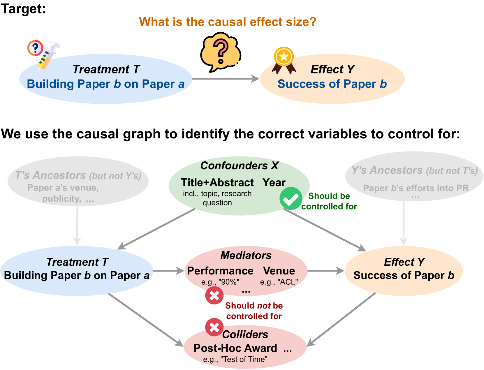
## Diagram: Causal Graph for Paper Success
### Overview
This diagram illustrates a causal graph used to identify variables to control for when determining the causal effect of building Paper b on Paper a (Treatment T) on the success of Paper b (Effect Y). The diagram is split into two sections, with the top section providing a general overview and the bottom section detailing confounders, mediators, and colliders.
### Components/Axes
The diagram consists of several components:
* **Treatment T:** "Building Paper b on Paper a"
* **Effect Y:** "Success of Paper b"
* **Confounders X:** Variables that influence both Treatment T and Effect Y.
* **Mediators:** Variables that are influenced by Treatment T and then influence Effect Y.
* **Colliders:** Variables that are influenced by both Treatment T and Effect Y.
* **Arrows:** Indicate causal relationships.
* **Text Boxes:** Provide descriptions and examples of variables.
* **Checkmark/X Symbols:** Indicate whether a variable should or should not be controlled for.
The diagram also includes a header with the question: "What is the causal effect size?".
### Detailed Analysis or Content Details
**Top Section:**
* Treatment T (Building Paper b on Paper a) is shown on the left, connected by a light-orange arrow to Effect Y (Success of Paper b) on the right.
* A question mark icon is positioned above Treatment T, and another larger question mark icon is centered above the arrow connecting T and Y, emphasizing the goal of determining the causal effect size.
**Bottom Section:**
* **Confounders X:** Represented by a pink oval labeled "Confounders X". The text within states "Title+Abstract incl., topic, research question Year". A green checkmark with the text "Should be controlled for" is positioned to the right of this oval. Arrows originate from this oval pointing towards both Treatment T and Effect Y.
* T's Ancestors (but not Y's): "Paper a's venue, publicity, ..." is shown in a light-pink box connected to the Confounders X.
* Y's Ancestors (but not T's): "Paper b's efforts into PR ..." is shown in a light-pink box connected to the Confounders X.
* **Mediators:** Represented by a light-green oval labeled "Mediators". The text within states "Performance e.g., "90%" Venue e.g., "ACL"". A red "X" with the text "Should not be controlled for" is positioned to the right of this oval. Arrows originate from Treatment T and Effect Y pointing towards this oval.
* **Colliders:** Represented by a red "X" shape labeled "Colliders". The text within states "Post-Hoc Award e.g., "Test of Time"". Arrows originate from both Treatment T and Effect Y pointing towards this collider.
### Key Observations
* The diagram clearly distinguishes between variables that should be controlled for (Confounders) and those that should not (Mediators and Colliders).
* The use of color-coding (pink for confounders, green for mediators, red for colliders) aids in quick identification of variable types.
* The diagram emphasizes the importance of controlling for confounders to accurately estimate the causal effect.
* The examples provided for each variable type (e.g., "90%" for performance, "ACL" for venue, "Test of Time" for post-hoc award) provide concrete illustrations of the concepts.
### Interpretation
This diagram is a visual representation of a causal inference framework. It demonstrates how to identify and control for confounding variables to estimate the true causal effect of one variable (building Paper b on Paper a) on another (success of Paper b). The diagram highlights that simply observing a correlation between the two variables is not sufficient to establish causality; one must account for potential confounders that may influence both variables.
The distinction between mediators and colliders is crucial. Controlling for mediators can bias the estimate of the causal effect, while controlling for colliders can introduce bias. The diagram provides a clear guide for researchers to navigate these complexities and draw valid causal conclusions. The diagram is a pedagogical tool, designed to explain a complex statistical concept in a visually accessible manner. The question at the top, "What is the causal effect size?" frames the entire diagram as a method for answering that question.