## Network Diagram: ASP Navigator Graph Visualization
### Overview
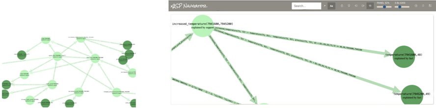
The image displays a screenshot of a software interface titled "ASP Navigator," showing a network graph visualization. The interface is split into two main panels: a smaller overview graph on the left and a larger, detailed view of a selected subgraph on the right. The visualization appears to represent logical relationships or data structures, possibly from Answer Set Programming (ASP) or a similar declarative programming domain, given the tool's name and the node labels.
### Components/Axes
**Interface Components:**
* **Header Bar:** Contains the title "ASP Navigator" on the left. On the right, there is a search bar with placeholder text "Search...", followed by a series of control buttons/icons (icons for what appear to be zoom, fit-to-view, layout options, etc.). A status indicator reads "Nodes: 340 Edges: 420".
* **Left Panel (Overview):** Displays a dense, small-scale network graph with numerous interconnected nodes. Nodes are circular and colored in varying shades of green. Edges are light green lines.
* **Right Panel (Detail View):** Shows a zoomed-in portion of the network from the left panel. This view contains larger, more legible nodes and labeled edges. The background is white.
**Graph Elements (Detailed View):**
* **Nodes:** Circular elements with text labels inside. Two primary node types are visible:
1. A light green node labeled `increased_temperature(7941686,746108)`.
2. Two dark green nodes labeled `temperature(7941686,48)` and `temperature(7941686,49)`.
* **Edges:** Directed arrows (lines with arrowheads) connecting nodes. Each edge has a text label describing the relationship.
* **Legend/Color Key:** No explicit legend is present. Node color (light green vs. dark green) appears to differentiate between predicate types or states.
### Detailed Analysis
**Node Details (Right Panel):**
1. **Node 1 (Top-Left):**
* **Color:** Light green.
* **Label:** `increased_temperature(7941686,746108)`
* **Position:** Top-left quadrant of the detail view.
2. **Node 2 (Center-Right):**
* **Color:** Dark green.
* **Label:** `temperature(7941686,48)`
* **Position:** Center-right of the detail view.
3. **Node 3 (Bottom-Right):**
* **Color:** Dark green.
* **Label:** `temperature(7941686,49)`
* **Position:** Bottom-right of the detail view.
**Edge Details (Right Panel):**
* **Edge from Node 1 to Node 2:**
* **Label:** `has_property(7941686,746108,temperature,48)`
* **Trend/Flow:** A direct, downward-sloping arrow from the `increased_temperature` node to the `temperature(...,48)` node.
* **Edge from Node 1 to Node 3:**
* **Label:** `has_property(7941686,746108,temperature,49)`
* **Trend/Flow:** A direct, downward-sloping arrow from the `increased_temperature` node to the `temperature(...,49)` node.
* **Other Edges:** Several other edges are partially visible, originating from or connecting to nodes outside the current view. Their labels are truncated but follow a similar pattern (e.g., `has_property(...)`).
**Overview Graph (Left Panel):**
* Shows a complex, interconnected network with an estimated 30-40 visible nodes.
* The graph has a roughly circular or force-directed layout.
* Node colors range from pale to dark green, suggesting a property gradient or categorical distinction.
* The density of connections indicates a highly relational dataset.
### Key Observations
1. **Hierarchical Relationship:** The `increased_temperature` node acts as a source, connecting to multiple `temperature` nodes via `has_property` edges. This suggests a one-to-many relationship where a single "increased temperature" event or state is associated with specific temperature values.
2. **Data Structure:** The node labels follow a predicate logic format: `predicate_name(entity_id, value_or_id)`. The numbers (7941686, 746108, 48, 49) are likely unique identifiers or data values.
3. **Visualization Strategy:** The tool uses a dual-view approach: a macro-level overview for context and a micro-level detail view for inspecting specific relationships and labels.
4. **Color Coding:** The consistent use of green hues, with light green for the `increased_temperature` predicate and dark green for the `temperature` predicate, provides immediate visual categorization.
### Interpretation
This image captures a technical debugging or analysis session using the ASP Navigator tool. The graph visualizes a fragment of a knowledge base or logic program, where facts and rules are represented as nodes and their logical relationships as edges.
* **What the data suggests:** The specific subgraph shown models a scenario where an entity (ID: 7941686) has an associated "increased temperature" state (ID: 746108). This state is further defined by having specific temperature properties with values 48 and 49. This could represent a system monitoring log, a scientific model, or a constraint satisfaction problem.
* **How elements relate:** The `has_property` edges are the critical connectors, explicitly defining that the abstract `increased_temperature` state is composed of or implies concrete `temperature` readings. The overview graph implies this is a small part of a much larger, interconnected system of rules and facts.
* **Notable patterns/anomalies:** The clean, hierarchical structure in the detail view contrasts with the dense, web-like overview, highlighting the tool's utility in navigating complexity. There are no obvious visual anomalies; the graph appears to be a coherent representation of structured data. The primary "anomaly" for a viewer is the lack of context for what the IDs represent, which is typical for such low-level data structure visualizations.
**Language Declaration:** All text in the image is in English, using a technical/programming syntax.