## Network Diagram: Relationship Visualization
### Overview
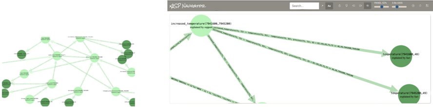
The image contains two network diagrams side-by-side. The left diagram shows a complex web of interconnected nodes and edges, while the right diagram presents a simplified version with labeled nodes and directional arrows. Both diagrams use green nodes and edges, with no visible text or labels discernible in the provided image.
### Components/Axes
- **Nodes**: Circular green shapes representing entities or data points.
- **Edges**: Green lines connecting nodes, indicating relationships or dependencies.
- **Right Diagram**: Includes a search bar labeled "XASP Navigator" at the top, with directional arrows and numerical annotations (e.g., `increased_temperature(7941688, 7945288)`).
### Detailed Analysis
- **Left Diagram**:
- Nodes vary in size, with some appearing larger (possibly indicating importance or centrality).
- Edges form a dense, overlapping network, suggesting high interconnectivity.
- No axis titles, legends, or numerical scales are visible.
- **Right Diagram**:
- A central node labeled `increased_temperature(7941688, 7945288)` acts as a hub.
- Arrows point to two peripheral nodes labeled `temperature(7941680, 48)` and `temperature(7945280, 49)`, both annotated with "explained by fact."
- Numerical values in parentheses may represent identifiers or metrics, but their exact meaning is unclear without additional context.
### Key Observations
- The right diagram emphasizes a hierarchical structure, with the central node distributing influence to peripheral nodes.
- Numerical annotations suggest quantitative relationships, but their interpretation requires domain-specific knowledge.
- No explicit legend or color-coding scheme is present to clarify node/edge meanings.
### Interpretation
The diagrams likely represent a system of interdependent variables or processes, with the right diagram highlighting a specific causal or explanatory relationship (e.g., temperature changes). The absence of readable labels or legends limits the ability to extract precise data points or trends. The use of numerical identifiers (e.g., `7941688`) implies a structured dataset, but without further context, their significance remains speculative. The "explained by fact" annotations suggest a focus on evidence-based relationships, possibly in a scientific or analytical context.
**Note**: The image contains no legible text beyond the search bar label and numerical annotations. All interpretations are based on visual structure and common diagrammatic conventions.