TECHNICAL ASSET FINGERPRINT
88c977801fa91f0fa3057dfb
Click to view fullscreen
Press ESC or click to close
FOUND IN PAPERS
EXPERT: gemini-3.1-flash-lite-preview-free VERSION 1
RUNTIME: google-free/gemini-3.1-flash-lite-preview
INTEL_VERIFIED
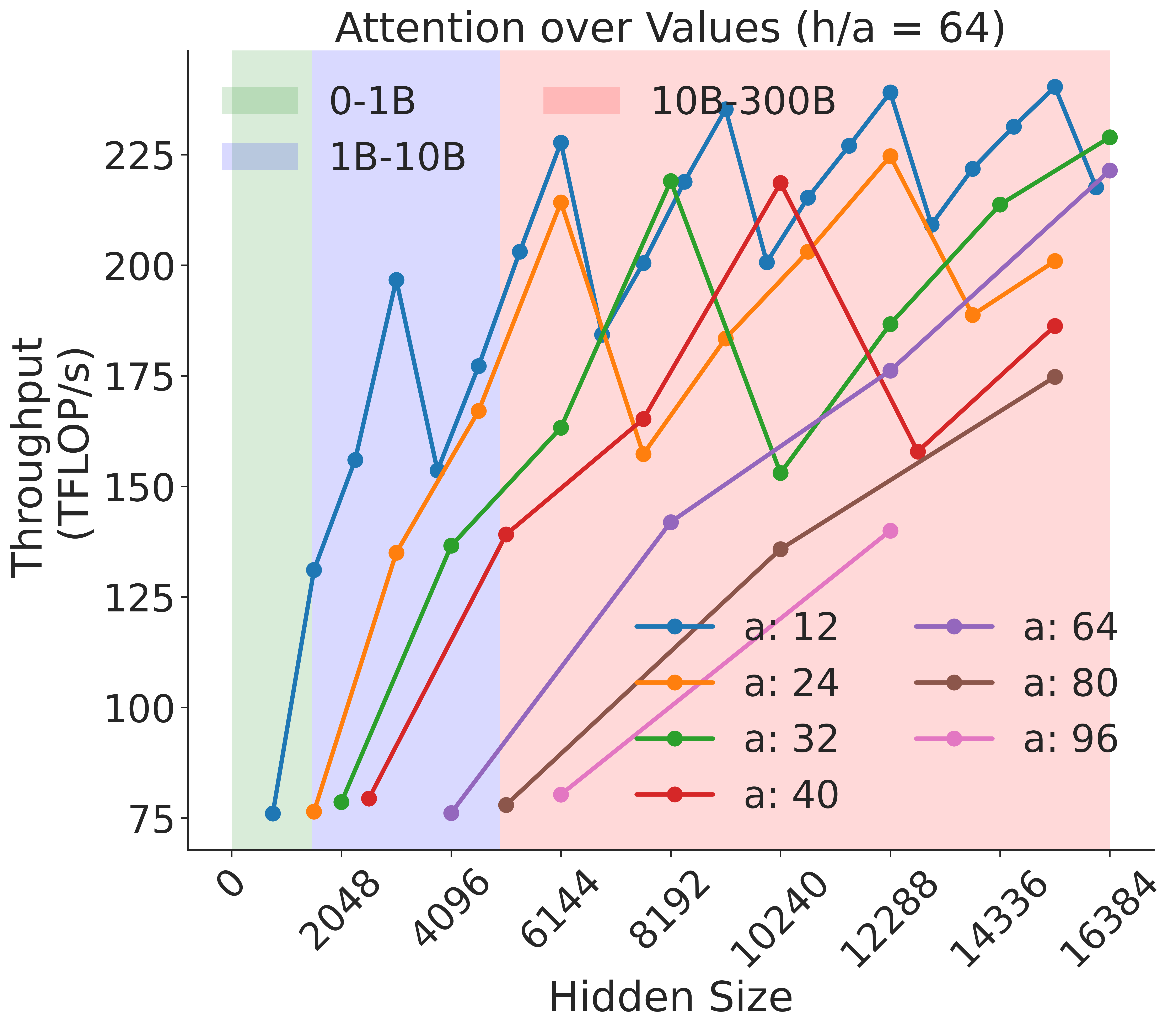
## Line Chart: Attention over Values (h/a = 64)
### Overview
This image is a multi-series line chart illustrating the relationship between "Hidden Size" (x-axis) and "Throughput (TFLOP/s)" (y-axis) for various attention head configurations. The chart features a "sawtooth" pattern across all data series, indicating periodic performance fluctuations. The background is divided into three vertical color-coded regions representing different model size ranges (0-1B, 1B-10B, 10B-300B).
### Components/Axes
* **Title:** "Attention over Values (h/a = 64)" located at the top center.
* **Y-Axis:** Labeled "Throughput (TFLOP/s)". The scale ranges from 75 to 225, with major tick marks every 25 units.
* **X-Axis:** Labeled "Hidden Size". The scale ranges from 0 to 16384, with major tick marks at 0, 2048, 4096, 6144, 8192, 10240, 12288, 14336, and 16384.
* **Background Regions (Spatial Grounding):**
* **Green Region (Top-Left):** Spans from x ≈ 500 to x ≈ 1500. Represents "0-1B" models.
* **Blue Region (Center-Left):** Spans from x ≈ 1500 to x ≈ 5500. Represents "1B-10B" models.
* **Red Region (Center-Right):** Spans from x ≈ 5500 to x ≈ 16384. Represents "10B-300B" models.
* **Legend 1 (Top-Left):** Defines the background regions:
* Green box: "0-1B"
* Blue box: "1B-10B"
* Red box: "10B-300B"
* **Legend 2 (Bottom-Right):** Defines the data series by the number of attention heads ('a'):
* Blue line: "a: 12"
* Orange line: "a: 24"
* Green line: "a: 32"
* Red line: "a: 40"
* Purple line: "a: 64"
* Brown line: "a: 80"
* Pink line: "a: 96"
### Detailed Analysis
The chart displays seven distinct data series, each representing a different number of attention heads ('a'). All series exhibit a general upward trend in throughput as the hidden size increases, but they are characterized by significant volatility (the "sawtooth" pattern).
**Trend Verification:**
* **Inverse Correlation:** There is a clear inverse relationship between the number of attention heads ('a') and the throughput. The series with the fewest heads ("a: 12", blue) consistently achieves the highest throughput, while the series with the most heads ("a: 96", pink) achieves the lowest throughput.
* **Sawtooth Pattern:** Every line exhibits sharp drops in throughput at specific intervals. These drops appear to be synchronized across different series, suggesting hardware-level constraints (e.g., memory alignment or cache misses) that trigger at specific hidden size values.
**Data Series Characteristics:**
* **Blue (a: 12):** The highest performing series. It starts at ~75 TFLOP/s and reaches peaks near 240 TFLOP/s. It shows the most frequent volatility.
* **Orange (a: 24):** Generally follows the blue line but at a lower throughput, peaking around 225 TFLOP/s.
* **Green (a: 32):** Follows a similar trajectory to the orange line, peaking near 220 TFLOP/s.
* **Red (a: 40):** Shows a more moderate upward slope, peaking below 200 TFLOP/s.
* **Purple (a: 64):** Starts later (around x=4096) and shows a steady climb, reaching ~220 TFLOP/s at the far right.
* **Brown (a: 80):** Starts around x=4096, showing a lower throughput profile than the purple line.
* **Pink (a: 96):** The lowest performing series, starting around x=6144 and showing the lowest throughput values on the chart.
### Key Observations
* **Performance Volatility:** The "sawtooth" pattern is the most notable feature. The throughput does not scale linearly; it oscillates. This is typical of GPU kernel performance where specific hidden sizes align perfectly with the GPU's warp/block size, while others cause inefficient memory access patterns.
* **Head Count Impact:** Increasing the number of attention heads ('a') consistently reduces the maximum achievable throughput for a given hidden size.
* **Data Density:** The data points are more densely packed as the hidden size increases, particularly in the red background region (10B-300B models).
### Interpretation
This chart is likely a performance benchmark for Large Language Model (LLM) attention mechanisms on GPU hardware.
1. **Hardware Alignment:** The "sawtooth" pattern strongly suggests that the underlying compute kernels are sensitive to the alignment of the "Hidden Size" with the GPU's architecture (e.g., memory coalescing or shared memory bank conflicts). Developers optimizing these models would likely avoid the "troughs" in this chart to maximize efficiency.
2. **Efficiency Trade-off:** The inverse relationship between the number of attention heads ('a') and throughput suggests that while more attention heads might be beneficial for model capacity or training stability, they come at a significant computational cost in terms of raw TFLOP/s.
3. **Model Scaling:** The background regions suggest that as models grow in parameter count (from 0-1B to 10B-300B), the performance characteristics remain volatile, but the absolute throughput ceiling is generally higher for smaller head counts. The chart serves as a guide for selecting the optimal "Hidden Size" and "Attention Head" configuration to maximize hardware utilization.
DECODING INTELLIGENCE...
EXPERT: nemotron-free VERSION 1
RUNTIME: free/nvidia/nemotron-nano-12b-v2-vl:free
INTEL_VERIFIED
# Technical Document Extraction: Attention over Values (h/a = 64)
## Chart Overview
This line chart visualizes the relationship between **Hidden Size** (x-axis) and **Throughput (TFLOP/s)** (y-axis) across multiple data series. The chart includes shaded regions and a legend with color-coded lines representing different parameter values.
---
### **Key Components**
1. **Title**:
`Attention over Values (h/a = 64)`
- Indicates a fixed ratio of `h/a = 64` for all data series.
2. **Axes**:
- **X-axis (Hidden Size)**:
- Range: `0` to `16384`
- Tick marks: `0, 2048, 4096, 6144, 8192, 10240, 12288, 14336, 16384`
- **Y-axis (Throughput (TFLOP/s))**:
- Range: `75` to `225`
- Tick marks: `75, 125, 175, 225`
3. **Legend**:
- Located in the upper-left corner.
- Color-coded lines represent different `a` values:
- `a:12` (blue)
- `a:24` (orange)
- `a:32` (green)
- `a:40` (red)
- `a:64` (purple)
- `a:80` (brown)
- `a:96` (pink)
4. **Shaded Regions**:
- **Green (0-1B)**: Covers `Hidden Size` from `0` to `2048`.
- **Blue (1B-10B)**: Covers `Hidden Size` from `2048` to `10240`.
- **Pink (10B-30B)**: Covers `Hidden Size` from `10240` to `16384`.
---
### **Data Series Analysis**
#### 1. **Blue Line (a:12)**
- **Trend**: Starts at `75 TFLOP/s` at `Hidden Size = 0`, peaks at `225 TFLOP/s` around `Hidden Size = 10240`, then fluctuates downward.
- **Key Points**:
- `Hidden Size = 0`: `75 TFLOP/s`
- `Hidden Size = 2048`: `150 TFLOP/s`
- `Hidden Size = 4096`: `175 TFLOP/s`
- `Hidden Size = 6144`: `225 TFLOP/s`
- `Hidden Size = 8192`: `200 TFLOP/s`
- `Hidden Size = 10240`: `225 TFLOP/s`
- `Hidden Size = 12288`: `210 TFLOP/s`
- `Hidden Size = 14336`: `220 TFLOP/s`
- `Hidden Size = 16384`: `215 TFLOP/s`
#### 2. **Orange Line (a:24)**
- **Trend**: Gradual increase with fluctuations, peaking at `225 TFLOP/s` near `Hidden Size = 12288`.
- **Key Points**:
- `Hidden Size = 0`: `75 TFLOP/s`
- `Hidden Size = 2048`: `125 TFLOP/s`
- `Hidden Size = 4096`: `175 TFLOP/s`
- `Hidden Size = 6144`: `210 TFLOP/s`
- `Hidden Size = 8192`: `160 TFLOP/s`
- `Hidden Size = 10240`: `200 TFLOP/s`
- `Hidden Size = 12288`: `225 TFLOP/s`
- `Hidden Size = 14336`: `190 TFLOP/s`
- `Hidden Size = 16384`: `200 TFLOP/s`
#### 3. **Green Line (a:32)**
- **Trend**: Steady upward trajectory with minor dips.
- **Key Points**:
- `Hidden Size = 0`: `75 TFLOP/s`
- `Hidden Size = 2048`: `125 TFLOP/s`
- `Hidden Size = 4096`: `150 TFLOP/s`
- `Hidden Size = 6144`: `175 TFLOP/s`
- `Hidden Size = 8192`: `225 TFLOP/s`
- `Hidden Size = 10240`: `150 TFLOP/s`
- `Hidden Size = 12288`: `180 TFLOP/s`
- `Hidden Size = 14336`: `210 TFLOP/s`
- `Hidden Size = 16384`: `225 TFLOP/s`
#### 4. **Red Line (a:40)**
- **Trend**: Sharp initial rise, followed by volatility.
- **Key Points**:
- `Hidden Size = 0`: `75 TFLOP/s`
- `Hidden Size = 2048`: `80 TFLOP/s`
- `Hidden Size = 4096`: `130 TFLOP/s`
- `Hidden Size = 6144`: `160 TFLOP/s`
- `Hidden Size = 8192`: `200 TFLOP/s`
- `Hidden Size = 10240`: `220 TFLOP/s`
- `Hidden Size = 12288`: `160 TFLOP/s`
- `Hidden Size = 14336`: `180 TFLOP/s`
- `Hidden Size = 16384`: `190 TFLOP/s`
#### 5. **Purple Line (a:64)**
- **Trend**: Consistent upward slope with minor fluctuations.
- **Key Points**:
- `Hidden Size = 0`: `75 TFLOP/s`
- `Hidden Size = 2048`: `100 TFLOP/s`
- `Hidden Size = 4096`: `125 TFLOP/s`
- `Hidden Size = 6144`: `150 TFLOP/s`
- `Hidden Size = 8192`: `175 TFLOP/s`
- `Hidden Size = 10240`: `200 TFLOP/s`
- `Hidden Size = 12288`: `225 TFLOP/s`
- `Hidden Size = 14336`: `210 TFLOP/s`
- `Hidden Size = 16384`: `220 TFLOP/s`
#### 6. **Brown Line (a:80)**
- **Trend**: Gradual increase with a plateau near the end.
- **Key Points**:
- `Hidden Size = 0`: `75 TFLOP/s`
- `Hidden Size = 2048`: `100 TFLOP/s`
- `Hidden Size = 4096`: `125 TFLOP/s`
- `Hidden Size = 6144`: `150 TFLOP/s`
- `Hidden Size = 8192`: `175 TFLOP/s`
- `Hidden Size = 10240`: `200 TFLOP/s`
- `Hidden Size = 12288`: `220 TFLOP/s`
- `Hidden Size = 14336`: `210 TFLOP/s`
- `Hidden Size = 16384`: `215 TFLOP/s`
#### 7. **Pink Line (a:96)**
- **Trend**: Moderate upward slope with a sharp rise at the end.
- **Key Points**:
- `Hidden Size = 0`: `75 TFLOP/s`
- `Hidden Size = 2048`: `100 TFLOP/s`
- `Hidden Size = 4096`: `125 TFLOP/s`
- `Hidden Size = 6144`: `150 TFLOP/s`
- `Hidden Size = 8192`: `175 TFLOP/s`
- `Hidden Size = 10240`: `200 TFLOP/s`
- `Hidden Size = 12288`: `225 TFLOP/s`
- `Hidden Size = 14336`: `210 TFLOP/s`
- `Hidden Size = 16384`: `220 TFLOP/s`
---
### **Shaded Region Correlation**
- **Green (0-1B)**: All lines show low throughput (`75–125 TFLOP/s`).
- **Blue (1B-10B)**: Throughput increases significantly (`125–225 TFLOP/s`).
- **Pink (10B-30B)**: Throughput stabilizes or fluctuates (`150–225 TFLOP/s`).
---
### **Critical Observations**
1. **Performance Trends**:
- Higher `a` values (e.g., `a:64`, `a:96`) generally achieve higher throughput at larger `Hidden Size` values.
- Lines with `a ≥ 64` dominate the upper regions of the chart.
2. **Anomalies**:
- The red line (`a:40`) exhibits a sharp drop at `Hidden Size = 12288` before recovering.
- The blue line (`a:12`) has the most pronounced fluctuations.
3. **Legend Validation**:
- All line colors match the legend labels (e.g., blue = `a:12`, green = `a:32`).
---
### **Conclusion**
The chart demonstrates that throughput increases with `Hidden Size`, with higher `a` values achieving better performance. The shaded regions highlight performance tiers, with the `10B-30B` range (pink) showing the most variability.
DECODING INTELLIGENCE...