## Line Chart: TV Distance vs. Iterations per Trial for Two Methods
### Overview
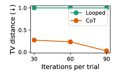
The image is a line chart comparing the performance of two methods, "Looped" and "CoT," based on a metric called "TV distance." The chart plots this distance against the number of "Iterations per trial." The y-axis includes a downward arrow (↓), indicating that a lower TV distance value is better or more desirable.
### Components/Axes
* **Chart Type:** Line chart with markers.
* **X-Axis:**
* **Label:** "Iterations per trial"
* **Scale/Major Ticks:** 30, 60, 90.
* **Y-Axis:**
* **Label:** "TV distance (↓)"
* **Scale/Major Ticks:** 0.0, 0.5, 1.0.
* **Legend:** Located in the top-right corner of the plot area.
* **Looped:** Represented by a teal/green line with solid circle markers.
* **CoT:** Represented by an orange line with solid circle markers.
### Detailed Analysis
**Data Series 1: Looped (Teal/Green Line)**
* **Trend Verification:** The line is perfectly horizontal, indicating no change in the measured value across the tested iterations.
* **Data Points:**
* At 30 iterations: TV distance ≈ 1.0
* At 60 iterations: TV distance ≈ 1.0
* At 90 iterations: TV distance ≈ 1.0
**Data Series 2: CoT (Orange Line)**
* **Trend Verification:** The line shows a clear downward slope, indicating improvement (reduction in TV distance) as iterations increase. The rate of decrease accelerates between 60 and 90 iterations.
* **Data Points:**
* At 30 iterations: TV distance ≈ 0.3
* At 60 iterations: TV distance ≈ 0.25
* At 90 iterations: TV distance ≈ 0.05 (very close to 0.0)
### Key Observations
1. **Performance Gap:** There is a significant and consistent performance gap between the two methods. The "Looped" method performs poorly (high TV distance) compared to "CoT" at all measured points.
2. **CoT Improvement:** The "CoT" method shows a clear benefit from increased computation (more iterations per trial), with its best performance at 90 iterations.
3. **Looped Stagnation:** The "Looped" method shows no sensitivity to the number of iterations within the tested range (30-90), maintaining a constant, high TV distance.
4. **Convergence:** The "CoT" method appears to be converging towards a TV distance of 0.0 as iterations increase.
### Interpretation
This chart demonstrates a comparative evaluation of two algorithmic approaches ("Looped" vs. "CoT") on a task measured by Total Variation (TV) distance, where lower values indicate better alignment or fidelity.
* **What the data suggests:** The "CoT" (likely "Chain-of-Thought") method is substantially more effective than the "Looped" method for this specific task. Its effectiveness scales with computational budget (iterations), suggesting an iterative refinement process that successfully reduces error or divergence. In contrast, the "Looped" method appears to be stuck in a suboptimal state, unable to improve regardless of additional iterations.
* **How elements relate:** The x-axis (Iterations per trial) represents the computational effort allowed per attempt. The y-axis (TV distance) is the outcome metric. The diverging trends of the two lines highlight a fundamental difference in how the two methods utilize additional computation. The downward arrow on the y-axis label explicitly frames the goal: minimize TV distance.
* **Notable anomalies/implications:** The most striking feature is the flat line for "Looped." This could indicate a method that is either fundamentally incapable of improvement on this metric, has already reached its performance ceiling at 30 iterations, or is not designed to leverage iterative refinement in the same way "CoT" is. The chart strongly argues for the superiority of the "CoT" approach in this context, especially when more iterations are feasible.