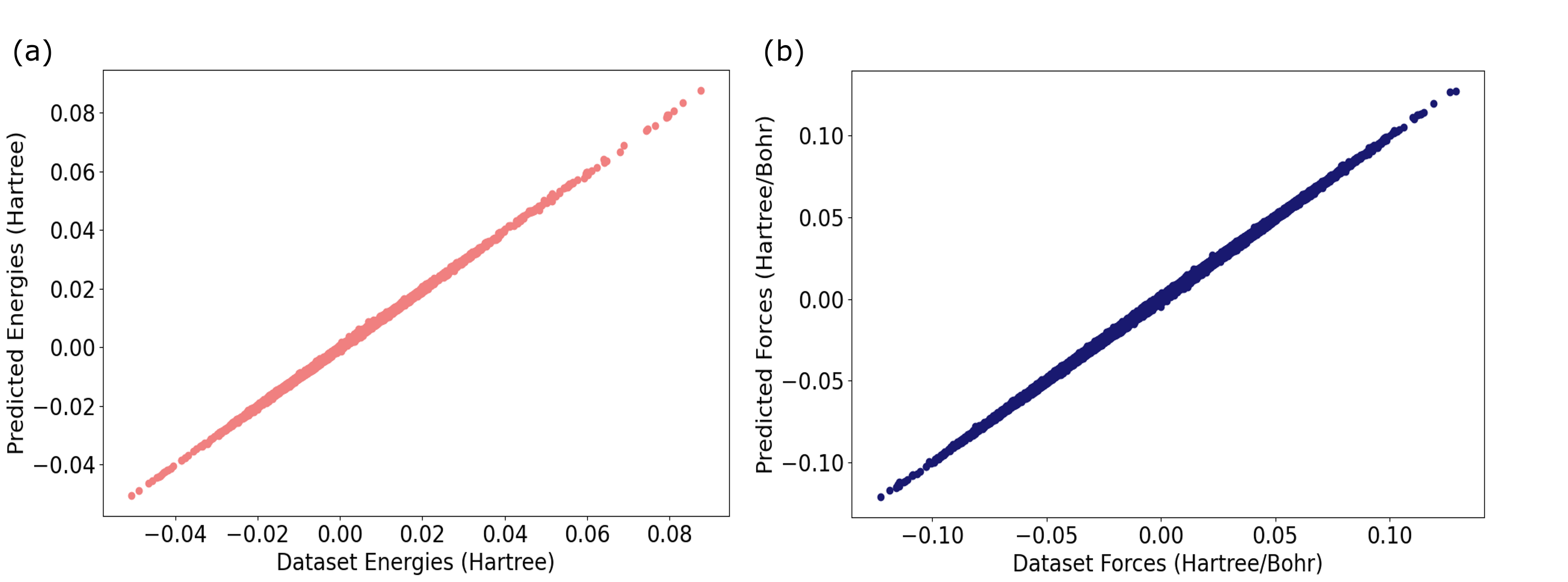
# Technical Document Extraction: Scatter Plot Analysis
## Plot (a): Energy Predictions
### Axes Labels
- **X-axis**: "Dataset Energies (Hartree)"
- Range: -0.04 to 0.08
- **Y-axis**: "Predicted Energies (Hartree)"
- Range: -0.04 to 0.08
### Data Characteristics
- **Data Points**: Red markers
- **Trend**: Linear correlation (bottom-left to top-right)
- **Key Observations**:
- Data points align closely along a diagonal line, indicating strong agreement between dataset and predicted energies.
- No outliers or deviations from the trendline are visible.
## Plot (b): Force Predictions
### Axes Labels
- **X-axis**: "Dataset Forces (Hartree/Bohr)"
- Range: -0.10 to 0.10
- **Y-axis**: "Predicted Forces (Hartree/Bohr)"
- Range: -0.10 to 0.10
### Data Characteristics
- **Data Points**: Blue markers
- **Trend**: Linear correlation (bottom-left to top-right)
- **Key Observations**:
- Data points follow a tight linear pattern, suggesting high predictive accuracy for forces.
- Symmetrical distribution around the origin (0,0) indicates balanced predictions across positive and negative force values.
## Cross-Reference Validation
- **Legend Consistency**:
- Plot (a) red markers correspond to energy predictions.
- Plot (b) blue markers correspond to force predictions.
- **Axis Units**:
- Energies measured in Hartree (a).
- Forces measured in Hartree/Bohr (b).
## Summary
Both plots demonstrate strong linear relationships between dataset and predicted values for energies and forces, respectively. The consistent diagonal alignment of data points across both plots suggests effective model performance in capturing underlying trends.