## Bar Chart: Mean Values by Layer
### Overview
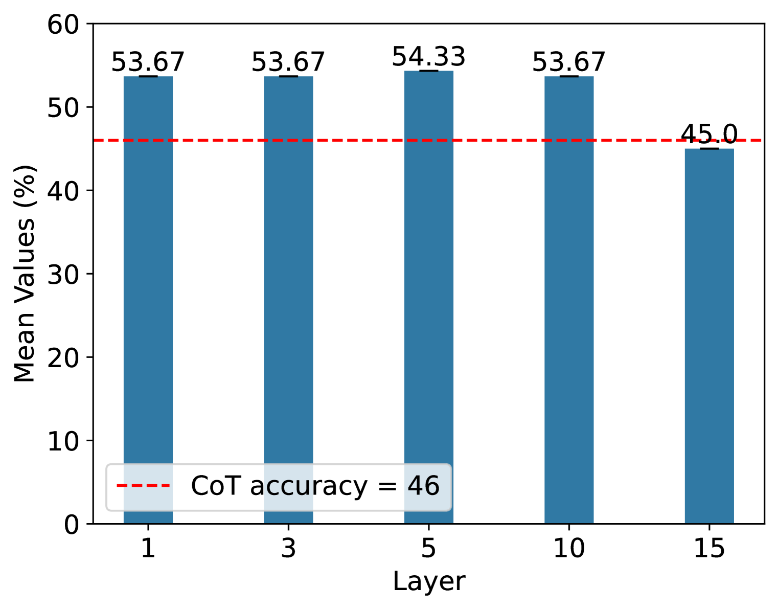
The image is a bar chart comparing the mean values (%) across different layers (1, 3, 5, 10, and 15). The chart also includes a horizontal dashed red line representing the "CoT accuracy = 46". The bars are blue.
### Components/Axes
* **X-axis:** "Layer" with values 1, 3, 5, 10, and 15.
* **Y-axis:** "Mean Values (%)" ranging from 0 to 60.
* **Bars:** Blue bars representing the mean values for each layer.
* **Horizontal Line:** A dashed red line labeled "CoT accuracy = 46".
* **Legend:** Located at the bottom-left, indicating the dashed red line represents "CoT accuracy = 46".
### Detailed Analysis
* **Layer 1:** Mean Value = 53.67
* **Layer 3:** Mean Value = 53.67
* **Layer 5:** Mean Value = 54.33
* **Layer 10:** Mean Value = 53.67
* **Layer 15:** Mean Value = 45.0
* **CoT Accuracy:** Represented by a dashed red line at approximately 46.
### Key Observations
* The mean values for layers 1, 3, 5, and 10 are relatively consistent, hovering around 53-54.
* The mean value for layer 15 is significantly lower at 45.0.
* The CoT accuracy line at 46 serves as a baseline for comparison.
### Interpretation
The chart suggests that the mean values are relatively stable across layers 1 to 10, with a slight peak at layer 5. However, there is a noticeable drop in the mean value at layer 15. This could indicate that performance decreases at higher layers. The CoT accuracy line provides a reference point, showing that the mean values for layers 1 to 10 are significantly higher than the CoT accuracy, while the mean value for layer 15 is closer to it. This might imply that the model's performance degrades and approaches the CoT accuracy level at layer 15.