\n
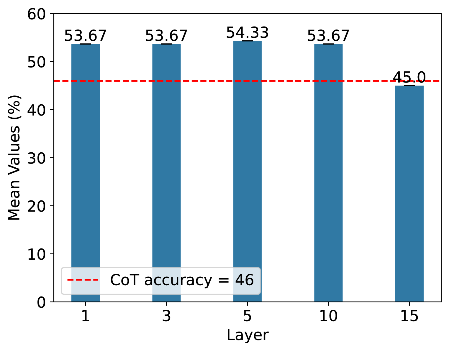
## Bar Chart: Mean Values (%) vs. Layer
### Overview
This image presents a bar chart illustrating the mean values (expressed as percentages) across different layers. The chart compares these mean values to a constant "CoT accuracy" level, indicated by a horizontal dashed line.
### Components/Axes
* **X-axis:** "Layer" with markers at 1, 3, 5, 10, and 15.
* **Y-axis:** "Mean Values (%)" ranging from 0 to 60, with increments of 10.
* **Data Series:** A single series of bars representing the mean values for each layer. The bars are a consistent blue color.
* **Horizontal Line:** A red dashed line labeled "CoT accuracy = 46" representing a threshold or benchmark.
* **Bar Labels:** Each bar is labeled with its corresponding mean value.
### Detailed Analysis
The chart displays the following data points:
* **Layer 1:** Mean Value = 53.67%
* **Layer 3:** Mean Value = 53.67%
* **Layer 5:** Mean Value = 54.33%
* **Layer 10:** Mean Value = 53.67%
* **Layer 15:** Mean Value = 45.0%
The bars representing layers 1, 3, 5, and 10 are approximately the same height, indicating similar mean values. The bar for layer 15 is noticeably shorter, indicating a lower mean value. The red dashed line representing "CoT accuracy" is positioned at 46%.
### Key Observations
* The mean values for layers 1, 3, 5, and 10 are all above the "CoT accuracy" line.
* The mean value for layer 15 is below the "CoT accuracy" line.
* The highest mean value is observed at layer 5 (54.33%).
* The mean values are relatively stable across layers 1, 3, 5, and 10.
### Interpretation
The data suggests that the mean value remains relatively consistent across the first four layers (1, 3, 5, and 10), all exceeding a "CoT accuracy" benchmark of 46%. However, there is a significant drop in the mean value at layer 15, falling below this benchmark. This could indicate a performance degradation or change in behavior at layer 15. The "CoT accuracy" likely represents a baseline performance metric, and the chart demonstrates how the mean values compare to this baseline across different layers. The consistent values for layers 1-10 suggest a stable performance, while the drop at layer 15 warrants further investigation. The chart is a clear visual representation of how a metric changes across different stages or levels (layers) of a system or process.