## Line Plot: Model Performance on HealthBench Metrics
### Overview
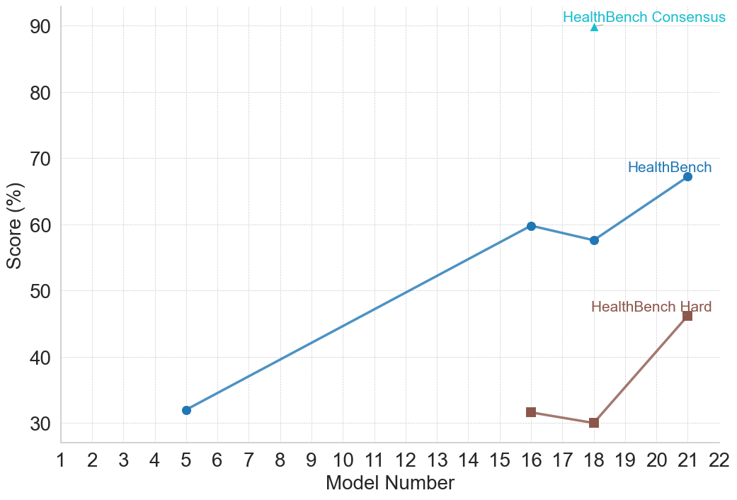
This image is a 2D line and scatter plot illustrating the performance scores (in percentages) of various numbered models across three different evaluation metrics related to "HealthBench." The chart plots discrete model numbers on the horizontal axis against their corresponding percentage scores on the vertical axis.
### Components/Axes
* **Y-axis (Left):** Labeled "Score (%)". The scale ranges from 30 to 90, with major tick marks and corresponding horizontal dashed light-gray grid lines at increments of 10 (30, 40, 50, 60, 70, 80, 90).
* **X-axis (Bottom):** Labeled "Model Number". The scale ranges from 1 to 22, with major tick marks and corresponding vertical dashed light-gray grid lines at increments of 1.
* **Legend:** There is no separate legend box. Instead, data series are labeled directly on the chart area near their respective data points or at the end of their lines.
* Cyan/Light Blue Triangle: `HealthBench Consensus`
* Medium Blue Circle: `HealthBench`
* Brown/Maroon Square: `HealthBench Hard`
### Detailed Analysis
**1. Series: HealthBench Consensus**
* *Spatial Grounding:* Located in the top-right quadrant of the chart area. The label is placed directly above the single data point.
* *Trend Verification:* This is a single, isolated data point; therefore, there is no line or trend to describe.
* *Data Points:*
* Model Number: 18
* Score: ~90.0% (The cyan triangle rests exactly on the 90 grid line).
**2. Series: HealthBench**
* *Spatial Grounding:* Spans from the lower-left to the middle-right of the chart. The label is placed just above the final data point at Model 21.
* *Trend Verification:* The line slopes upward significantly from Model 5 to Model 16, dips slightly downward to Model 18, and then slopes upward again to Model 21.
* *Data Points:*
* Model Number: 5 | Score: ~32% (Medium blue circle, slightly above the 30 line).
* Model Number: 16 | Score: ~60.0% (Medium blue circle, exactly on the 60 line).
* Model Number: 18 | Score: ~58% (Medium blue circle, slightly below the 60 line).
* Model Number: 21 | Score: ~67% (Medium blue circle, situated between 60 and 70, closer to 70).
**3. Series: HealthBench Hard**
* *Spatial Grounding:* Located in the lower-right quadrant of the chart. The label is placed just above the final data point at Model 21.
* *Trend Verification:* The line starts at Model 16, slopes slightly downward to Model 18, and then slopes sharply upward to Model 21.
* *Data Points:*
* Model Number: 16 | Score: ~32% (Brown square, slightly above the 30 line).
* Model Number: 18 | Score: ~30.0% (Brown square, exactly on the 30 line).
* Model Number: 21 | Score: ~46% (Brown square, situated between 40 and 50, slightly above the midpoint).
### Key Observations
* **Data Sparsity:** Data is not provided for every model number. Only models 5, 16, 18, and 21 have recorded scores.
* **Model 18 Convergence:** Model Number 18 is the only point on the x-axis where data exists for all three metrics simultaneously.
* **Difficulty Gap:** For the models where both are measured (16, 18, 21), the standard "HealthBench" score is consistently and significantly higher (by roughly 20-28 percentage points) than the "HealthBench Hard" score.
* **Performance Dip:** Both "HealthBench" and "HealthBench Hard" show a slight decrease in performance from Model 16 to Model 18, before rebounding strongly at Model 21.
* **Outlier/Peak:** The "HealthBench Consensus" score for Model 18 (90%) is a massive outlier compared to the standard score for the same model (~58%).
### Interpretation
* **Evolution of Capability:** The chart likely tracks the historical progression of a specific family of AI models (e.g., iterations of a Large Language Model) on a medical or healthcare-specific evaluation benchmark ("HealthBench"). The general upward trajectory from Model 5 to Model 21 indicates overall improvement in the models' capabilities over time or iterations.
* **Benchmark Stratification:** The introduction of "HealthBench Hard" at Model 16 suggests that as models improved (reaching 60% on the standard benchmark), the evaluators needed a more rigorous subset of questions to prevent the benchmark from topping out and to accurately measure advanced reasoning. The consistent gap proves the "Hard" dataset is functioning as intended.
* **The "Consensus" Anomaly (Peircean Inference):** The most striking feature of the chart is Model 18. While its base performance on standard and hard metrics actually *regressed* slightly compared to Model 16, its "Consensus" score is 90%.
* *Reading between the lines:* "Consensus" usually implies an ensemble method (multiple models voting), a multi-agent framework (e.g., Medprompt), or a human-in-the-loop verification process. The chart demonstrates that while the raw, zero-shot capability of Model 18 might have dipped slightly, applying a "Consensus" methodology to that specific model yields state-of-the-art results, vastly outperforming even the newer Model 21's base score.
* **Milestone Reporting:** The non-sequential x-axis data points (5, 16, 18, 21) suggest these are major milestone releases or specific checkpoints chosen for publication, rather than a continuous daily or weekly training log.