## [Pie Charts]: Task Distribution by Category and Difficulty
### Overview
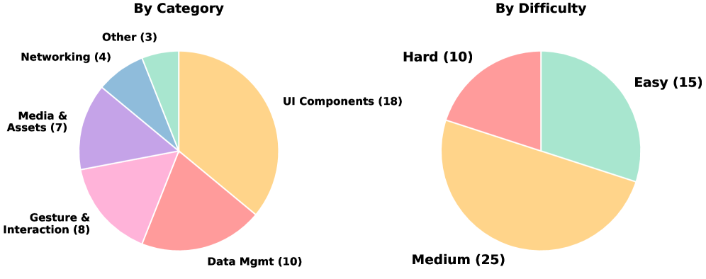
The image displays two distinct pie charts presented side-by-side on a white background. The charts visualize the same dataset of 50 items, categorized in two different ways: first by functional category, and second by difficulty level. The charts are simple 2D pie charts with labeled segments.
### Components/Axes
**Left Chart: "By Category"**
* **Title:** "By Category" (centered above the chart).
* **Segments & Labels (clockwise from top-right):**
* UI Components (18) - Light orange segment.
* Data Mgmt (10) - Salmon pink segment.
* Gesture & Interaction (8) - Light pink segment.
* Media & Assets (7) - Purple segment.
* Networking (4) - Blue segment.
* Other (3) - Light green segment.
* **Total Count:** 50 (sum of all segment values).
**Right Chart: "By Difficulty"**
* **Title:** "By Difficulty" (centered above the chart).
* **Segments & Labels (clockwise from top-right):**
* Easy (15) - Light green segment.
* Medium (25) - Light orange segment.
* Hard (10) - Salmon pink segment.
* **Total Count:** 50 (sum of all segment values).
**Spatial Grounding:** The "By Category" chart occupies the left half of the image. The "By Difficulty" chart occupies the right half. Labels are placed directly adjacent to their corresponding pie segments, with no separate legend box.
### Detailed Analysis
**By Category Chart Data:**
* **UI Components:** 18 items (36% of total). This is the largest segment.
* **Data Mgmt:** 10 items (20% of total).
* **Gesture & Interaction:** 8 items (16% of total).
* **Media & Assets:** 7 items (14% of total).
* **Networking:** 4 items (8% of total).
* **Other:** 3 items (6% of total). This is the smallest segment.
**By Difficulty Chart Data:**
* **Medium:** 25 items (50% of total). This is the largest segment, representing exactly half of all tasks.
* **Easy:** 15 items (30% of total).
* **Hard:** 10 items (20% of total).
**Trend Verification:**
* In the "By Category" chart, the visual size of the segments corresponds directly to the numerical values, with "UI Components" being the most prominent.
* In the "By Difficulty" chart, the "Medium" segment is visually dominant, occupying half the circle, which matches its value of 25 out of 50.
### Key Observations
1. **Dominant Category:** "UI Components" is the most frequent category, comprising over a third of all items.
2. **Difficulty Skew:** Half of all items are classified as "Medium" difficulty, indicating a central tendency in the dataset's complexity.
3. **Consistent Total:** Both charts sum to 50, confirming they represent the same underlying dataset partitioned differently.
4. **Color Reuse:** The color light orange is used for both "UI Components" (largest category) and "Medium" (largest difficulty), potentially implying a visual association between the most common category and the most common difficulty level. Similarly, salmon pink is used for "Data Mgmt" and "Hard".
### Interpretation
This data suggests a structured set of tasks or components, likely for a software development project, training curriculum, or technical assessment. The primary focus is on **User Interface (UI) development**, as evidenced by the "UI Components" category being the largest. The fact that half the tasks are of **"Medium" difficulty** indicates a balanced design, avoiding an excess of trivial or overly complex items, which is optimal for progressive learning or a sustainable workload.
The cross-categorization allows for insightful analysis. For instance, one could investigate if the 18 "UI Components" tasks are predominantly of "Medium" difficulty, or if the 10 "Hard" tasks are concentrated in categories like "Data Mgmt" or "Networking". The presence of an "Other" category (6%) acknowledges minor, miscellaneous tasks that don't fit the primary classifications. Overall, the charts depict a well-defined and categorized body of work with a clear emphasis on UI and a central difficulty level.