## Line Chart: Separation between true and false statements across layers
### Overview
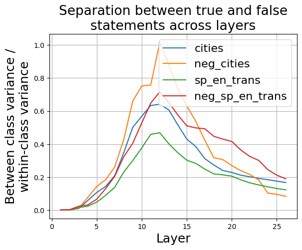
The image is a line chart that illustrates the separation between true and false statements across different layers for four categories: "cities", "neg_cities", "sp_en_trans", and "neg_sp_en_trans". The y-axis represents the ratio of "Between class variance / within-class variance", and the x-axis represents the "Layer". The chart shows how well the model separates true and false statements at each layer.
### Components/Axes
* **Title:** Separation between true and false statements across layers
* **X-axis:**
* Label: Layer
* Scale: 0 to 25, with tick marks at intervals of 5.
* **Y-axis:**
* Label: Between class variance / within-class variance
* Scale: 0.0 to 1.0, with tick marks at intervals of 0.2.
* **Legend:** Located in the top-right corner of the chart.
* cities (Teal)
* neg\_cities (Orange)
* sp\_en\_trans (Green)
* neg\_sp\_en\_trans (Brown)
### Detailed Analysis
* **cities (Teal):** The line starts at approximately 0 at layer 0, increases to a peak of approximately 0.65 at layer 12, and then gradually decreases to approximately 0.2 at layer 26.
* **neg\_cities (Orange):** The line starts at approximately 0 at layer 0, increases to a peak of approximately 1.0 at layer 12, and then gradually decreases to approximately 0.1 at layer 26.
* **sp\_en\_trans (Green):** The line starts at approximately 0 at layer 0, increases to a peak of approximately 0.47 at layer 13, and then gradually decreases to approximately 0.15 at layer 26.
* **neg\_sp\_en\_trans (Brown):** The line starts at approximately 0 at layer 0, increases to a peak of approximately 0.7 at layer 13, and then gradually decreases to approximately 0.2 at layer 26.
### Key Observations
* All four categories show a similar trend: an initial increase in the variance ratio, followed by a decrease.
* "neg\_cities" reaches the highest peak variance ratio, indicating the best separation between true and false statements for this category around layer 12.
* "sp\_en\_trans" has the lowest peak variance ratio, suggesting a less distinct separation between true and false statements compared to the other categories.
* The peak separation occurs around layers 12-13 for all categories.
### Interpretation
The chart suggests that the model's ability to distinguish between true and false statements varies across different layers and categories. The "neg\_cities" category shows the most distinct separation, while "sp\_en\_trans" shows the least. The peak separation around layers 12-13 indicates that these layers are most effective in differentiating between true and false statements for these tasks. The initial increase in variance ratio likely corresponds to the model learning relevant features, while the subsequent decrease may indicate overfitting or a loss of discriminative power in later layers.