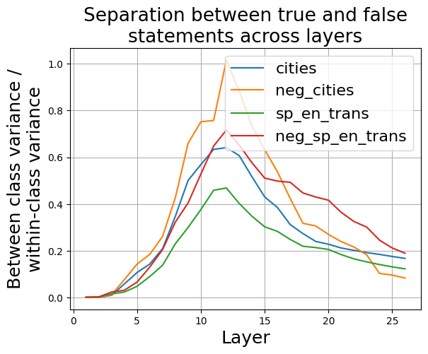
## Line Chart: Separation between true and false statements across layers
### Overview
This line chart visualizes the separation between true and false statements across different layers. The y-axis represents the ratio of between-class variance to within-class variance, indicating the degree of separation. The x-axis represents the layer number. Four different data series are plotted, each representing a different condition or dataset.
### Components/Axes
* **Title:** "Separation between true and false statements across layers" (centered at the top)
* **X-axis Label:** "Layer" (bottom-center)
* Scale: 0 to 28, with gridlines at integer values.
* **Y-axis Label:** "Between class variance / within-class variance" (left-center)
* Scale: 0 to 1.0, with gridlines at 0.2 intervals.
* **Legend:** Located in the top-right corner.
* "cities" - Blue line
* "neg\_cities" - Orange line
* "sp\_en\_trans" - Green line
* "neg\_sp\_en\_trans" - Red line
### Detailed Analysis
The chart displays four lines representing the separation ratio for different conditions as the layer number increases.
* **cities (Blue Line):** The line starts at approximately 0.0 at layer 0. It gradually increases, reaching approximately 0.2 at layer 5. There is a sharp increase between layers 9 and 11, peaking at approximately 0.95 at layer 11. After layer 11, the line declines steadily, reaching approximately 0.15 at layer 28.
* **neg\_cities (Orange Line):** This line also starts near 0.0 at layer 0. It increases more rapidly than the "cities" line, reaching approximately 0.4 at layer 5. It peaks at approximately 0.85 at layer 10, then declines more quickly than the "cities" line, reaching approximately 0.2 at layer 28.
* **sp\_en\_trans (Green Line):** This line begins at approximately 0.0 at layer 0. It increases gradually, reaching approximately 0.25 at layer 5. It peaks at approximately 0.6 at layer 12, and then declines more slowly than the "neg\_cities" line, reaching approximately 0.1 at layer 28.
* **neg\_sp\_en\_trans (Red Line):** This line starts at approximately 0.0 at layer 0. It increases steadily, reaching approximately 0.35 at layer 5. It peaks at approximately 0.5 at layer 10, and then declines gradually, reaching approximately 0.3 at layer 28.
### Key Observations
* All four lines show an initial increase in separation ratio as the layer number increases.
* The "cities" and "neg\_cities" lines exhibit the most pronounced peaks, indicating a strong separation between true and false statements at specific layers.
* The "neg\_cities" line peaks earlier (layer 10) than the "cities" line (layer 11).
* The "sp\_en\_trans" and "neg\_sp\_en\_trans" lines have lower peak separation ratios and a more gradual decline.
* The "neg\_cities" line shows the most rapid decline after its peak.
### Interpretation
The chart suggests that the separation between true and false statements improves with increasing layer number, up to a certain point. The different lines likely represent different datasets or conditions, with "cities" and "neg\_cities" showing the strongest separation. The negative conditions ("neg\_cities" and "neg\_sp\_en\_trans") might represent some form of contrastive learning or adversarial training, where the model is explicitly trained to distinguish between true and false statements. The peaks in the lines indicate layers where the separation is maximized, suggesting these layers are particularly effective at distinguishing between the two classes. The subsequent decline could indicate overfitting or a loss of generalization ability. The differences between the lines suggest that the specific dataset or condition influences the optimal layer for separation. The chart provides insights into the learning process and the effectiveness of different layers in a model for distinguishing between true and false statements.