## Line Chart: Separation between true and false statements across layers
### Overview
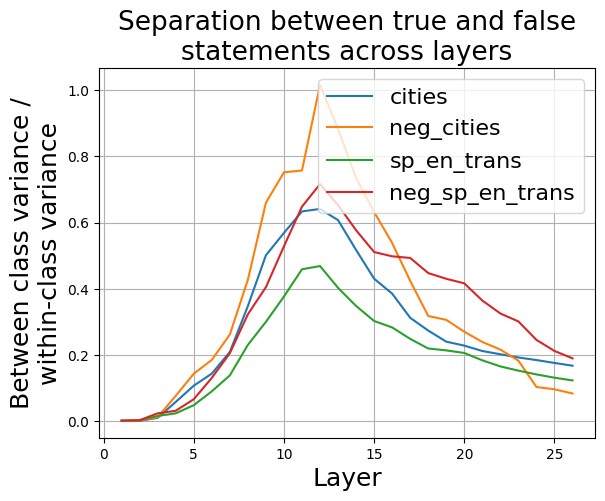
The image is a line chart titled "Separation between true and false statements across layers." It plots a metric defined as "Between class variance / within-class variance" on the y-axis against "Layer" on the x-axis for four different data series. The chart illustrates how this separation metric changes across approximately 26 layers of a model or system.
### Components/Axes
* **Title:** "Separation between true and false statements across layers" (centered at the top).
* **Y-axis Label:** "Between class variance / within-class variance" (rotated vertically on the left). The scale ranges from 0.0 to 1.0, with major tick marks at 0.0, 0.2, 0.4, 0.6, 0.8, and 1.0.
* **X-axis Label:** "Layer" (centered at the bottom). The scale ranges from 0 to 25, with major tick marks at 0, 5, 10, 15, 20, and 25.
* **Legend:** Located in the top-right quadrant of the chart area. It contains four entries, each with a colored line segment and a label:
* Blue line: `cities`
* Orange line: `neg_cities`
* Green line: `sp_en_trans`
* Red line: `neg_sp_en_trans`
* **Grid:** A light gray grid is present, aligning with the major tick marks on both axes.
### Detailed Analysis
The chart displays four data series, each following a similar overall trend: starting near zero, rising to a peak between layers 10 and 15, and then declining towards the final layers (25-26). The magnitude and exact peak location vary by series.
**Trend Verification & Data Points (Approximate):**
1. **`cities` (Blue Line):**
* **Trend:** Slopes upward from layer 1, peaks, then slopes downward.
* **Key Points:** Starts near 0.0 at layer 1. Rises steadily to a peak of approximately **0.65** around **layer 12**. Declines to about **0.18** by layer 26.
2. **`neg_cities` (Orange Line):**
* **Trend:** Slopes upward more steeply than `cities`, reaches the highest peak of all series, then declines.
* **Key Points:** Starts near 0.0 at layer 1. Rises sharply to a peak of approximately **1.0** (the maximum of the y-axis) at **layer 12**. Declines to about **0.08** by layer 26.
3. **`sp_en_trans` (Green Line):**
* **Trend:** Slopes upward, but remains the lowest of the four series throughout. Peaks and declines.
* **Key Points:** Starts near 0.0 at layer 1. Rises to a peak of approximately **0.47** around **layer 12**. Declines to about **0.12** by layer 26.
4. **`neg_sp_en_trans` (Red Line):**
* **Trend:** Slopes upward, generally positioned between the `cities` and `sp_en_trans` lines. Peaks and declines.
* **Key Points:** Starts near 0.0 at layer 1. Rises to a peak of approximately **0.70** around **layer 12**. Declines to about **0.20** by layer 26.
**Spatial Grounding & Cross-Reference:**
* The legend is positioned in the top-right, overlapping the descending portion of the lines.
* The orange line (`neg_cities`) is visually the highest at its peak, confirming its value of ~1.0.
* The green line (`sp_en_trans`) is consistently the lowest, confirming its peak of ~0.47.
* The red line (`neg_sp_en_trans`) peaks slightly higher than the blue line (`cities`), at ~0.70 vs. ~0.65.
### Key Observations
1. **Common Peak Layer:** All four series reach their maximum value at or very near **layer 12**.
2. **Hierarchy of Separation:** There is a clear and consistent ordering in the magnitude of the separation metric across most layers: `neg_cities` (highest) > `neg_sp_en_trans` > `cities` > `sp_en_trans` (lowest).
3. **Negation Effect:** For both the "cities" and "sp_en_trans" categories, the version with the `neg_` prefix (likely indicating negation) exhibits a significantly higher peak separation than its non-negated counterpart.
4. **Convergence at Extremes:** All lines start near 0.0 at the earliest layers and converge to a narrow range between approximately 0.08 and 0.20 by the final layers (25-26).
### Interpretation
This chart likely visualizes a metric from an analysis of a neural network's internal representations, comparing how the model distinguishes between true and false statements across its layers.
* **What the data suggests:** The "between-class variance / within-class variance" ratio is a measure of separability. A higher value indicates that representations for true statements are more distinct from representations for false statements (high between-class variance) relative to the spread within each group (within-class variance).
* **How elements relate:** The peak at layer 12 suggests this is the layer where the model's internal representations are most effective at separating truth from falsehood for these specific categories. The subsequent decline indicates that in later layers, this specific separability metric decreases, possibly as information is integrated for final prediction.
* **Notable Patterns & Anomalies:**
* The most striking finding is the **amplified separation for negated statements** (`neg_cities`, `neg_sp_en_trans`). This implies the model's processing of negation creates a stronger contrast in its internal activations between true and false claims compared to non-negated statements.
* The consistent hierarchy suggests the model finds the "cities" domain inherently easier to separate (higher baseline variance ratio) than the "sp_en_trans" (likely Spanish-English translation) domain, regardless of negation.
* The convergence at the final layers is logical, as the model's representations are being funneled toward a single output decision, reducing the dimensionality where such variance ratios are measured.
**In summary, the chart provides evidence that a model's ability to internally distinguish truth from falsehood is not uniform across its depth, peaks in middle layers, and is significantly modulated by linguistic features like negation and task domain.**