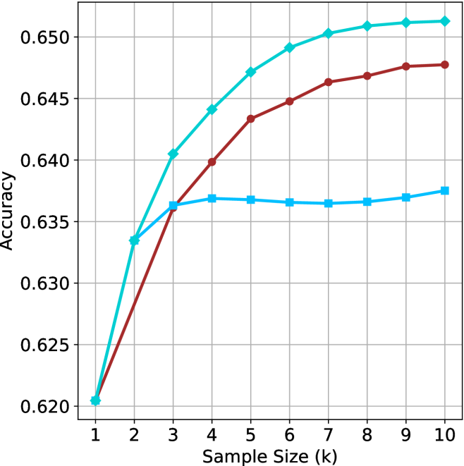
## Line Chart: Accuracy vs. Sample Size
### Overview
This image presents a line chart illustrating the relationship between sample size and accuracy. Three distinct lines represent different data series, showing how accuracy changes as the sample size increases from 1k to 10k. The chart is set against a white background with a gray grid for easier readability.
### Components/Axes
* **X-axis:** Labeled "Sample Size (k)". The scale ranges from 1 to 10, representing sample sizes in thousands.
* **Y-axis:** Labeled "Accuracy". The scale ranges from 0.620 to 0.650.
* **Lines:** Three lines are present, each with a distinct color:
* Cyan/Light Blue
* Red
* Blue
* **Grid:** A gray grid is overlaid on the chart to aid in reading values.
### Detailed Analysis
Let's analyze each line individually, noting trends and approximate data points.
* **Cyan/Light Blue Line:** This line exhibits a strong upward trend, initially steep, then gradually flattening.
* At Sample Size = 1k, Accuracy ≈ 0.620
* At Sample Size = 2k, Accuracy ≈ 0.635
* At Sample Size = 3k, Accuracy ≈ 0.642
* At Sample Size = 4k, Accuracy ≈ 0.645
* At Sample Size = 5k, Accuracy ≈ 0.648
* At Sample Size = 6k, Accuracy ≈ 0.649
* At Sample Size = 7k, Accuracy ≈ 0.650
* At Sample Size = 8k, Accuracy ≈ 0.650
* At Sample Size = 9k, Accuracy ≈ 0.650
* At Sample Size = 10k, Accuracy ≈ 0.650
* **Red Line:** This line also shows an upward trend, but it is less pronounced than the cyan line. It appears to plateau earlier.
* At Sample Size = 1k, Accuracy ≈ 0.620
* At Sample Size = 2k, Accuracy ≈ 0.636
* At Sample Size = 3k, Accuracy ≈ 0.640
* At Sample Size = 4k, Accuracy ≈ 0.643
* At Sample Size = 5k, Accuracy ≈ 0.645
* At Sample Size = 6k, Accuracy ≈ 0.646
* At Sample Size = 7k, Accuracy ≈ 0.646
* At Sample Size = 8k, Accuracy ≈ 0.647
* At Sample Size = 9k, Accuracy ≈ 0.647
* At Sample Size = 10k, Accuracy ≈ 0.647
* **Blue Line:** This line initially rises, then plateaus and even slightly decreases at higher sample sizes.
* At Sample Size = 1k, Accuracy ≈ 0.620
* At Sample Size = 2k, Accuracy ≈ 0.637
* At Sample Size = 3k, Accuracy ≈ 0.639
* At Sample Size = 4k, Accuracy ≈ 0.639
* At Sample Size = 5k, Accuracy ≈ 0.638
* At Sample Size = 6k, Accuracy ≈ 0.637
* At Sample Size = 7k, Accuracy ≈ 0.637
* At Sample Size = 8k, Accuracy ≈ 0.637
* At Sample Size = 9k, Accuracy ≈ 0.637
* At Sample Size = 10k, Accuracy ≈ 0.637
### Key Observations
* The cyan line consistently demonstrates the highest accuracy across all sample sizes.
* The blue line shows diminishing returns in accuracy as the sample size increases beyond 4k, and even a slight decrease.
* The red line exhibits a moderate increase in accuracy, but plateaus before reaching the levels of the cyan line.
* All three lines start at the same accuracy level (0.620) at a sample size of 1k.
### Interpretation
The chart suggests that increasing the sample size generally improves accuracy, but the rate of improvement varies depending on the data series. The cyan line indicates a method or model that benefits significantly from larger sample sizes, achieving high accuracy with a sample size of 7k or greater. The red line suggests a moderate improvement with increasing sample size, while the blue line indicates that beyond a certain point (around 4k), increasing the sample size does not lead to further accuracy gains and may even slightly reduce it. This could be due to factors like data redundancy, noise, or limitations in the underlying model. The initial convergence of all lines at a sample size of 1k suggests a common baseline performance before the different methods diverge. This data could be used to optimize sample size selection for a given accuracy target, balancing the cost of data acquisition with the desired level of performance.