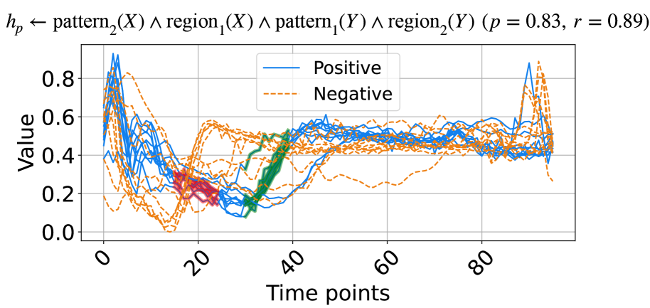
## Line Chart: Pattern-Region Hypothesis Performance Over Time
### Overview
The image displays a line chart plotting multiple time-series data series against a "Value" metric over "Time points." The chart is titled with a logical hypothesis expression and associated statistical performance metrics. It compares two primary categories, "Positive" and "Negative," each represented by multiple individual lines, suggesting multiple trials or samples per category. Two distinct clusters of data points, colored red and green, are overlaid on the main lines in the early-to-mid time range.
### Components/Axes
* **Title/Header:** Located at the top center. Text: `hₚ ← pattern₂(X) ∧ region₁(X) ∧ pattern₁(Y) ∧ region₂(Y) (p = 0.83, r = 0.89)`. This appears to define a hypothesis (`hₚ`) as a logical conjunction of patterns and regions for variables X and Y, with a p-value of 0.83 and a correlation coefficient (r) of 0.89.
* **Y-Axis:** Labeled "Value" (vertical text, left side). Scale ranges from 0.0 to 0.8 with major tick marks at 0.0, 0.2, 0.4, 0.6, and 0.8.
* **X-Axis:** Labeled "Time points" (bottom center). Scale ranges from 0 to approximately 90, with major labeled tick marks at 0, 20, 40, 60, and 80.
* **Legend:** Positioned in the top-center area of the plot, inside the axes. It contains two entries:
* A solid blue line labeled "Positive".
* A dashed orange line labeled "Negative".
* **Data Series:**
* **Positive (Solid Blue Lines):** Multiple (approximately 8-10) solid blue lines. They generally start at high values (0.6-0.8+) at Time point 0, show a sharp decline to a trough between Time points 15-25 (values ~0.1-0.3), then recover and stabilize in the 0.4-0.6 range for the remainder of the timeline, with a notable spike near Time point 90.
* **Negative (Dashed Orange Lines):** Multiple (approximately 8-10) dashed orange lines. They exhibit higher volatility. Many start lower than the Positive lines, dip to very low values (near 0.0) around Time point 15, then rise sharply. They fluctuate significantly in the middle range (Time points 20-70) and show a dramatic, synchronized spike to high values (0.7-0.9) near Time point 90 before dropping again.
* **Overlaid Clusters:**
* **Red Cluster:** A dense grouping of red data points or short line segments located approximately between Time points 15-25 and Value 0.1-0.3. This cluster overlaps with the trough region of many lines.
* **Green Cluster:** A dense grouping of green data points or short line segments located approximately between Time points 30-40 and Value 0.2-0.5. This cluster is positioned on the rising slope following the initial trough.
### Detailed Analysis
* **Trend Verification - Positive (Blue) Series:** The general trend for the Positive series is a "U" or "check mark" shape: high initial value, a pronounced dip in the first quarter of the timeline, followed by a recovery and a relatively stable plateau with minor fluctuations, ending with a late spike.
* **Trend Verification - Negative (Orange) Series:** The Negative series trend is more complex and volatile. It shows an initial decline to a deep minimum, a sharp rebound, a period of high variance and oscillation in the middle, culminating in a very sharp, collective peak near the end of the observed time range.
* **Spatial Grounding of Clusters:** The red cluster is situated in the lower-left quadrant of the main data area, precisely where both Positive and Negative series reach their lowest values. The green cluster is positioned to the right of the red cluster, along the upward trajectory where values are increasing from the trough.
* **Statistical Annotation:** The title provides key metrics: `p = 0.83` (suggesting a non-significant p-value if this is a statistical test) and `r = 0.89` (indicating a strong positive correlation).
### Key Observations
1. **Divergent Early Behavior:** Positive and Negative series show their most distinct separation in the initial phase (Time 0-15), with Positive starting much higher.
2. **Convergent Trough:** Both series converge to their lowest values in the Time 15-25 window, which is also where the red cluster is located.
3. **Mid-Chart Volatility:** The Negative series exhibits substantially more noise and fluctuation between Time points 20 and 70 compared to the smoother Positive series.
4. **Synchronized Late Spike:** A striking feature is the near-simultaneous sharp peak in almost all Negative series lines and some Positive lines around Time point 90.
5. **Cluster Significance:** The red and green clusters highlight specific temporal regions (early trough and subsequent rise) that are likely critical to the hypothesis being tested, as indicated by the title.
### Interpretation
This chart visualizes the temporal dynamics of a model or system's output ("Value") under conditions hypothesized to be "Positive" or "Negative." The title suggests the chart evaluates a specific, complex hypothesis (`hₚ`) involving the conjunction of patterns and regions across two variables (X and Y).
The data demonstrates that the "Positive" condition leads to a more stable and predictable recovery after an initial drop, while the "Negative" condition is associated with high instability and a dramatic, late-stage anomaly (the spike). The strong correlation (`r=0.89`) noted in the title may refer to the relationship between the hypothesized conditions and the observed value trajectories, despite the high p-value (`p=0.83`) which might indicate the observed pattern could occur by chance under a null hypothesis, or relates to a different statistical test.
The red and green clusters likely mark algorithmically identified "regions of interest" (`region₁` and `region₂` from the title) where specific patterns (`pattern₁`, `pattern₂`) are detected. Their placement in the trough and recovery phases suggests these are the critical periods where the logical conditions of the hypothesis are most active or discriminative. The chart ultimately suggests that the defined hypothesis `hₚ` captures a meaningful temporal signature that differentiates the two conditions, particularly in the early dip and the mid-chart volatility, with the late spike being a notable, possibly anomalous, event.