\n
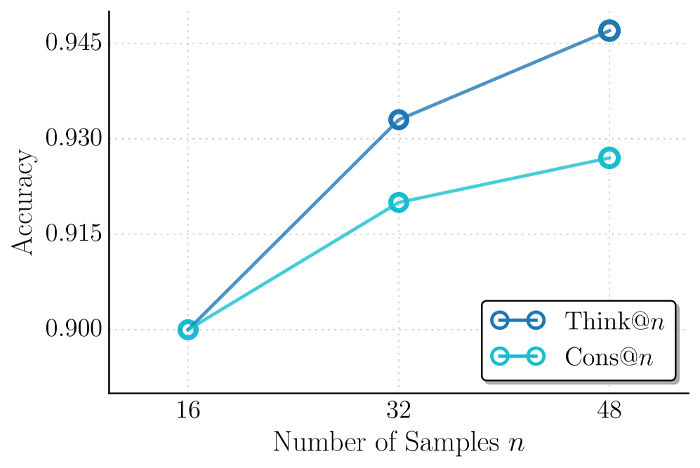
## Line Chart: Accuracy vs. Number of Samples
### Overview
This image presents a line chart illustrating the relationship between the number of samples (n) and accuracy for two different methods: "Think@n" and "Cons@n". The chart displays accuracy on the y-axis and the number of samples on the x-axis.
### Components/Axes
* **X-axis Title:** "Number of Samples n"
* **Y-axis Title:** "Accuracy"
* **X-axis Markers:** 16, 32, 48
* **Y-axis Scale:** Ranges from approximately 0.900 to 0.945, with gridlines at 0.900, 0.915, 0.930, and 0.945.
* **Legend:** Located in the top-right corner.
* "Think@n" - Represented by a blue line with circular markers.
* "Cons@n" - Represented by a teal line with circular markers.
### Detailed Analysis
**Think@n (Blue Line):**
The blue line representing "Think@n" shows a generally upward trend.
* At n = 16, Accuracy ≈ 0.900.
* At n = 32, Accuracy ≈ 0.930.
* At n = 48, Accuracy ≈ 0.945.
**Cons@n (Teal Line):**
The teal line representing "Cons@n" also shows an upward trend, but it plateaus after n = 32.
* At n = 16, Accuracy ≈ 0.900.
* At n = 32, Accuracy ≈ 0.930.