## Grouped Bar Chart: F1 vs. BLEU-1 Scores by k Value
### Overview
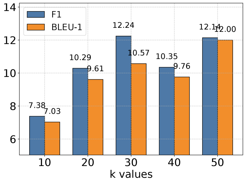
The image is a grouped bar chart comparing the performance of two metrics, F1 and BLEU-1, across five different values of a parameter labeled "k". The chart displays numerical scores on the y-axis against discrete k values on the x-axis. Each k value has a pair of bars: a blue bar for the F1 score and an orange bar for the BLEU-1 score.
### Components/Axes
* **Chart Type:** Grouped Bar Chart.
* **X-Axis:**
* **Label:** "k values"
* **Categories/Markers:** 10, 20, 30, 40, 50.
* **Y-Axis:**
* **Scale:** Linear, ranging from 6 to 14.
* **Major Tick Marks:** 6, 8, 10, 12, 14.
* **Legend:**
* **Position:** Top-left corner of the chart area.
* **Items:**
* A blue square labeled "F1".
* An orange square labeled "BLEU-1".
* **Data Labels:** Each bar has its exact numerical value displayed directly above it.
### Detailed Analysis
The chart presents the following data points for each k value:
| k value | F1 Score (Blue Bar) | BLEU-1 Score (Orange Bar) |
| :------ | :------------------ | :------------------------ |
| **10** | 7.38 | 7.03 |
| **20** | 10.29 | 9.61 |
| **30** | 12.24 | 10.57 |
| **40** | 10.35 | 9.76 |
| **50** | 12.14 | 12.00 |
**Trend Verification:**
* **F1 Series (Blue):** The line connecting the tops of the blue bars shows an overall upward trend from k=10 to k=50, with a notable peak at k=30 (12.24) and a dip at k=40 (10.35) before rising again at k=50.
* **BLEU-1 Series (Orange):** The line connecting the tops of the orange bars also shows a general upward trend. It increases from k=10 to k=30, dips slightly at k=40, and then reaches its highest point at k=50.
### Key Observations
1. **Consistent Performance Gap:** For every k value shown, the F1 score is higher than the corresponding BLEU-1 score.
2. **Peak Performance:** The highest F1 score (12.24) occurs at k=30. The highest BLEU-1 score (12.00) occurs at k=50.
3. **Performance Dip at k=40:** Both metrics show a decrease in score when moving from k=30 to k=40, breaking the otherwise increasing trend.
4. **Convergence at k=50:** At k=50, the scores for F1 (12.14) and BLEU-1 (12.00) are very close, representing the smallest gap between the two metrics on the chart.
5. **Lowest Performance:** The lowest scores for both metrics are at k=10 (F1: 7.38, BLEU-1: 7.03).
### Interpretation
This chart likely illustrates the results of a hyperparameter tuning experiment for a machine learning model, possibly in natural language processing or information retrieval, where "k" is a key parameter (e.g., number of retrieved documents, beam search size, or a similar top-k selection parameter).
The data suggests that increasing the k value generally improves both F1 (a measure of a test's accuracy, considering both precision and recall) and BLEU-1 (a metric for evaluating machine-generated text against reference texts). However, the relationship is not perfectly linear. The peak in F1 at k=30 followed by a dip at k=40 indicates a potential optimal point or a region of instability in model performance. The convergence of scores at k=50 might imply that at higher k values, the model's behavior as measured by these two distinct metrics becomes more similar.
The consistent superiority of F1 over BLEU-1 scores could indicate that the model is better optimized for the task measured by F1, or that the BLEU-1 metric is inherently more challenging for this specific task. The dip at k=40 is a critical anomaly that would warrant further investigation—it could signal overfitting, a change in data distribution for that test case, or an interaction effect with other parameters. Overall, the chart demonstrates that parameter "k" has a significant and non-monotonic impact on model performance, with k=30 and k=50 being the most promising values tested.