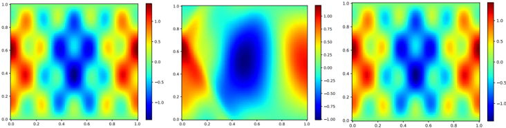
## Heatmap Series: Normalized Spatial Distribution Patterns
### Overview
The image displays three horizontally arranged 2D heatmaps, each plotting a scalar field over a normalized unit square domain (x: 0.0 to 1.0, y: 0.0 to 1.0). Each heatmap is accompanied by its own vertical color bar (legend) on its right side, mapping color to numerical values. The left and right heatmaps exhibit highly similar, symmetric patterns, while the central heatmap shows a distinctly different, asymmetric distribution.
### Components/Axes
* **Chart Type:** Three separate 2D heatmaps (contour plots).
* **Axes:** All three plots share identical axes.
* **X-axis:** Linear scale from 0.0 to 1.0, with major tick marks at 0.0, 0.2, 0.4, 0.6, 0.8, 1.0.
* **Y-axis:** Linear scale from 0.0 to 1.0, with major tick marks at 0.0, 0.2, 0.4, 0.6, 0.8, 1.0.
* **Color Bars (Legends):** Each plot has an independent color bar positioned to its immediate right.
* **Left Plot Color Bar:** Range approximately -1.0 to 1.0. Ticks at -1.0, -0.5, 0.0, 0.5, 1.0.
* **Middle Plot Color Bar:** Range approximately -1.00 to 1.00. Ticks at -1.00, -0.75, -0.50, -0.25, 0.00, 0.25, 0.50, 0.75, 1.00.
* **Right Plot Color Bar:** Range approximately -1.0 to 1.0. Ticks at -1.0, -0.5, 0.0, 0.5, 1.0.
* **Color Mapping:** A "jet" or similar rainbow colormap is used across all plots: deep blue represents the minimum value (~-1.0), transitioning through cyan, green, yellow, to deep red for the maximum value (~1.0). Green/yellow tones represent values near zero.
### Detailed Analysis
**1. Left Heatmap:**
* **Pattern:** Exhibits a complex, symmetric pattern resembling a grid of alternating high (red) and low (blue) value regions. There are prominent red peaks near the corners (e.g., top-left, bottom-left) and along the left and right edges. A central vertical band of blue (low values) is flanked by green/yellow (near-zero) regions. The pattern has a vertical mirror symmetry about x=0.5.
* **Spatial Grounding:** High-value (red) regions are concentrated at the left and right boundaries. Low-value (blue) regions form a central vertical corridor and smaller pockets within the grid.
**2. Middle Heatmap:**
* **Pattern:** Shows a markedly different, asymmetric distribution. A large, dominant region of deep blue (minimum values) occupies the center, roughly centered at (x=0.5, y=0.5). This central low is surrounded by a ring of green/yellow (near-zero values). High-value (red) regions are concentrated along the left and right edges, with the left edge showing a more intense and vertically extended red area compared to the right.
* **Spatial Grounding:** The primary low (blue) is centrally located. The primary highs (red) are at the left and right peripheries, with the left-side high being more prominent.
**3. Right Heatmap:**
* **Pattern:** Visually nearly identical to the Left Heatmap. It displays the same symmetric grid of alternating high and low regions, with red peaks at the corners and edges, and a central blue vertical band.
* **Spatial Grounding:** Identical to the Left Heatmap. Highs at left/right edges and corners; lows in a central vertical band and grid pockets.
### Key Observations
1. **Symmetry vs. Asymmetry:** The left and right heatmaps are symmetric about the vertical centerline (x=0.5). The middle heatmap is asymmetric, with its central feature slightly offset and its left-edge high more pronounced than its right-edge high.
2. **Pattern Similarity:** The left and right heatmaps are visually indistinguishable, suggesting they represent the same or very closely related data/functions.
3. **Central Feature Contrast:** The most striking difference is the central feature: a vertical blue band in the left/right plots versus a large, circular blue blob in the middle plot.
4. **Color Bar Precision:** The middle plot's color bar uses two decimal places for its tick labels, while the left and right use one. This may indicate a higher precision in the underlying data or simply a formatting choice.
### Interpretation
This image likely visualizes the results of a computational simulation or mathematical function evaluation over a 2D domain. The heatmaps could represent:
* **Physical Phenomena:** Such as wave interference patterns, stress/strain fields, or fluid flow properties. The symmetric left/right plots might represent a standing wave pattern or a symmetric mode shape, while the middle plot could represent a different, asymmetric mode or a superposition state.
* **Mathematical Functions:** The patterns resemble solutions to partial differential equations (e.g., the wave equation, Laplace's equation) on a unit square with specific boundary conditions. The left/right plots suggest a solution with symmetry, possibly involving sine/cosine terms in both x and y. The middle plot suggests a solution dominated by a single, broader feature.
* **Data Comparison:** The arrangement strongly implies a comparison. The left and right plots may be "before" and "after" states that are unchanged, or two identical control cases, while the middle plot represents a distinct experimental condition or a different variable altogether. The near-perfect match between left and right is a key finding, indicating stability, reproducibility, or identity between those two datasets.
**Notable Anomaly:** The primary anomaly is the stark difference in the central pattern of the middle heatmap compared to its neighbors. This suggests a fundamental change in the underlying system's state, boundary conditions, or the function being plotted for that specific case. The investigation would focus on what parameter was varied to produce this distinct central low-pressure (or low-value) region.