## 3D Surface Plots: Visualization of Z-Value Variations
### Overview
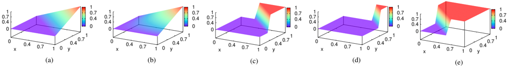
The image contains five 3D surface plots (labeled a–e) depicting variations in a z-value (0–1) across x and y axes (0–1). Each plot uses a color gradient (blue = 0, red = 1) to represent z-values, with axes labeled x, y, and z. The plots illustrate distinct spatial patterns, including linear gradients, discontinuities, and localized peaks.
### Components/Axes
- **Axes**:
- X-axis: Labeled "x" (0–1).
- Y-axis: Labeled "y" (0–1).
- Z-axis: Labeled "z" (0–1).
- **Color Legend**:
- Positioned on the right of each plot.
- Gradient: Blue (0) → Red (1).
- Label: "z" (implicit).
### Detailed Analysis
#### Plot (a)
- **Structure**: Flat triangular surface sloping from (0,0,0) to (1,1,1).
- **Trend**: Linear increase in z with x and y.
- **Color**: Blue (z=0) at origin, transitioning to red (z=1) at (1,1,1).
#### Plot (b)
- **Structure**: Flat triangular surface sloping from (0,1,1) to (1,0,1).
- **Trend**: Linear increase in z with x and inverse y.
- **Color**: Blue (z=0) at (1,1,0), transitioning to red (z=1) at (0,1,1) and (1,0,1).
#### Plot (c)
- **Structure**: Flat surface with a sharp vertical drop at x=0.5.
- **Trend**:
- z=0.7 for x < 0.5.
- z=0 for x ≥ 0.5.
- **Color**: Blue (z=0) for x ≥ 0.5, green (z=0.7) for x < 0.5.
#### Plot (d)
- **Structure**: Flat surface with a vertical spike at x=0.5.
- **Trend**:
- z=0.4 for x ≠ 0.5.
- z=1 at x=0.5.
- **Color**: Blue (z=0.4) for x ≠ 0.5, red (z=1) at x=0.5.
#### Plot (e)
- **Structure**: Flat surface with a red-highlighted region in the top-right corner (x=0.7–1, y=0.7–1).
- **Trend**:
- z=0.7 in the red region.
- z=0 elsewhere.
- **Color**: Blue (z=0) for x < 0.7 or y < 0.7, red (z=0.7) in the highlighted region.
### Key Observations
1. **Linear Gradients**: Plots (a) and (b) show smooth, continuous z-increases.
2. **Discontinuities**: Plot (c) exhibits an abrupt z-drop at x=0.5.
3. **Localized Peaks**: Plot (d) features a singular spike at x=0.5.
4. **Regional Highlighting**: Plot (e) isolates a high-z region in the top-right quadrant.
### Interpretation
The plots likely represent scenarios in a parametric model where z-values depend on x and y. The color gradients emphasize z-magnitude, while discontinuities (e.g., plot c) suggest threshold effects. The spike in plot (d) could indicate a critical point or anomaly, and the highlighted region in (e) may represent a targeted area of interest. These visualizations are useful for identifying patterns, thresholds, or anomalies in multidimensional data.