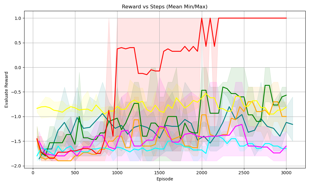
## Line Chart: Reward vs Steps (Mean Min/Max)
### Overview
The image is a line chart displaying the "Evaluate Reward" on the y-axis against "Episode" (steps) on the x-axis. There are multiple lines, each representing a different data series, with shaded regions around each line indicating the min/max range. The chart title is "Reward vs Steps (Mean Min/Max)".
### Components/Axes
* **Title:** Reward vs Steps (Mean Min/Max)
* **X-axis:**
* Label: Episode
* Scale: 0 to 3000, with markers at 0, 500, 1000, 1500, 2000, 2500, and 3000.
* **Y-axis:**
* Label: Evaluate Reward
* Scale: -2.0 to 1.0, with markers at -2.0, -1.5, -1.0, -0.5, 0.0, 0.5, and 1.0.
* **Data Series:** There are 6 data series represented by different colored lines: red, yellow, green, teal, orange, and magenta. Each line has a shaded region around it, indicating the min/max range for that series. There is no explicit legend.
### Detailed Analysis
**Red Line:**
* Trend: Starts around -1.8, increases sharply around episode 900 to approximately 0.4, then fluctuates between -0.2 and 0.4 until around episode 2000, where it spikes to 1.0, and remains at 1.0 until the end.
* Data Points:
* Episode 0: -1.8
* Episode 900: 0.4
* Episode 1500: -0.2
* Episode 2000: 1.0
* Episode 3000: 1.0
**Yellow Line:**
* Trend: Starts around -0.8, fluctuates between -0.7 and -1.0 throughout the entire range.
* Data Points:
* Episode 0: -0.8
* Episode 1500: -0.8
* Episode 3000: -0.7
**Green Line:**
* Trend: Starts around -1.6, increases to around -1.0 by episode 500, fluctuates between -0.5 and -1.5 until the end.
* Data Points:
* Episode 0: -1.6
* Episode 500: -1.0
* Episode 1800: -0.5
* Episode 3000: -0.6
**Teal Line:**
* Trend: Starts around -1.8, increases to around -1.5 by episode 500, fluctuates between -1.5 and -1.8 until the end.
* Data Points:
* Episode 0: -1.8
* Episode 500: -1.5
* Episode 3000: -1.6
**Orange Line:**
* Trend: Starts around -1.8, increases to around -1.6 by episode 500, fluctuates between -1.2 and -1.8 until the end.
* Data Points:
* Episode 0: -1.8
* Episode 500: -1.6
* Episode 3000: -1.2
**Magenta Line:**
* Trend: Starts around -1.7, increases to around -1.4 by episode 500, fluctuates between -1.4 and -1.8 until the end.
* Data Points:
* Episode 0: -1.7
* Episode 500: -1.4
* Episode 3000: -1.7
### Key Observations
* The red line shows a significant increase in reward around episode 900 and then stabilizes at the maximum reward (1.0) after episode 2000.
* The other lines (yellow, green, teal, orange, and magenta) show relatively stable rewards, fluctuating within a narrower range between -0.5 and -1.8.
* The shaded regions around each line indicate the variability (min/max) of the reward for each series.
### Interpretation
The chart suggests that the red data series (likely representing a specific algorithm or configuration) learns to achieve a high reward after a certain number of episodes (around 900), eventually reaching and maintaining the maximum possible reward. The other series show less learning progress and remain at lower reward levels. The shaded regions indicate the consistency of the rewards for each series, with wider regions suggesting more variability. The red series demonstrates a clear learning curve, while the others show limited improvement over the course of the episodes.