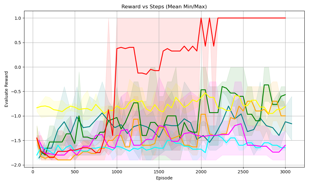
## Line Chart: Reward vs Steps (Mean Min/Max)
### Overview
The chart visualizes the relationship between "Episode" (x-axis) and "Evaluation Reward" (y-axis) across multiple data series. It features six colored lines with shaded regions (likely representing min/max variability) and a prominent red line with a sharp spike. The y-axis ranges from -2.0 to 1.0, while the x-axis spans 0 to 3000 episodes. The red line dominates the upper half of the chart after ~1000 episodes.
### Components/Axes
- **X-axis (Episode)**: Labeled "Episode," with ticks at 0, 500, 1000, 1500, 2000, 2500, and 3000.
- **Y-axis (Evaluation Reward)**: Labeled "Evaluation Reward," with ticks at -2.0, -1.5, -1.0, -0.5, 0.0, 0.5, and 1.0.
- **Legend**: Located on the right side of the chart. Colors include yellow, green, blue, purple, orange, and cyan. However, **no color matches the red line**, suggesting a potential labeling error or omission.
- **Shaded Regions**: Each colored line has a semi-transparent shaded area around it, likely representing the range between minimum and maximum values for each episode.
### Detailed Analysis
1. **Red Line (No Legend Label)**:
- **Trend**: Starts at ~0.0 at Episode 0, spikes sharply to 1.0 at ~1000 episodes, then plateaus at 1.0 until 3000 episodes.
- **Key Data Points**:
- Episode 0: ~0.0
- Episode 1000: 1.0 (peak)
- Episode 2000: 1.0
- Episode 3000: 1.0
2. **Yellow Line**:
- **Trend**: Fluctuates between -1.0 and -0.5, with a slight upward trend after ~1500 episodes.
- **Key Data Points**:
- Episode 0: ~-1.2
- Episode 1000: ~-0.8
- Episode 2000: ~-0.6
- Episode 3000: ~-0.7
3. **Green Line**:
- **Trend**: Oscillates between -1.5 and -0.5, with a notable dip to -1.5 at ~1500 episodes.
- **Key Data Points**:
- Episode 0: ~-1.8
- Episode 1000: ~-1.2
- Episode 1500: ~-1.5
- Episode 3000: ~-0.9
4. **Blue Line**:
- **Trend**: Gradual decline from ~-1.5 to ~-1.8, with minor fluctuations.
- **Key Data Points**:
- Episode 0: ~-1.5
- Episode 1000: ~-1.7
- Episode 2000: ~-1.8
- Episode 3000: ~-1.7
5. **Purple Line**:
- **Trend**: Stable around -1.5 with minor dips.
- **Key Data Points**:
- Episode 0: ~-1.5
- Episode 1000: ~-1.5
- Episode 2000: ~-1.5
- Episode 3000: ~-1.5
6. **Orange Line**:
- **Trend**: Sharp decline from ~-1.2 to ~-1.8, then stabilizes.
- **Key Data Points**:
- Episode 0: ~-1.2
- Episode 1000: ~-1.6
- Episode 2000: ~-1.8
- Episode 3000: ~-1.7
7. **Cyan Line**:
- **Trend**: Fluctuates between -1.8 and -1.2, with a peak at ~-1.2 at ~2000 episodes.
- **Key Data Points**:
- Episode 0: ~-1.8
- Episode 1000: ~-1.4
- Episode 2000: ~-1.2
- Episode 3000: ~-1.5
### Key Observations
- The **red line** exhibits an anomalous spike to 1.0 at ~1000 episodes, followed by a sustained maximum value. This contrasts sharply with all other lines, which remain below 0.0.
- The **yellow line** shows the most improvement over time, trending upward after ~1500 episodes.
- The **green line** has the most volatility, with a pronounced dip at ~1500 episodes.
- The **shaded regions** for all lines indicate significant variability, with widths suggesting standard deviations or confidence intervals.
- **Legend mismatch**: The red line has no corresponding legend entry, and the legend colors do not align with the lines (e.g., yellow in the legend does not match the yellow line).
### Interpretation
- The **red line** likely represents a critical threshold or target metric (e.g., "Success Reward") that agents achieve after ~1000 episodes, after which performance stabilizes. Its lack of a legend label suggests a possible omission or mislabeling.
- The **other lines** (yellow, green, blue, purple, orange, cyan) likely represent individual agent performances or experimental runs, with shaded regions indicating uncertainty or variability in rewards.
- The **sharp spike in the red line** could indicate a sudden improvement in a specific agent or system, possibly due to a parameter change or external intervention.
- The **lack of legend alignment** introduces ambiguity, making it difficult to definitively associate colors with their intended metrics. This may reflect a design flaw or data visualization error.
- The **overall trend** suggests that most agents struggle to achieve high rewards, with only the red line (and possibly the yellow line) showing meaningful progress.
## Additional Notes
- **Language**: All text is in English.
- **Uncertainty**: Approximate values are inferred from visual inspection; exact numerical data is not provided.
- **Spatial Grounding**:
- Legend: Right side of the chart.
- Red line: Dominates the upper half of the chart.
- Shaded regions: Centered on each line, extending vertically.