## Scatter Plot: log(u_anom) vs. log(u_0)
### Overview
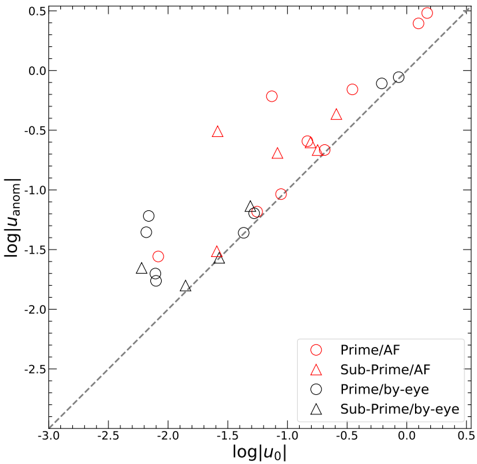
This image presents a scatter plot comparing `log(u_anom)` against `log(u_0)` for four different categories of data: Prime/AF, Sub-Prime/AF, Prime/by-eye, and Sub-Prime/by-eye. A dashed line representing the equality line (y=x) is also present. The plot appears to be investigating the relationship between an anomalous velocity component (`u_anom`) and an initial velocity component (`u_0`).
### Components/Axes
* **X-axis:** `log|u_0|` (Logarithm of the absolute value of u_0). Scale ranges from approximately -3.0 to 0.5.
* **Y-axis:** `log|u_anom|` (Logarithm of the absolute value of u_anom). Scale ranges from approximately -2.0 to 0.5.
* **Legend:** Located in the bottom-right corner.
* Prime/AF (Red circles)
* Sub-Prime/AF (Red triangles)
* Prime/by-eye (Black circles)
* Sub-Prime/by-eye (Black triangles)
* **Equality Line:** A dashed grey line with a slope of 1, representing the line where `log|u_anom|` equals `log|u_0|`.
### Detailed Analysis
Let's analyze each data series individually:
* **Prime/AF (Red Circles):** The data points generally cluster above the equality line, indicating that `log|u_anom|` tends to be greater than `log|u_0|`. The trend is roughly linear, with a positive slope. Approximate data points:
* (-2.0, -1.5)
* (-1.5, -0.8)
* (-1.0, -0.3)
* (-0.5, 0.0)
* (0.0, 0.2)
* (0.2, 0.4)
* **Sub-Prime/AF (Red Triangles):** These points also tend to cluster above the equality line, but are more scattered than the Prime/AF data. The trend is also roughly linear, but with more variability. Approximate data points:
* (-2.0, -1.0)
* (-1.5, -0.5)
* (-1.0, -0.2)
* (-0.5, 0.1)
* (0.0, 0.3)
* **Prime/by-eye (Black Circles):** These points are more closely aligned with the equality line than the AF data, but still generally lie above it. The trend is approximately linear. Approximate data points:
* (-2.0, -1.7)
* (-1.5, -1.2)
* (-1.0, -0.7)
* (-0.5, -0.2)
* (0.0, 0.0)
* **Sub-Prime/by-eye (Black Triangles):** These points are the most scattered and show the greatest deviation from the equality line. They are generally below the equality line for lower values of `log|u_0|`, and above it for higher values. Approximate data points:
* (-2.0, -1.8)
* (-1.5, -1.0)
* (-1.0, -0.5)
* (-0.5, 0.0)
* (0.0, 0.2)
### Key Observations
* The "AF" data (both Prime and Sub-Prime) consistently shows `log|u_anom|` greater than `log|u_0|`, suggesting a systematic overestimation of the anomalous velocity component when using the "AF" method.
* The "by-eye" data is closer to the equality line, indicating a more accurate estimation of the anomalous velocity component.
* The Sub-Prime/by-eye data is the most variable, suggesting that the "by-eye" method is less reliable for Sub-Prime data.
* There is a clear distinction between the Prime and Sub-Prime data, particularly when using the "AF" method.
### Interpretation
This plot likely represents a comparison of two methods ("AF" and "by-eye") for estimating an anomalous velocity component (`u_anom`) based on an initial velocity component (`u_0`), separated by loan type (Prime vs. Sub-Prime). The equality line serves as a benchmark for perfect estimation.
The data suggests that the "AF" method systematically overestimates `u_anom` for both Prime and Sub-Prime loans, while the "by-eye" method provides more accurate estimates, particularly for Prime loans. The increased variability in the Sub-Prime/by-eye data suggests that the "by-eye" method is more susceptible to subjective error when applied to Sub-Prime loans.
The difference between the Prime and Sub-Prime data, especially when using the "AF" method, could indicate that the "AF" method is more sensitive to the characteristics of Sub-Prime loans, leading to a greater overestimation of the anomalous velocity component. This could have implications for risk assessment and loan pricing. The plot highlights the importance of carefully considering the method used for estimating `u_anom` and the potential biases associated with each method, particularly when dealing with different loan types.